Monday, 28 December 2020

Beautiful Britain: Piccadilly Circus and the Albert Memorial

 So, in my last post I explained how I found it difficult to make the last painting, of the Shambles in York, partly because I was using acrylic paper. The paint was drying very quickly on the paper, which is great if you don't want the colours running into each other and mixing, but not so good if you do. I ordered a watercolour pad, which arrived today, but not until I'd already started. So these were made on 110 gsm cartridge paper. 

Albert Memorial

This first one is the Albert Memorial in London. The memorial is one of hose buildings that loads of people know, but relatively few take a really close look at, which is a shame since there's a lot to actually look at with it. I laid down the vertical bands of yellow, orange and blue first, and them started applying ink, brush pen and more watercolour. It's okay.

I followed this up with this painting of Piccadilly Circus.


I began by painting the fountain and the statue fist of all as a direct watercolour. This went surprisingly well, and I didn't apply any ink to the fountain itsel until I was well underway with the background buildings on either side. At the moment I really rather like this one - it's closer to what I was trying to achieve. 

Saturday, 26 December 2020

Beautiful Britain: The Shambles, York

 I likes an old, narrow street, don't you? The Shambles, in York, has some of the best in Britain, and the most famous. I think it was used for some of the exteriors in the Diagon/ Knockturn Alley scenes in the Harry Potter movies. I first visited in 1977. I was mad keen on trains at the time, and so my parents took us on a special excursion train day trip to York to visit the National Railway Museum. Which was absolutely great, but I loved the city of York generally just as much, with the Minster and the Shambles. I remember that it was the day that Red Rum won the Grand National for the third time. We went into a supermarket to buy some refreshments for the journey home, and they had a big sign up saying Red Rum has won, or words to that effect.

I made this after watching a demo video on Youtube made by the master, Ian Fennelly. I just tried to follow some of the method he used. Hence this underwent a number of stages, and has pencil, watercolour, ink and brushpen used in it. One thing to mention - I'm out of watercolour paper, and so I made this on acrylic paper. The problem with this particular Reeves pad is that absorbs the paint incredibly quickly, so you have to move very swiftly to get the colours to flow into each other at all. Live and learn.


Wednesday, 23 December 2020

Beautiful Britain - Blackpool Tower

Off Prompt: Today's British landmark is the Blackpool Tower. For non UK readers, Blackpool is the premier coastal resort in the whole of England. (Sorry Brighton - I love you as well, but for me, Blackpool is number 1) It's a great place to visit, and its most iconic landmark is this. it was inspired by the Eiffel Tower in Paris, and was built in 1894. I last went up the Tower about 5 years ago, and absolutely loved it. Inside that complex is the most famous ballroom in England, and an interactive exhibition. Love it.

Tuesday, 22 December 2020

Beautiful Britain: Stonehenge


Stonehenge


I think I ca safely say that Stonehenge is the oldest building that I've sketched in my beautiful Britain series, and will probably remain so. I drove past it. many years ago now when my kids were very little, but that's as close as I've ever come to it. I'm quit pleased with the drawing and the use of shading to give texture. I haven't applied any watercolour yet, but I may well do so . 

Beautiful Britain: Brighton Royal Pavilion

 Yes, I returned to Brighton for yesterday's beautiful Britain drawing. This completely mad piece of architectural exuberance is one of my favourite 'just for the hell of it' buildings.


Of course, some of its appeal lies in the fact that it was built for the Prince Regent, later King George IV. I've always found him a fascinating character, an opinion that was reinforced when I studied his life in some detail as a Mastermind subject. George was somewhat taken with Brighton when he visited one of his royal uncles, Henry Duke of Cumberland, there. His first Brighton home was a rented former farmhouse, which he had the architect Henry Holland rebuild into the Marine Pavilion. This was a far more conventional, classical structure than the Royal Pavilion. It proved to be a home conveniently far away enough from London for the Prince to be able to enjoy playing house with his illegal wife, Maria Fitzherbert.

The Prince assumed the regency in 1811, when his father George III, poor man, was incapacitated by the dementia which would afflict him for the rest of his life. In 1815 he engaged architect John Nash to remodel the Pavilion into its current form. It took a good 7 years. 

William IV, George's brother and successor, would stay in the Pavilion in fairly regular visits during his reign. His own successor, their niece Victoria, really didn't care for the place at all. The Pavilion was sold to Brighton, which helped pay for Osborne House, the royal family's new summer house. 

When I'd finished this one it was crying out for watercolour, and I applied washes of four colours. The bending of yellow, purple and blue in the sky above the main dome for once wasn't a clumsy accident, but a deliberate choice to let it happen and see what effect we could get. 

Sunday, 20 December 2020

Beautiful Britain (Take 2)

 In the few weeks since I last posted, I've been concentrating on extending my range of Beautiful Britain prints. There's a couple of reasons for this. Firstly, as I'm sure that you know if you've been following the blog for any length of time, I just love drawing. In particular I love drawing buildings with a fineliner. Secondly, after a slow start, business in my Etsy shop has started picking up, so I wanted to extend the range of prints on sale. 

So, here's the drawings from December so far: - 


Brighton Pier. I did a mental inventory of cities in Britain, and I know that Brighton and Hove became a city maybe 20 years ago. My first thought was to do the Pavilion, and I may well yet end up sketching that. My second thought, though, as this, Brighton Pier. When I first visited it in the 70s, this was the Palace Pier, as compared to the derelict Victorian West Pier. Well, sadly the West Pier is now gone. but let's at least celebrate what we have left. I have actually painted this pier before (one oat of primer and two coats of whitewash guv, I thenk yow.) and sold an acrylic painting of it a few years ago. 

Liverpool Roman Catholic Cathedral. I made a drawing of Liverpool's iconic Liver Building in the first set of beautiful Britain sketches. It has a drawback - it's not very good. I just didn't get it right. You can see it in my beautiful Britain gallery if you so desire - but it's not a drawing which is good enough to make prints of. So I really needed another drawing representative of the great city of Liverpool, and settled on this iconic building. Nicknamed Paddy's Wigwam, the Metropolitan Cathedral of Liverpool is a stunning modern building, opened during my lifetime in 1967. 

Portsmouth Spinnaker Tower and Skyline. I see this on the horizon every time I drive to visit my mother who lives in Worthing. I don't think that I quite caught it, and this is one of the least successful of my recent drawings, in my opinion. Still, allow me to gloss over that by offering you a choice piece of trivia about Portsmouth. It is the only city in the UK o be completely built on an island. 
St. Michael's Mount, Cornwall. Okay, not a city for once. I made a sketch of Mont St. Michel earlier this year, and thought that it's a shame that it's on the border between Normandy and Brittany in France, which means I can't include it in beautiful Britain. However, its sister establishment is in Cornwall, and this is it. I like this sketch - it came off for me, and I think that the shingle on the sides of the causeway works well. 
Cardiff Bay. I have sketched - and painted similar views before. but I wanted to make sure that I included Cardiff, Wales' capital, in this sequence of drawings. I like Cardiff, and the Bay is terrific, and really well worth a visit if the opportunity ever presents itself to you. 
Clifton Suspension Bridge.
So, to the largest city in the West of England - Bristol. Let's be honest, when I was weighing up which landmark to sketch, it was always going to b this iconic bridge, designed by IK Brunel. Every time I have any reason to go to Bristol airport, I always drive under it. It's a beautiful bridge in its own right, but it's situation spanning the Avon Gorge means that it is nothing short of world class. 
Edinburgh Castle
Yes, I've already sketched Edinburgh once, with a view from Calton Hill. But I just fancied having a go at the castle. What I like about this sketch isn't actually the castle, but the crags of the hill on which it sits. 

Leeds Town Hall.
This is one of the buildings in the series that I have actually visited. On my first ever appearance on Mastermind, it was filmed in the Yorkshire TV studios in Leeds. (The following year, when I appeared again and actually won it was all shot in Manchester). I was blown over by this piece of baroque neo classical. 
Now, having completed the drawing, I decided that, for the sake of variety, I'd have another go at applying a watercolour wash or two to an ink sketch. This was the result.
I have to say that I really rather like this. This is as close to what I was trying to achieve as I've ever got. I have to say, it actually looks better than this scan has made it - the colours aren't quite as washed out. Still. it encouraged me to have another go with the next drawing. Which was this one:-

The Radcliffe Camera, Oxford University. This is possibly Oxford's most famous landmark, forming part of the world renowned Bodleian Library. This is the plain drawing,

And this is the watercolour wash version. Again, I', not unhappy with the results, even though, again, the original does look a little bit better than it comes across in this scan. 

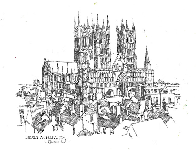
Lincoln Cathedral. This is the most complicated drawing I've made in December, and I simply haven't found time to apply watercolour yet. I guess hat Cathedrals are something of a fallback for me - if all other inspiration fails you can always go back to cathedrals - we have so many impressive ones. I think I once read that Lincoln Cathedral was, at one time, the world's tallest building, although I do stand prepared to be corrected on this one.

Finally, the sketch I made this morning, of the Roman baths in Bath. 


Monday, 30 November 2020

HB Pencil Sketch: Chameleon

 I belong to a Facebook group called Sketching Everyday. Maybe I've mentioned it before. Yesterday, being Sunday morning, not having any work to go to, I had a hankering to do a drawing. More than that, I had a hankering to make an HB pencil drawing. I haven't made a pencil sketch for a long time. What to do, though? Which is where Sketching Everyday came in. I had no idea what to sketch, and the group set a different drawing challenge every day. So I picked out the photo challenge to draw this chameleon. 

That's about all there is to tell, really.


Saturday, 28 November 2020

New Painting: Asleep on the Tube


I just fancied a quick acrylic today. For this is an acrylic, not a watercolour, even though I ended up applying it as such. My original idea was to have this paper painting as part of a diptych, juxtaposing his one with a painting of a scene of Londoners sleeping on the platform of Holborn station during the Blitz. And you never know, I may yet do so. As it often does, the scanner has made a couple of rather idiosyncratic choices about the way that it picks out certain of the colours. I do rather like this, though - it's closer to what I was actually trying to do than I often get with acrylic or watercolour on paper. 

Friday, 27 November 2020

Great British Illustrators 11: Sir Quentin Blake

Sir Quentin is in his 80s now, and still going strong. He’s indelibly associated with the works of Roald Dahl – I picked an illustration from “Charlie and the Chocolate Factory”, the first Dahl novel I ever read. For me it’s difficult to think of Roald Dahl’s books without thinking of Quentin Blake’s illustrations – as writer and illustrator they were an absolutely perfect match. However, Sir Quentin’s portfolio is much wider and more varied than that. Sir Quentin was the first ever Children’s laureate in the UK, and a good choice for that honour too. 

Like Ronald Searle and Peggy Fortnum, his style looks deceptively simple. Yet when you try to make a copy of one of his illustrations you start to realise just how clever and precise it actually is. No single pen stroke is wasted, and as a result all of his pictures crackle and sparkle with life and personality.


Thursday, 26 November 2020

Great British Illustrators 10) Beatrix Potter and The Tale of Jeremy Fisher

 Any discussion of great British illustrators of children’s fiction in the 20th century can’t ignore the claims of Beatrix Potter as one of the finest. She was arguably the greatest writer illustrator. Beatrix Potter wrote some thirty books, starting with The Tale of Peter Rabbit. Now, I’ll be honest, while I loved “The Tailor of Gloucester” and “The Tale of Jeremy Fisher” when I was a kid, I really didn’t like some of the other stories very much. For example, I thought that “The Roly Poly Pudding” was very weird, and not a little disturbing for that matter. But I still think that Beatrix Potter’s illustrations were never less than engaging, and some of them are absolutely enchanting.


Great British Illustrators 9) Thomas Henry and Richmal Crompton's Just William

 Richmal Crompton was a teacher in south east London who took up writing seriously in the early 1920s after polio forced her to give up her teaching career. It was about this time she created her 11 year old anti hero William Brown, popularly known as Just William after the title of her first collection of stories about him. She continued to write stories about William for almost 50 years, although it’s said she became somewhat resentful of the stories’ popularity, as she really saw herself as a writer of adult fiction.


Maybe it was the fact that I was generally a very well behaved, studious kid myself which made the scruffy, anti-authority, anarchic William appeal to me so much. Maybe it was just because the stories were so funny and well written that I loved William. I think it’s quite possible that Thomas Henry’s illustrations had something to do with it as well. Thomas Henry, although barely remembered now, was already a prolific and successful magazine illustrator by the time he was commissioned to illustrate Just William, and the William books kept him gainfully employed until his death in 1962. I’m a little frustrated that I just haven’t quite captured William’s face correctly in this copied sketch. Not quite.

Great British Illustrators 8) Peggy Fortnum and Paddington Bear

 If we’re discussing British children’s illustrators of the 20th century, we can’t really ignore Peggy Fortnum. Peggy Fortnum, who passed away in 2016, illustrated over 50 books, but she’s best known as the original illustrator of Michael Bond’s charming Paddington Bear books. The idea of anyone else having illustrated Paddington is about as outlandish as anyone other than E.H. Shepard having illustrated Winnie the Pooh.


Copying this picture was an interesting and surprisingly challenging experience. It looks simple, yet I found that every one of her lines was precisely placed, and imprecision on my part rendered the sketch far less effective than the original.

Great British Illustrators: Stuart Tresilian and Enid Blyton's "Adventure Series"


Most British children who grew up enjoying reading at any time from the 1930s until as late as the 1980s will probably have gone through an Enid Blyton phase at one time or another. She was an incredibly prolific writer, although she did come under increasing criticism from critics as her fame and success progressed. Some of the criticisms are valid. She was a middle class Englishwoman whose social attitudes were formed during the early decades of the 20th century, and to modern readers it is possible, for example, to read paternalism, and even mild racism into her books. Myself, I was never hooked on her more famous series, such as The Famous Five and The Secret Seven. However, for my 7th birthday I was given “The Sea of Adventure”, and I was hooked, and devoured all 8 of the – of Adventure – novels.

The picture is my copy of an illustration from “The Sea of Adventure” by Stuart Tresilian. He’s little remembered now, but worked prolifically for magazines from the 1930s until the 1960s, and served as president of the Society of Graphic Art in the mid 60s. Just looking at his work brings a warm glow, and reminds me how thrilled I was by the adventures of Jack, Philip, Dinah, Lucy Anne and Jack’s parrot Kiki.

Saturday, 21 November 2020

Great British Illustrators 6: Ronald Searle and Molesworth


Off Prompt: British Illustrators 6: Ronald Searle and Molesworth


In a reversal of the normal practice, the illustrator of the ‘Molesworth’ books, Ronald Searle, is far better remembered than the actual writer, Geoffrey Willans. Ronald Searle is best remembered for his St. Trinians sketches, which gave rise to some successful popular British films in the 50s, and several desperately unfunny remakes since. Searle’s loose, anarchic style perfectly fits Geoffrey Willans’ antihero Nigel Molesworth, schoolboy protagonist of “Down with Skool!” and three sequels. Molesworth is a pupil at the fictional boarding school St. Custard. Sadly I don’t think many kids still read Willans – the books are fondly remembered and treasured by any adults of a certain age, like myself , who discovered them for themselves, albeit they were already 20 years old when I first read them in the 70s. Incidentally, J.K. Rowling is about the same age as me, and I can’t help wondering if she read a lot of the same kind of books that I did at a formative age. I say this, because Hogwarts in the Harry Potter books is a direct lineal descendant of schools like St. Custard, Greyfriars in Billy Bunter, Linbury Court in Anthony Buckeridge’s Jennings books, and Enid Blyton’s Malory Towers.

Great British Illustrators 5: C.H. Chapman

In an earlier post I mentioned about my primary school library being stuck in the 50s and earlier decades. Well, Billy Bunter, whose acquaintance I first made through said library, actually first appeared in print in 1908. His adventures were written by Charles Hamilton, under the pseudonym Frank Richards. It’s difficult to explain the enduring popularity of Bunter. Taking me for instance, I was a 1970s city kid attending the local state school, reading about the pre-war adventures of a boy in an exclusive boarding school. I still have no idea about what some of the terms used in the stories meant. For example, Bunter was in a grouping at his school called the Remove. To this day I haven’t a Scoody Doo what this meant. Doesn’t matter. Bunter himself could have been a very unappealing character – he was a glutton, not above stealing, disloyal, cunning and at the same time a bit of an idiot, and very much a free loader. Yet, remarkably, there was something endearing about him, which I think comes across in the illustrations provided by C.H. Chapman.

Chapman is little remembered now, but illustrating Bunter became a cottage industry for him which sustained him for over 50 years. 

Great British Illustrators 4: Arthur Rackham

 Arthur Rackham, a near contemporary of E.H. Shepard, is synonymous with a fairytale style of illustration combining strong ink work with subtle watercolour. Rackham was the illustrator of J.M.Barrie’s first ever Peter Pan story “Peter Pan in Kensington Gardens”. He also made illustrations for an edition of “The Wind in the Willows”, although I’ve chosen to copy one of his illustrations for a later edition of “Alice in Wonderland”.


Tenniel is my hero, and for me his illustrations ARE Alice in Wonderland, however Rackham’s style is also highly effective at portraying the fantastic elements of Carroll’s story, even if for me they lack a little of the sinister quality of Tenniel’s work which I like so much.

Rackham is an illustrator whose reputation and popularity has only increased in the decades since his death.

Sunday, 15 November 2020

Card Update

 Just in case you were worrying about it, I thought that I'd better let you know that I've finished making my Christmas Cards now. In the end I decided that I'd use up all of my blanks, which means I've made a grand total of 50. With that many I wouldn't be at all surprised if I end up with some left over for next Christmas.

Just out of interest, 2 of them have watercolour, 15 of them are silhouettes, 11 of them just show reindeer, 17 are based on old sketches or engravings, and the rest are a mixture of odds and ends. 

I've always said that the Christmas cards - even when I do 50 of them - are just for family and friends, and not something I would sell. Still, when it comes to stuff that I actually do sell, it's been a bit of a mixed bag of a month so far. During September and October I sold several original paintings, and some prints on Etsy. This month, not so much. I can live with it - well I haven't got a lot of choice - and it's not as if the original paintings and sketches take up a great deal of room. 

You can imagine my delight when I got home from work on Wednesday to discover an order on Etsy for one of my prints. It was almost as great as my chagrin to discover a message from the buyer asking if I wouldn't mind canceling the sale. To add insult to injury, what made it worse was the buyer explaining that he was buying it for someone else, and when he showed it to them on Etsy, they didn't like it!  

Well, I cancelled the sale and sent a polite message to the buyer informing him that I'd done as he requested anyway. No point going on with a sale if you're not both happy about it. 

Saturday, 14 November 2020

Great British Illustrators 3) Ernest Shepard and "The Wind in the Willows"

 It’s unthinkable now that A.A. Milne’s Winnie the Pooh books could have been illustrated by anyone else than Ernest Shepard, yet it nearly didn’t happen. According to one source I read, Milne originally believed that Shepard’s style was unsuitable, and only agreed to allow him to work on the verse book “Now We Are Six”. When he saw Shepard’s work for the book, though, he changed his mind, and indeed, once he became convinced that Shepard’s illustration was adding to the popularity of the books, then he voluntarily paid Shepard a percentage of his royalties.


Shepard’s most beloved work after his Winnie the Pooh illustrations are surely his illustrations of Kenneth Grahame’s evergreen novel “The Wind in the Willows”, and it’s one of these that I’ve chosen to copy.

Great British Illustrators: 2) Pauline Baynes and The Chronicles of Narnia

 Yes, you might not have heard of Pauline Baynes, but she was the original illustrator of C.S. Lewis’ enchanting Narnia books. I was fortunate enough to attend a primary school in the early 1970s whose library hadn’t been updated much since the 1950s. I picked up the library’s copy of “Prince Caspian” because I liked the look of the front cover, and from then on I was hooked. Pauline Baynes came to the attention of C.S. Lewis through the recommendation of his good friend, and fellow Oxford don, J.R.R. Tolkien, (no mean illustrator himself) for whom Pauline Baynes had illustrated his highly enjoyable “Farmer Giles of Ham” tale.


I love the cleanness of her work, and her effortless ability to conjure up epic landscapes with a few strokes of the pen. As a kid, one of the first sketches I made that I was ever really proud of was a copy of a Pauline Baynes illustration of a little sad dragon from “The Voyage of the Dawn Treader”. This is a copy of an illustration from “The Magician’s Nephew”, not the first to be written, but the first part of the series in terms of the ongoing narrative. An utter joy.

Monday, 9 November 2020

Great British Illustrators: 1 Edward Ardizzone and "The Land of Green Ginger"

 One of the ways that I kept myself sane and occupied during the first lockdown in April and May was in making a list of some 50 of my favourite British illustrators, and copying an illustration that each of them had made. Writing about my love of 18th century and Victorian illustration in my last post brought it back to me that I did this. So what I’m planning to do is to make a series of posts showing you the illustration copies that I made. My apologies to all of the artists involved, whose work I’ve undoubtedly failed to do justice to.  

1) Edward Ardizzone and The Land of Green Ginger

Edward Ardizzone was an English illustrator of French-Italian extraction, who illustrated a very large number of children’s books through the 40s, 50s and 60s. It's really rather fitting that he was the first artist I chose, since he was the first winner of the prestigious Kate Greenaway Medal for illustration of a children's book“The Land of Green Ginger” by Noel Langley, is an absolutely wonderful book, full of wit, whimsy, humour and adventure. Although it’s called a children’s classic – which it is – it’s sadly out of fashion now. It continues the story of Aladdin, through his son, Abu Ali, focusing on Abu Ali’s quest to win the hand of the beautiful Silver Bud. It’s just great, an utter gem, and I can’t wait until my grandson is old enough for me to read it with him. 


The illustration I’ve copied shows Abu Ali and Silver Bud on the left, while his rival suitors, TinTac Ping Foo and Rubdub Ben Thud look on from the right. Noel Langley, who wrote the novel, was a South African writer, who wrote the original screenplay for the smash hit film “The Wizard of Oz”, but this book, I think, is his most inspired creation, and it’s perfectly portrayed in Ardizzone’s unique and distinctive style.


Sunday, 8 November 2020

Victorian Illustration on Christmas Cards

Yesterday I made another batch of Christmas cards, and once again, a significant number of them were copied from original Victorian engravings and illustrations.

I just really love that style of illustration, from the engravings of William Hogarth in the middle of the 18th century, then the savagely biting political cartoons of men like James Gillray, which begat the social conscience driven work of men like George Cruikshank, Hablot Knight Brown (Phiz) and John Leach in the first half of the 19th century, which in turn begat the more satirical work of artists like Sir John Tenniel, primarily in Punch magazine.

I’d already fallen under the spell of Hogarth and Gillray long before I discovered that I have a family connection to Hogarth himself, and to Gillray’s generation of cartoonists. In the early noughties when I was researching my family history, I discovered that one of my 5x great grandfathers was an artist called Philip Dawe. He may have been a pupil of Hogarth – he certainly worked for him at one time. Philip made a crust from engraving other people’s paintings, from publishing prints, and also from tutoring promising young artists, including George Morland. He was also a political cartoonist, although as his cartoon “The Bostonians in Distress” here shows, he was, in my opinion, competent but uninspired.

I’ll try to illustrate what I like so much about Victorian illustration with some of the cards I’ve sketched this year and in the last few years.

This one shows a cook steaming the Christmas Pudding. Christmas pudding is one of the stock subjects that Victorian illustrators would return to throughout the century, although more often to the bringing in or the serving of the pudding like this one.

The first illustration shows one of the things that I love, the way a Victorian illustrator could suggest a whole background interior with just a few well paced lines, and with careful use of hatching and cross hatching. I think that artists like the man who made the original of this one were also great storytellers too.

This one of this year’s batch is copied from an illustration made right at the end of the Victorian era, in 1900, but it illustrates my point about storytelling here – with the cheeky chappy beckoning the young lady, all the while hiding the mistletoe behind his back. Victorian illustration, when it’s not being satirical in the pages of Punch and the like, can be very sentimental, but that’s another reason why I think they make great Christmas cards – because Christmas is a time of year when being sentimental just fits.

I also really like the rather different ways that Father Christmas/Santa Claus is portrayed. In the cards I’ve made over the last few years, I’ve largely followed two distinctly different traditions, the British and the American. In Victorian times, British illustrators tended to depict Father Christmas as a very traditional figure, a hearty – although not noticeably fat - old man with long flowing white beard, a long robe, crowned with holly, often holding a Christmas tree, and spreading good cheer in the form of food and drink, rather than delivering toys to children. I’ve made a few cards in this tradition this year.


I haven’t made any based on the Victorian American Santa this year, but I’ve copied a lot of the work of the great cartoonist and illustrator Thomas Nast in the past.


As you can see from the cards I’ve posted here, his Santa is a fat, twinkly rogue – not quite in the full coca cola Santa Claus garb yet, but delivering presents for all. I think that Nast's inspiration was the description of Santa Claus in Clement Clark Moore's famous poem "A Visit from Saint Nicholas" ('Twas the night before Christmas etc.) 

Another Christmas subject that Victorian illustrators liked was carol singers. These two from last year demonstrate a couple of different ways that they explored this idea.

You can see from this first one the artist's social conscience is very much at work, with this rather ragged family deriving some little cheer from carolling in the open in the run down area where they live, hoping to make a few bob, enough to be able to eat on Christmas Day. Well, that’s the meaning I bring to it when I look at it, and it’s a testament to the skill of the original that sitting here, getting on for the best part of 2 centuries later, and I can read that into it.

One of the other things to note about Victorian Christmas illustrations is the wistful harking back to days gone by. This design, showing cheerful folk dragging a yule log up to the big house – in return for which they would presumably be received with a pat on the head, a mince pie, and a glass of the cheap stuff from the Lord of the Manor. The most famous Victorian Christmas story, Dickens’ “A Christmas Carol” pulls this same trick. It may be set in contemporary London of the late 1840s, but it’s wrung from Dickens’ own longing for the Christmas of his childhood some twenty five years earlier.

Thursday, 29 October 2020

Christmas Cards 2020


This time I’m not posting about a painting of any type. Since 2016, I’ve been in the habit of drawing, and occasionally painting, my own Christmas Cards. I don’t sell these, they’re just something I like to do for my friends and family.

I tend to do most of them with an ink pen. Ink sketching is something I really enjoy, and I’m probably more skillful when it comes to sketching with an ink pen than I am when it comes to making cards with watercolours. For one thing you are working on a very small scale, and I find it’s far easier to get details right with a pen than with a brush. I really like the monochrome look, similar to a Victorian engraving, which you can get with an ink pen too. Which probably explains the subject matter that I like to choose.

I’m useless when it comes to making something completely out of my own head. I have to see what I’m sketching. So for a lot of the cards I take my ideas from. . . well, from original Victorian engravings. Few of these are actually taken from original Christmas cards, but for the most part they’re illustrations that have appeared in magazines or books.

Usually I use A5 blank white cards which I buy from a well-known internet auction site (other well-known internet auction sites are available). However, earlier in the year my youngest daughter obtained a pack of square blank cards, a bit smaller than A5, from somewhere, and bought me a pack, so I’ve started by using these. I scanned the before I inscribed Merry Christmas on them because it’s possible I may want to use these images again for another purpose. So, if you’re ready, here’s the first batch of 2020 cards:-

Yes, the traditional bringing in of the Christmas pud. It’s so huge in this one I can’t help wondering whether the lady’s old man is hiding inside it. Leaving aside the facetious comments, it can be tricky getting children’s faces right when you’re working on such a small scale. Still, at least it helped me get my eye in. Yesterday I worked at a fairly furious pace to produce 8 cards.

Working like this did at least mean that I had my eye ‘in’ for the next card. This is possibly my favourite of the cards I made yesterday. It’s such a simple idea (and not mine, as I said earlier), but the silhouette against the snowy foreground works beautifully, and I also really like the way the clouds and sky have been rendered. Using horizontal lines like that says about 1920s to me, but I’m always open to being informed otherwise.

Carol singers are, I find, a fruitful field in which to find useful images to copy, and in particular, Dickensian era carol singers, be they well meaning toffs like these, or harmless, humble yokels like in a couple of the cards I made for 2019.

This next design originally dates from 1900. I just really liked the cheeky faced chap with the mistletoe. To me, that sort of thing is perhaps just on the right side of twee. Being critical, this is probably my least favourite of the cards I produced yesterday since, with the girl and her dog in particular, it’s not brilliantly executed.

I enjoy sketching reindeer, and it’s not so hard to find old engravings and line drawings to work from. This one is part of an illustration from a Victorian or Edwardian magazine, I would guess, which shows a whole group of reindeer, of which this is just one. To my way of looking at it, you really can’t go wrong with reindeer for Christmas cards – pulling a sleigh, lying down, standing up, whatever you do you can’t go wrong, although the hatching and cross hatching to produce the fur is always an interesting challenge.

Of course, if it’s true that you can’t go wrong with reindeer, then it’s even more true that you can’t go wrong with Santa. This rather old fashioned Santa is just based on a rather old painted illustration of the lad himself. I was tempted to paint, but if I do paint any of this year’s cards I’m much more likely to do so on the A5 cards when they arrive.

In past years I’ve always tried to do at least some of the cards by using more old fashioned representations of the American Santa of wonderful illustrators like Thomas Nast, and the old English Father Christmas. This is a more traditional Father Christmas. I don’t know exactly where and when the original illustration that I copied was made, but the clues that it’s English are that long, pointy hood, liberally adorned with holly, that he’s wearing, and the fact that he’s not shown bringing round toys for the kids, but spreading good cheer with food and drink. In the original, he’s carrying a large, dead bird by its neck, but I didn’t like this, so I sketched him with a bottle of falling down water instead.

I really like this next Santa. I’ll be honest, I don’t know how old the original is, but I like the humour behind it – poor old Santa confronting the obstacles posed by the demise of the Victorian chimney pot. We always used to tell our children that Santa had a magic key which opened everyone’s doors so he could get in even if they didn’t have a chimney. Looking at the picture, the style of is coat suggests a little bit of a more old-fashioned Santa, but I think it’s quite a bit more modern than the previous.

Those 8 cards I made yesterday. I got up this morning, my drawing hand felt fine, and so I made these last couple this morning. I liked this rather bucolic carol orchestra, similar in a way to the choirs I’ve used in other cards. I know that if any of us were magically transported back in time to mid-Victorian times, for all the Dickensian trappings we’d find it a pretty grim and horrible place to be compared with our own lives, but there’s no denying the appeal of the images.

Number 10 then, and we’re back to the reindeer. Again, not from an original Christmas card, merely a book or magazine illustration. I always enjoy making cards like this one, because of the intricacy and the level of challenge.

That’s my first 10 3030 cards, then. I don’t have specific recipients in mind yet, but every year I produce more cards, and yet every year there’s requests from my nearest and dearest if they can have one of my cards to give to someone, and I never have any left over by the end. That’s the way, uh huh, uh huh, I like it.