Showing posts with label Alice in Wonderland. Show all posts

Sunday, 13 April 2025

The Illustration Family Robinson

Stick with me for a moment. This will all eventually become relevant. I remember when I began studying for my A Levels there was a guy in my class who was actually a year older than the rest of us.  I think that he’d done O Level resits the previous year. I hope that I’m not being unfair when I say that I don’t think that he found A Level English the easiest of subjects. When it come to Art though, the guy was brilliant. To look at his own original work was to die a little inside, with the realisation that you would never be capable of producing original work like that yourself. He was so modest about it as well. I remember him telling me that he was doing a project on artist and illustrator Aubrey Beardlsey. This was my first encounter with the work of the man who would become one of my absolute favourite artist/illustrators. If I could wave my magic wand and have any artist or illustrator from the past produce a set of Alice illustrations it would be Aubrey Beardsley. I think he would have produced something outstanding. Sadly, he died just a few years before the copyright of Wonderland passed into the public domain.

So to the Robinson brothers, then. Once upon a time there were three brothers born in London, Thomas, Charles and William. Only 3 years spanned heir births. I can relate to this myself, since my older brother was born in 1963, I was born in 1964, and our younger brother was born in 1965. Their father and grandfather had both been illustrators and all three brothers had successful careers in illustration, especially during the Golden Age of British illustration. The youngest, William Heath Robinson, is the best remembered today, for his depiction of strange, convoluted and often pointless machines. To this day his name is used as an adjective for this kind of machine, the sort that looks like a mad inventor has knocked it up in their bedroom. William was the only one of the three who did not produce a set of illustrations to the Alice books. Both of the older brothers, Thomas and Charles, did.

The three brothers were active professionally from the 1890s onwards. Beardsley himself passed away in 1898. Did they know each other? Bearing in mind the similarity in their ages – Beardsley was actually slightly younger, and with the similar circles they moved in it seems very likely. Whatever the case the Robinsons’ work seems definitely to have been influenced by Beardsley. A few years ago when the Beardsley Gallery mounted an exhibition ‘The Beardsley Generation’ about Beardsley and his contemporaries who were influenced by him, the Robinsons were represented. Both Thomas Heath (TH) and Charles produced illustrations for Wonderland when the copyright on the book lapsed in 1907. I appreciate both but have a preference for Charles’ work, and I will start with these.

I find Charles Robinson's Alice illustrations a consistently interesting set. Like Mervyn Peake’s they range from the very complex and detailed - the Pool of Tears - to the much simpler - the Mock Turtle. Yet all of Peake's illustrations look like they were made by the same artist. Tenniel’s illustration all look like Tenniel’s work and Ralph Steadman’s illustrations all look like Ralph Steadman’s work. But with Charles Robinson’s, that’s not the case. If you didn't know, I don’t think you would pick out the pool of tears and mock turtle illustrations as having been created by the same hand. 


His illustration of the pool of tears goes beyond the text. His Alice looks almost demonic. The shading is really heavy, and the use of swirls and reflections in the pool make it a real tour de force, and hint at what Beardsley might have done. It’s by far my favourite illustration of Alice in the pool of tears. It’s framed by a relatively ornate Edwardian border. Yet many of his illustrations use very little shading at all. The Mock Turtle illustration for example could easily have been made 60 years later. With the stylisation of the image, the contrast between large areas of negative space and patches of pure black shading and the use of simple geometric shapes, this is another reflection of a different aspect of Beardsley’s work. Speaking of the Mock Turtle I can respect Robinson’s choice to go with something far more closely resembling a real turtle rather than riffing on the Tenniel conception of the character.

If we take these two illustrations as the extremes of a continuum, all of his illustrations of Wonderland fit more closely at one or other ends of the continuum. And you get a lot for your money. There are several colour plates and over 100 black and white illustrations – the majority of which are further towards the Mock Turtle end of the spectrum. This might be why when you view his illustrations today, almost 120 years after he made them, a huge number of them still look fresh and fun. To this extent Helen Oxenbury’s work on the story reminds me of Charles Robinson’s. Their styles are quite different, yet there is the same clean and uncluttered sense of fun and freshness. So while I might not quite put Charles Robinson right at the top of the tree of Alice illustrators with Peake and Tenniel, I’d put him pretty close. He’s a very significant Alice illustrator. I don’t think that he ever illustrated Alice Through the Looking Glass. That’s a shame. I’d love to have seen what he would have made of the Jabberwock.

Now, I said that I prefer Charles’ work to that of TH. However, the set of illustrations that TH produced in the same magic year of 1907 are still a fine set and well worthy of your attention. The set that TH produced is a far more homogenous set than Charles’. They were all clearly drawn by the same hand and they clearly all belong to he same work. Which makes it all the more strange that they were combined in the same edition with colour plates by Charles Pears. It looks as if neither artist had seen what the other produced. Their styles are completely different and so is their conception of the characters. But let’s concentrate on the work of TH. With their heavy borders TH’s illustrations almost have something of the quality of medieval woodcut engravings. Each illustration illustrates a whole scene and gives us full backgrounds and foregrounds within a plain, thick rectangular border.

I won’t lie, I have tremendously enjoyed copying TH’s work. Of his more memorable illustrations there’s the turbaned caterpillar and especially the elongated Alice being berated by the pigeon. The use of forced perspective with Alice’s head is something special and is probably my favourite illustration of his scene. But otherwise I don’t include TH in the absolute top branches of the tree because he does often play it safe in his depiction of the scenes. Yes, his Mad Hatter is dark and doesn’t have a 10/6 ticket in his hat. (Charles’ Pears’ does – shame on you Charles.) But it’s still a top hat and he still has a very prominent beaky nose. I like TH’s illustration of Alice with the Gryphon and Mock Turtle, but putting a top hat on the Mock Turtle does nothing to hide the fact that this is still very much Tenniel’s concept of the character. Likewise, while his Alice wears a sailor dress rather than a pinafore dress she is still recognisably a pretty direct descendant of Tenniel’s Alice.

I don’t want to keep harking back to comparisons with his brother Charles’ work but it’s very hard to avoid. If you compare the way that Charles illustrated Alice in the Pool of Tears with TH’s illustration of the scene, they both use swirls of water, but to me TH’s while technically accomplished just doesn’t portray or evoke the same level of emotion. TH’s Alice has an expression just seems to say – oh well, here we are, then, swimming in a pool of my own tears with a mouse. Another day at the office. - While many of Charles’ illustrations look fresh and timeless, all of TH’s illustrations seem to be very much of their time, the Edwardian era.

As I said earlier, I really do enjoy copying TH’s work even though they are not my favourite illustrations of Wonderland and here are two more I’ve just finished.


Sunday, 6 April 2025

The Sixties Alice - Ralph Steadman

Of all the sets of illustrations for the Alice books that have been produced during my lifetime, there are two in particular that have really inspired me. The first is Ralph Steadman’s.

If you delve at all into the history of how Alice has been illustrated over the years, certain illustrators’ work tends to be held up as landmarks. Tenniel, Rackham and Peake are all examples of such and so is Ralph Steadman. Ralph Steadman is a world famous British artist, illustrator and cartoonist. In the late sixties Ralph Steadman illustrated both of the Alice books. Of all of the Alice illustrators I've seen I think that Ralph Steadman captures the madness and the twisted logic of the books better than anyone, even Tenniel.

Which is not to say that I like all of his illustrations. I would like to say that I appreciate them, but that’s not the same thing. There are some that I do actually really dislike. But then in a way that’s all part of what you want from an illustration. With the best will in the world the Alice books need something more than the bland and inoffensive. When we get to Helen Oxenbury you’ll see someone whose Alice work is certainly not offensive, but it’s anything but bland. I’ll come to the Steadman illustrations that provoke my dislike later.

I do like what Steadman does with the character of Alice. Her starting point seems to have been Tenniel’s – long flowing hair with Alice band, pinafore dress and all. Tenniel’s Alice has hair that for the most part is just there. Steadman’s Alice has hair that at times almost takes on almost a life of its own. The way he uses it in the Wool and Water illustration is almost genius. I once saw Ralph Steadman contributing to a documentary about the work of Aubrey Beardsley, so it’s likely he was a fan. The Wool and Water illustration I mentioned seems to me to show Beardsley’s influence very much. Steadman’s Alice is as much a bystander as Tenniel’s, but her expressions of surprise, confusion and at times almost horror mirror the reader’s reaction to the strangeness all around.

Steadman uses hatching but very unobtrusively and you’re more likely to be drawn to his characteristic use of what look to be ink blots . There’s a feeling of violent action – either manifest or repressed within many of his illustrations, yet at the same time there is a strong geometrical quality to his work. One of my favourites of his illustrations shows Alice entering and emerging from the looking glass at the same time which demonstrates this. His use of the chessboard pattern in some of his illustrations for Looking Glass gets as far away from Tenniel’s flat tableaux as it is possible to get on a two dimensional surface. They put me in mind of illustrations I’ve seen which try to explain how space is curved. Some of his compositions are so brilliantly and intricately constructed that it almost makes my eyes hurt to try to completely unravel what I’m looking at. I particularly like the two knights fighting in Looking Glass.

So what’s not to like? Well. . . Ralph Steadman illustrated the books at the end of the sixties, a time in which the books were ‘discovered’ by a certain proportion of the readership who wondered what exactly the caterpillar was smoking in his hookah. The kind of misguided person who believes that the books were written under the influence of narcotics. I think we have to be honest here. The caterpillar is introduced in the last couple of sentences of Chapter IV - “. . . her eyes immediately met those of a large blue caterpillar, that was sitting on the top with its arms folded, quietly smoking a long hookah, and taking not the smallest notice of her or of anything else.” Then at the start of Chapter V the description continues – “The Caterpillar and Alice looked at each other for some time in silence: at last the Caterpillar took the hookah out of its mouth, and addressed her in a languid, sleepy voice.” So, the Caterpillar is smoking an unnamed substance. At first he seems oblivious to his surroundings, and even when he does notice Alice he seems sleepy – one might almost say – drugged. So I don’t know if I can reasonably complain because Steadman’s caterpillar looks spaced out. Martin Gardner’s Annotated Alice suggests that Steadman gives it the face of self-confessed drug user John Lennon. There’s a general resemblance. But he had the caterpillar smoking some kind of cigarette through a long cigarette holder. The fact that Carroll says he was smoking a hookah leads you to surmise this is a joint. I think that I can justify the cigarette holder and will do so shortly – but this doesn’t mean I have to like it.

Which brings me to what I really dislike. I can’t get over my dislike of Ralph Steadman’s portrayal of the Hatter. Yes, he is completely different from Tenniel’s. But in one illustration he looks like a bloodhound – his open mouth looks like a shiny black nose. He wears what in one illustration appears to be union jack sunglasses. All he has in the way of hats is a plain bowler. Which surprises me a little considering the way that Steadman uses clothes symbolically in other places. For example, the White Rabbit, the Caterpillar, the lobster and others all wear pinstriped trousers. In the case of the White Rabbit this completes an ensemble which makes him look for all the world like a harassed commuter. It gives you an idea that there is some kind of weird Establishment in Wonderland that all of these characters in their own way are part of. It also contrasts well with the playing cards who are painting the roses red, to coin a phrase. These wear plain trousers, and in case we don’t get the point then they are also wearing flat caps. The flat cap is as much as a symbol of the blue collar working man as the bowler hat is a symbol of the white collar middle class managing classes. It’s interesting that Bill the lizard, who is also a hired hand, wears a flat cap, while the idle caterpillar smokes from a cigarette holder, an affectation of the bourgeoisie. Was Lewis Carroll making a dig at the class system? Probably not, if truth be told but it provides an interesting extra dimension to the work.

Ralph Steadman is another illustrator of the books who does not provide much in the way of backgrounds but manages to make a little go a long way. All in all, I kind of think that Mad Hatter notwithstanding, Ralph Steadman deserves a place alongside Tenniel and Peake on the branch at the top of the tree. The branch marked Genius.

All of my copies of Ralph Steadman's illustrations can be found on my page of Alice in Wonderland illustrations. You can find this in the links to the right of the page.

Peakeing again, and Good old Harry Boy

Well, it’s been a gently productive week, peeps. First, let’s look at the copy I made of one of Mervyn Peake’s Treasure Island illustrations. I have to say that this illustration of Long John Silver is one of my favourites. There’s something almost skeletal about the way that he is depicted here, with his skull like lower jaw, and the clear outline of his ribs. This is a malevolent Long John Silver. With Peake’s illustrations you never lose sight of the pirates as men capable of evil. They are cutthroats, every one. 

----------------------------

Now I’d like to come back to Harry Rountree. I wrote in detail about this wonderful illustrator last week. One of the points I made was that you can find many of his illustrations on the web, but they are mostly those he made for Wonderland. Harry – I’d like to think that we would have got on had we lived at the same time and known each other so I take the liberty of using just his first name – did illustrate Looking Glass too, but it can be much harder to find them on the net.

Or so I thought. I’ll explain that in a moment. Last Sunday I found a reasonably priced edition of the two books that contained Harry’s illustrations. It’s a Collins Pocket Classics edition. The bookplate says that it was presented to the recipient in 1949 and that seems about right. This was a year before Harry passed away.

Now, I don’t believe that the book contains all of the illustrations Harry produced for Looking Glass. I don’t know how many he produced for Looking Glass. 21 are reproduced here including a single colour plate with Harry’s striking depiction of the Jabberwock. What makes me think they may have left some out? Well, this edition only reproduces 21 illustrations from Wonderland too, and I know from my other copy of the Harry illustrated Wonderland that he did many more than this.

Okay, so allowing for all that I’m delighted to see more of Harry’s Alice illustrations that I’ve never seen before. Only. . . well, a couple of the illustrations I have seen before, incorrectly described as illustrations of Wonderland. Then there’s this one I’ve even made a copy of.

I’ll be honest, when I made it last week I mistakenly thought that this was Alice with the Queen of Hearts. I’ve seen it described as such on the net. It is also printed on the inside over of my copy of Harry’s Wonderland – and this edition only contains the earlier book. Why? I have no idea. I didn’t realise hat this was in fact Alice with the Red Queen until I saw it in the Collins combined edition, with a caption from the text printed underneath. And it’s clearly meant to be the Red Queen when you look closely. Peaking out of her robes, her body does resemble the base of a chess piece.

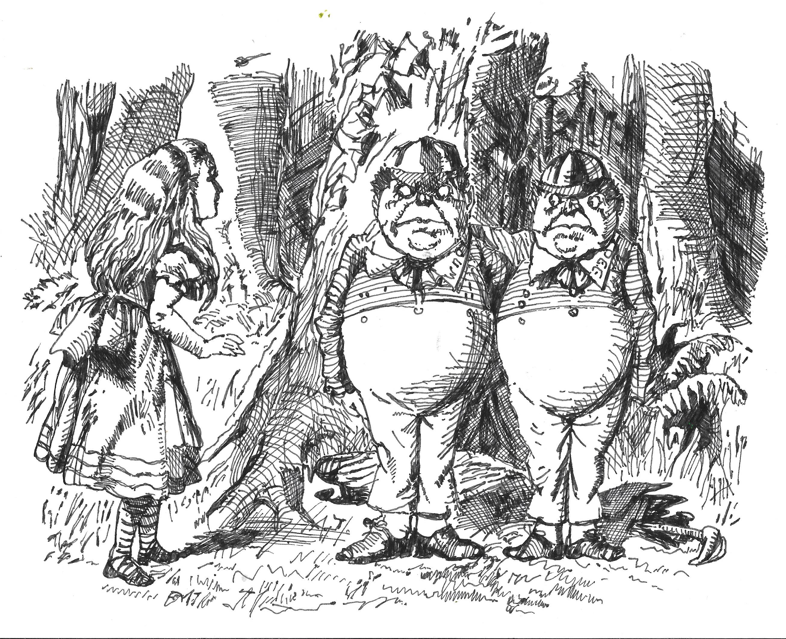
Well anyway, yesterday I made my first straight copy from the book, Tweedledum and Tweedledee. Here it is:-

Earlier in the week I made this copy of Alice and the Duchess from Wonderland:-

Finished with Harry for today then? Not quite. In the middle of last week I ordered a copy of an edition with Harry’s 1908 illustrations. I doubt I will end up copying these when it arrives, because I think that they were all or mostly colour plates. You know me and what happens when I try to copy coloured originals. Still, I can’t wait to see it when it’s delivered.

Sunday, 30 March 2025

Harry Rountree and the 1928 Alice

So, my fourth Alice illustrator of choice (leaving aside Treasure Island) for a moment, is Harry Rountree. Maybe you’re not as familiar with the name as with Tenniel or Rackham. Yet after leaving his native New Zealand to play his trade in London in the first years of the 20th Century, Harry Rountree enjoyed a wonderful career in illustration. Not that he found it easy at first. Editors whom he approached for commissions were discouraging. He enrolled in the Regent Street Polytechnic’s School of Art, and received a commission to illustrate “Extracts from the Diary of a Duckling.” for a children’s magazine. The story is forgotten now, but it established Rountree as an illustrator of animals. And soon he was establishing a name for himself.

By 1905 he was following a well-trodden path by illustrating for Punch. I haven’t tried to work out how many Alice illustrators plied their trade with Punch over the years, but it would be quite a total, I reckon. In 1908 Rountree made his first set of illustrations for Alice. I say first, for 20 years later Rountree would make new illustrations for another edition, which is the one I will chiefly be writing about. Coming back to the 1908 edition, this was produced at the height of the Golden Age of British illustration. It’s rarer than the 1928 edition, and I believe it has more colour plates than the 1928. Rountree’s colour work is absolutely gorgeous, but I haven’t seen a copy in the flesh, besides which I want to be true to myself. I love monochrome line illustrations.

So to the 1928 edition. He did produce some colour plates for this one as well, but these are relatively few and it’s the black and white line work I want to concentrate on. More than 60 years separate Tenniel and Rountree and you can see it in the styles that they use. Tenniel showed innovation in the way that he integrated text with illustrations but compared with Rountree he was really just scratching the surface. Yes, many of his illustrations are full page – and my treasured edition from probably the forties or fifties is not quite A4 size, but it’s pretty large, and this does the illustrations justice. More than a few are integrated beside, above or below the text on the same page. Especially those where the characters are involved in some energetic action.

For the ’28 Rountree is abounding with life. I’ve written before about the way that he depicts Bill the lizard exploding out of the chimney. His White Rabbit, even in repose, looks as if he is about to explode any moment. His cook, from Pig and Pepper, looks as if she has been caught in freeze frame in the act of hurling the frying pan, which is a huge contrast to Tenniel’s carefully posed tableaux. Some of this energy comes from the poses in which he draws the characters, but a lot also come from the way that he uses shading. He does occasionally use cross hatching, but far less than Tenniel, and his use of hatching is less intricate. He uses blocks of almost pure monochrome in strategic places. Backgrounds are often minimal – patches of grass are shown by a few hastily drawn spikes that look as if they have been applied furiously against the clock. Clouds are a few curved lines joined together depicting the outline of a fluffy, cotton wool ball. Indoors is show with a few vertical pen strokes. I love copying Rountree’s work and one of the things that I love about it is that often Rountree achieves so much with so little. Maybe not genius or rare brilliance, no, but masterful? I think so. I’ve copied more of Harry Rountree’s illustrations of Alice than any other illustrator except for Tenniel of Edgar Thurstan.

I look at Rountree’s work and feel a sense of nostalgia, because this particular style of illustration is something that feels very familiar to me. There were elements of it in the (British) comic books that I used to read as a kid in the early 70s, the Beano and the Dandy and their sort. Even more than that, this was a style that many illustrators of the thirties, forties and fifties used, and I read a lot of books from this time, often in reprints.

More than many illustrators, I think that Hary Rountree got the figure of Alice herself right. In the 1908 edition his Alice has long, flowing golden hair, wears Edwardian clothes, and she is a bit older than Tenniel’s. By 1928 the Rountree Alice is a bit younger, maybe 7 or 8. Her hair is cut shorter in a fashionable 1920s bob and is darker. The clothes she wears are noticeably more modern. While she isn’t maybe quite as much of a free spirit as Peake’s Alice she is far more of a participant than Tenniel’s or Rackham’s. I particularly like one illustration from the front pages of the book where Alice is standing right next to the Queen of Hearts who is shouting – hard to believe, right? – and Alice is holding her hands to her ears. I also love his depiction of the pigeon verbally attacking Alice when her next zooms up into the sky. If you look at Harry’s illustration he has depicted the neck in such a way that you can completely understand why the pigeon calls her a serpent.

Other highlights of the 1928 set include Harry’s illustrations of the Father William poem. Harry’s Father William looks nothing like Tenniel’s, yet Harry ‘gets’ him as much as Tenniel does. I fact I do feel that taken as a whole set, while Harry doesn’t give us archetypal images, he rarely gives us anything that feels ‘wrong’ about the characters. Yes, I do feel that there are a couple of instances where inspiration seems to have failed him and he gives us something derivative. With his Hatter, for instance, yes, he is taller than Tenniel’s and no, his head does not seem ridiculously out of proportion. But he wears a top hat and has a very prominent nose. Likewise, Harry’s mock turtle seems to draw heavily on Tenniel’s – which is a shame because I think that his gryphon is wonderful

One thing I haven’t mentioned yet about Harry is the sheer joie de vivre and humour in his illustrations. His Cheshire Cat has more of the shape of a wildcat, yet he is absolutely laughing his head off. When Alice dreamily muses ‘Do bats eat cats. . . do cats eat bats’ Harry supplies us with a very funny image of a cat launched into the sky with a butterfly net trying to catch the bats around him.

My edition only has Alice in Wonderland. Harry did also illustrate Looking Glass, but images of his illustrations for it are far harder to find online. I’ve only seen a couple of them myself. The combined edition I read about was published in 1940, but when Harry made his illustrations for Looking Glass, I couldn’t say. I fact, as I’m writing this I’ve found a very reasonably priced copy of this combined edition on Ebay and just bought it. So doubtless you can expect some posts about this in the future.

Is Harry Rountree perched on the top of the tree of my favourite Alice illustrators alongside Tenniel and Peake? Ooh, he’s close. But. . . he’s short of genius. But I think that his 1928 edition will be a set that I will always love and appreciate.

Thursday, 27 March 2025

Arthur Rackham - Did he really 'get' Alice?

So, today’s Alice illustrator of choice is Arthur Rackham. In the history of British illustration, Rackham’s place is as secure as both Tenniel’s and Peake’s. He is renowned as one of the leading lights of what has since been called the Golden Age of British Illustration, a time, between roughly 1880 and 1920, when there was a market for beautifully, sumptuously illustrated children’s books, and when printing technology had advanced to allow reproduction of coloured illustrations. By the middle of the first decade of the 20th century Arthur Rackham had well established a reputation for himself as an illustrator of fairy stories. His work is characterised by bold ink lines and beautifully subtle use of watercolour. So as soon as “Alice in Wonderland” passed into the public domain it seemed a natural choice to engage Rackham to produce his own illustrations for a new edition.

Don’t misunderstand me either. Some of Rackham’s illustrations of Alice in Wonderland are very beautiful, although we will have to consider whether they ae works of rare brilliance (genius). For Wonderland Arthur Rackham made 13 colour plates and 15 line drawings, and I think that you can see a clear difference between hem. I’ll come to the line drawings later, but for me it’s the colour plates that display Rackham’s best work on the book.

For one thing, each colour plate is a lovingly detailed, complete full page illustration. His wonderfully subtle use of watercolour gives each of them an ethereal, almost dreamlike quality. Arthur Rackham’s colour plate illustrating ‘Advice from a Caterpillar” is my favourite depiction of the caterpillar that I’ve yet seen. To get a flavour of just how good Rackham’s colour plates are it’s useful to compare them with the colorised Tenniel illustrations in “The Nursery Alice”. Thse are very nice, but the colour isn’t helping to tell the story at all. If anything (say it quietly) I think that in a few instances the bold colour actually detracts a little from Tenniel’s original sketch. Not so with Rackham. His use of colour is magical, and I wish I had just a fraction of his skill.

Having said that, the top of the tree of Alice illustrators whose work I value is a lonely place. Arthur Rackham doesn’t sit alongside John Tenniel and Mervyn Peake for me, but slightly below. Why should that be? Well, remember, please that this is just my opinion, but I think that there’s a couple of reasons why.

Firstly, there’s the line drawings. Now, again, don’t misunderstand me. I’m not saying that they are not good. They are. Rackham was a great and skillful draughtsman. But in many cases they are quite, should you pardon the pun, sketchy. Peake didn’t use detailed backgrounds either, but he contrived to suggest something vague, insubstantial and in its own way dreamlike. Considering how brilliant the backgrounds in his colour plates are, it almost looks as if he couldn’t be bothered – well, unless there was a tree in the background. I look at his line drawings of the Gryphon and the Cheshire Cat and I feel that he must have loved drawing trees, especially gnarled and twisted ones. But even with his drawing of the Gryphon, I can’t respond to it in the way that I respond to Tenniel’s illustration of the sleeping Gryphon. The lightness of touch that makes the colour plates so appealing works against the line drawings in my opinion.

When you look at Rackham’s line drawings you also can’t help feeling that the way that he depicts some of the characters is a little derivative of Tenniel and this is also a criticism you can make of his beautiful watercolour plates. If we start with the Hatter, alright, Rackham’s Hatter has dark hair, while Tenniel’s doesn’t. On the other hand, just like Tenniel’s archetype, Rackham’s Hatter has an overly large head, a remarkably prominent nose and he wears a top hat with a price ticket stuck into the hatband. When you look at it you get the impression that Rackham is not so much giving you his take on Carroll’s Hatter, as his take on Tenniel’s Hatter. However I look at Rackham’s Hatter it looks like a failure of the imagination to me.

That’s a colour plate. If you look at the line drawing of the Mock Turtle you can make the same criticism. Rackham was not the only illustrator to use what is essentially Tenniel’s conception of the character, but he is the illustrator we’re discussing now. I have a feeling about this. I have the feeling that Rackham didn’t really ‘get’ Carroll’s story. He does a thoroughly professional job but to me for the most part he is responding to Tenniel’s presentation of Wonderland. So while he can portray the substance of “Wonderland” he doesn’t get to the soul of it. I think that Mervyn Peake does and I think that he ‘gets’ Wonderland. Knowing of Tenniel’s relationship with Lewis Carroll and his extreme reluctance to illustrate ‘Looking Glass’ it’s tempting to suggest that Tenniel himself didn’t have a great deal of time for the story, but there’s such a connection between Carroll’s words and Tenniel’s illustration that it betrays an underlying understanding and connection.

Ironically Rackham, for me, gets closest to a really original response in the colour plates where he gets furthest away from Tenniel. I’ve already mentioned the caterpillar, but I also think his colour plate showing Alice with the White Rabbit is superb. His rabbit is something of a dandy with his frilly shirt cuffs flopping down from his long sleeves, and his red eyes reveal that he is an albino and at the same time hint at some suppressed rage and madness. The contrast between the darkness of the ground around him with the pale yellow sky is stunningly atmospheric.

Coming back to my comment about Rackham not necessarily ‘getting’ Carroll’s story is demonstrated by his conception of Alice as a character. Superficially Rackham’s Alice is darker haired than Tenniel’s, older than Tenniel’s and dressed in more contemporary clothes than Tenniel’s. For all that, though, Rackham’s Alice, like Tenniel’s, is often depicted as a bystander. She hardly ever seems to emote at all, maintaining a slightly glum expression on her face in many of the illustrations in which she appears. It’s difficult to believe that Rackham’s Alice would ever have had the gumption or the curiosity to follow the rabbit down the hole in the first place.

I'm not denying that Arthur Rackham was a master illustrator, and some of his work on Alice was wonderful. But I just can't quite help thinking that he lacks the inspiration of Tenniel and Peake.

Monday, 24 March 2025

John Tenniel - first Alice illustrator. And greatest?

I’ve written a lot about Edgar Thurstan and the relationship between the 21 illustrations of the Alice books he made for the 1930 Odham’s combined edition, and the original illustrations by Sir John Tenniel. For me, as for many other lovers of the books, Tenniel’s illustrations are the vision that I see in  my mind’s eye when I read the books again.

Why should this be? Especially when you consider that they have a 1951 Disney animated movie to contend with. It can’t be just because they came first , could it? Well, no, While I think being the first (published) helped establish Tenniel’s rendition of Wonderland in public consciousness, if they had been just mediocre they wouldn’t have lasted. And they’ve lasted alright – boy how they’ve lasted.

I think we can find at least part of the answer by asking the question – why did Lewis Carroll want Tenniel to make the illustrations in he first place? Carroll doesn’t often get credit for this, but I think he really understood how important illustrations would be for his story. He wrote it in manuscript form as Alice’s Adventures Underground, and accompanied the handwritten text with 37 of his own hand drawn illustrations, and presented it o Alice Liddell for Christmas in 1863. When he conceived the idea of having the book published he borrowed the manuscript and asked some literary friends to try it with their children. They were very positive about the text, much less so about the illustrations. Carroll, to his credit saw the recommendation to get a professional illustrator for what it was. Good advice. He recognised what Tenniel could bring to the party – the fact that he held off publishing Alice Through the Looking Glass for several years until Tenniel could be persuaded to illustrate it shows how essential he thought Tenniel was.

Why, though? Tenniel had already illustrated several books prior to making the illustrations for Wonderland, but he was best known as a cartoonist for Punch magazine. From 1850 he shared the duties of cartoonist with John Leech – the illustrator of Dickens’ A Christmas Carol, until becoming sole cartoonist on the death of Leech in 1864. It seems that Carroll was drawn, should you pardon the pun, to Tenniel through his great facility rendering anthropomorphic animals, and his unusual habit of drawing from his prodigious visual memory without using models or drawing from life. Did he perhaps see in Tenniel a man capable of creating worlds out of his imagination?

I personally feel that Tenniel’s illustrations demonstrate tremendous strengths. Namely –

Tenniel showed a fine ability to align his illustrations with the text, both literally and metaphorically. Tenniel followed the story. His illustrations show what Carroll wrote. In fact, he showed imagination in the way that his illustrations linked physically with the text, particularly in the L shaped illustrations of Alice looking up at Humpty and the Cheshire Cat, for example. The two side of Alice passing through the looking Glass on opposite sides of the page, and the two sides of the page showing the transformation of the Red Queen into the kitten show great innovation.

Tenniel managed to take what were sometimes sparse descriptions of the characters’ appearance and create archetypes of these same characters. A great example of this being the Hatter. (The Cheshire Cat tells us that he’s mad, but Carroll always refers to him as just The Hatter). It’s not an exaggeration to say that pretty much every depiction of the character since has been influenced by Tenniel. Illustrators are faced with the stark choice of borrowing aspects of Tenniel’s Hatter, or producing something that is deliberately made to be as different from Tenniel’s as possible.

I think that at least part of what makes Tenniel’s work on the Alice books so effective is that he doesn’t do sugar or saccharine. Even in the illustrations for the earlier chapters of Wonderland, he never really gives us anything cute, for want of a better word. Using monochrome with sometimes heavy shading means that even his brightest illustrations have shadows. Add to this his willingness to use relatively grotesque caricature. What Dickens achieved with words with, for example, a character like Sarah Gamp in “Nicholas Nickleby” Tenniel achieved with his drawing of the Duchess.

More than many of the illustrators of the Alice books who would come later, many of Tenniel’s illustrations reward the viewer who takes a second, more detailed look at them. While many who came after would concentrate on characters while giving merely the hint of a background, there’s a real richness to many of Tenniel’s backgrounds, especially the outdoors scenes. On first glance you might not notice the glass houses behind the Queen of Hearts, or the eel traps behind Father William when he is balancing an eel on his nose. They’re here. They don’t strictly need to be there but they add texture. The first time that you looked at the Duchess’ first illustration, did you notice the smiling cat by her feet? It’s the Cheshire cat before he is even mentioned as such.

I mentioned that Carroll seems to have appreciated Tenniel’s facility with anthropomorphic creatures which you can see in his illustrations of the fish and frog footmen. But he goes even further than just depicting living animals as people. For Tenniel was s wonderful fantasy artist even before anyone had conceived of that term. His sleeping Gryphon is a wonderful illustration, while his jabberwock is nothing less than a tour de force. Personally I think that this one illustration justifies the price of admission by itself.

--------------------------------------------

So, when you get right down to it I think that while other illustrators may have illustrated parts of either novel more effectively than Tenniel did, I think as a whole, as a set of illustrations they are unmatched. Which is ot the same as saying that they are beyond criticism.

I’m not totally sure exactly how I feel about Tenniel’s depiction of Alice. With her pinafore dress, and her long blond hair with its eponymous Alice band, Tenniel gives us another archetype. Even an artist as distinctive as Ralph Steadman gave us an Alice with the band, the hair and the pinafore dress. My issue with Tenniel’s Alice is that there is not a lot of life about her. Alice doesn’t do much more than standing or sitting listening to and looking at other characters, or reacting to something. In some illustrations she resembles a porcelain doll, and she’s about as dynamic as one too.

This is a criticism you can extend to many of Tenniel’s illustrations. In many of these his characters’ positions are beautifully observed, but they are poses. We, the viewers are looking straight on at characters who resemble actors who have been carefully placed in a tableau on stage, and are holding perfectly still.

Of course, it’s a bit much criticising Tenniel for not being more cinematic in his compositions when it was decades before cinema was even invented. But it’s clear how static many of his illustrations seem when you compare the slow and steady rise out of the chimney his Bill the Lizard makes, compared with the explosive lizard expectoration in Harry Rountree’s depiction of the same scene.

-        - -

Well, nobody’s perfect and trust me, it is far easier to criticise than to do something that other people can criticise. To me, Tenniel’s work is the standard against which all Alice illustrators must be judged. It’s that simple.

Sunday, 16 March 2025

Thurstan Challenge Completed

Yes, dear friends, my self-imposed Thurstan Challenge is complete. Here’s the copies of the remaining Edgar Thurstan illustrations, compared with Thurstan’s originals on the right. I’m tempted to say that it’s been harder this week, since the last five have all been pretty detailed, complicated illustrations, and more complicated than almost all of the Tenniel illustrations. They may not look like it but each one has taken hours to complete.

Carrying them out has convinced me that pretty much all of Edgar Thurstan’s 21 Alice illustrations do owe something to Tenniel to a greater or lesser extent. I go into a lot more detail about this in the Edgar Thurstan – Tenniel Clone or Unfairly Forgotten Alice illustrator page in my links section.

Here's the last few illustrations :-


Sunday, 9 March 2025

The Thurstan Challenge

If you’ve been reading my blog at all over the last year or two – look, it’s not impossible that you somehow stumbled across it and quite liked what you read – then you may well have noticed a couple of things. I am rather obsessed with ‘Alice in Wonderland’ and quite a few of its illustrators, and I am particularly interested with one called Edgar B. Thurstan. You would be right to think so. I’ve written a long article all about why and what I know about Thurstan and you can find it in my links section. In fact I’ll make it even easier for you. Just click on the link below.

So, I’ve copied 12 out of his 21 Alice illustrations. In celebration of the Alice Challenge I set myself about three years ago, to copy all 92 of Tenniel’s illustrations, I’ve now decided to undertake the Thurstan Challenge. I want to copy the remaining 9 of his illustrations. Granted it’s not that huge a challenge, but the bearing in mind that I’ve already copied my favourites of his Alice illustrations, I think that some credit is due for the undertaking. So here’s the originals of the 9 I have left to do:-


Saturday, 8 March 2025

More sketches in the new Canson Sketchbook

I’ve been doing a little more work in my new Carson mixed media sketching journal today. I mentioned that I like the way that it takes fineliner when I tested it and made my first sketch in it on Monday. After making two ink sketches in it today I stand by that. It’s quite similar to sketching in the Seawhite Travel Journal, I find, even though the paper in the Seawhite is much lighter at only 130 gsm.

So this first sketch is a copy of one of the Harry Rountree (1928) illustrations of the Pig and Pepper chapter in Wonderland. Now, I’ve made most of my other Harry Rountree copies in the Royal Talens book. What I find with that is that you have to use a thinner nib whenever you’re doing something a little more detailed. I was perfectly happy with a 0.1mm nib to make this sketch. I found it gave me a lot of control and meant I could sketch pretty accurately. In fact I’m sure I could have used a nib that was a least twice as thick and achieved just as good results.

So this encouraged me to try it out with a copy of an Edgar Thurstan illustration. This is my copy of Edgar Thurstan’s illustration of Alice entering the Looking Glass. I think it has come off a wee bit better than the copies I made in the Royal Talens book using the same nib. Here it is:-

I think I should also point out that this was made on the other side of the page on which I made the watercolour and ink sketch of Disneyland Paris. The paper is so robust that you can do this without ay issues at all.

Here's the same sketch alongside my copy of the Tenniel illustration. Tenniel’s illustration is accompanied with a Mirror image illustration of Alice emerging on the other side on the reverse of the page. Edgar had to do it all in just the one illustration.

I think Edgar gets maybe just a little further away from Tenniel in this one than he does in quite a few of his other illustrations. Alice has a glass dome clock to her right in both illustrations. The interior of the fireplaces are similar. To her left Tenniel’s Alice has a vase under a dome. There’s a similar vase on Thurstan’s Alice’s left, but this doesn’t have a dome. There’s also a more prominent vase on the right too. Tenniel’s mirror is square, while Thurstan’s is a more ornate, bowed shape. I some was I’m put in the mind of the way that Edgar worked on Tenniel’s original with the train carriage illustration. In both, if I can use a photographic analogy, he's not only positioned the ‘camera’ to look down on he scene from a bit of an angle, he has also zoomed out a little which means he gets to show more of the scene than Tenniel does.

I have to say, this was another of Edgar’s illustrations that I have thoroughly enjoyed copying. I don’t think I can put poor old Edgar up on a pedestal with Tenniel, because a lot of his illustrations to seem so derivative. But then, if you’re going to be derivative, the do it well and do it interestingly and I think that Edgar certainly manages to do this.

Monday, 24 February 2025

A difference between the 1860s and the 1930s

When you’re making a copy of someone else’s picture, one of the benefits to be derived from it is that you learn a lot about the original while you’re doing it. This makes sense when you think about it. You can’t, well, I can’t copy a picture, or a photograph or even draw from life without looking, looking, looking. I’ve written about my ‘method’ before – which is maybe making it sound more systematic than it really is – of mentally dividing parts of the original into a series of small drawings and reproducing these which eventually combine to form the big picture. Working this way I find does help me to focus on the detail of the separate parts of the picture.


I’m getting a little away from the point I’m going to make. This morning I made a copy of Edgar’s illustration of the fish and frog footmen from Wonderland. Here it is compared with my copy of Tenniel’s illustration of the same scene. The hallmarks of Edgar’s use of the Tenniel original to inspire his work are evident. This is a bit like a mirror image – what’s on the right in Tenniel’s is on the left in Edgar’s and vice versa. The figures are very similar in both, right down to the position of the frog’s legs, and the frock coat worn by the fish. And . . . the fact that the position of the viewer is shifted, so that we are looking slightly down and slightly on he diagonal, compared with Tenniel’s figures. With Tenniel, we the viewers are largely on a level with the figures who are directly in front of us.

Maybe I have an explanation for this. Work with me. For me, it’s the difference between watching a story play out in a theatre on a stage, and watching a story play out on film. Tenniel puts the viewer in the position of the audience in a theatre. Cinema had not been invented when Tenniel made his Alice illustrations. Edgar puts the viewer in much more interesting positions, just as a film director could do using cameras in different positions. Now, I’m not saying that Edgar was consciously trying to be cinematic in his approach. But in the 1930s, when I believe Edgar made his illustrations he was living in a world where cinema had already shown us all different ways of looking at the world.

Well, it’s a theory anyway. What’s not a theory, but a fact is that my admiration for Edgar’s technical skill increases with every one of his illustrations that I copy. You know, I think that I’m pretty decent at copying Tenniel’s work. But if you said to me, well this is what you have to do – you make a mirror image copy, but then you have to also shift the viewpoint upwards, and on the diagonal – well I don’t think I would produce anything decent if I tried to.

For the record his is my tenth copy of an Edgar Thurstan Alice illustration, out of just 21 illustrations he made in total. My eleventh copy is this one below. I think that these latest two copies are probably the best ones I’ve made of Thurstan and it’s probably because I used a nib only half as thick as the 0.1mm nib I used on the others.


Saturday, 22 February 2025

Thurther Thurstan Copies

So, are you in the market for more comparisons between Sir John Teniel’s Alice illustrations and Edgar B. Thurstan’s? I hope so because that’s all I have for you.

Yesterday I made this copy of Edgar’s illustration of Alice falling down the rabbit hole.

Now, I don’t have a comparison here for the simple reason that Tenniel did not illustrate Alice falling down the hole. To me it’s always seemed like a bit of an omission. But then Lewis Carroll himself did not illustrate the scene for Alice’s Adventures Underground. Maybe he just never saw the visual potential. So this is Edgar without the temptation to draw heavily on Tenniel. Now, you have to accept that I’ve done my best with this one but it’s really not a great copy. Edgar’s, you will have to take my word for it, is a technically highly competent piece of work. I do wonder if he was inspired by anyone else’s illustration for this. I haven’t done any research on this yet, so it’s a case of watch this space.

This is a copy of Edgar’s illustration of the Wool and Water chapter of Looking Glass, followed by Tenniel's

Thurstan has once again shifted the position of the viewer, so we’re looking down rather as we did with the railway carriage illustration. If the virtually identical sheep isn’t enough to convince you that we have a deliberate borrowing from Tenniel, then just look at the way that Edgar has taken the kite, spade et al from the side of the counter in Tenniel’s and put them on the front of the counter in his.

Yes, well spotted, there is a big difference between the two. Edgar’s has an open door looking out onto a jetty with the ewe’s rowing boat. I can understand the logic behind the decision to depict the scene in this way. For Tenniel made two illustrations of the chapter, while Edgar had to get as much of it as possible into 1 illustration.

Here's my copy of the second of Edgar’s illustrations that I made today. As if you didn’t know, this is Tweedledum and Tweedledee. Tenniel's is underneath it.


I would say that Edgar is just a little further away from Tenniel than he usually is. The heads are very similar and they are wearing very similar caps. However there are differences in the clothes they wear. Tenniel’s figures wear schoolboy ‘skeleton suits’ that were old fashioned when he drew them. Edgar’s wear rather more modern waistcoats, jackets and trousers. All the time having Alice in her Victorian pinafore dress. Well, as we’ve said before, either Odham’s wanted to go for I can’t believe it’s not Tenniel, or Edgar decided to go that way for his own reasons.

Sunday, 16 February 2025

Copying Thurstan again - easing my way back into sketching

Hi, how are you doing? Me? Well, I haven’t posted anything here since completing the text and illustrations for ‘Alice’s Adventures at the Poles’, no. That’s partly because I haven’t hardly produced anything since. You know how it is – I have to give my new day job the effort and dedication it deserves, and so a lot of the time I just haven’t had the oomph to sketch in the evenings or weekends. I do make a little money out of my art, enough to provide spendsies for my overseas sketching trips, but it’s not my living so I do have the luxury of being able to leave it for a bit when I’m not feeling it.

So up until the last week, the only sketching I’ve done at all recently was during a weekend in Oslo in January. I’ll write about that in a future post – probably. But by Friday just gone I could feel my sketching mojo coming back. But what to sketch? Ideally it would have been nice to copy one of John Tenniel’s Alice sketches – stick with what you know and what you enjoy, innit? But I’ve copied every sketch he made for Alice in the past and I don’t want to do it again. So what was the next best thing? Well, yes, I could have gone for one of the other great Alice illustrators and done another of theirs. I haven’t coped all of Mervyn Peake’s, or Ralph Steadman’s, of Charles Robinson’s etc. etc. But I wasn’t feeling it. I wanted to do a Tenniel style illustration. Which is what led me back to Edgar Thurstan.

In case you haven’t read my earlier posts on this subject I will try to summarise as best as I can. I fell under the spell of the Alice books through an edition, published by Odhams in the 1930s that my grandfather had bought. In my ignorance I had always felt that it contained some of the original Tenniel illustrations. Towards the end of last year I bought a copy of this exact same edition for pennies on ebay, and found out that the 21 illustrations within it were made by one Edgar Thurstan. But they are so clearly inspired by Tenniel’s work that I think my confusion is forgivable. For what it’s worth I think that Odhams wanted the Tenniel illustrations but didn’t want to pay the commission for them to the Tenniel estate. The rights remained with the estate until the 1960s. So I guess they set our Edgar to his work with the instruction to make them as much like the Tenniel originals without breaking copyright as he could.

I copied the Thurstan illustration of Alice in the train carriage  and compared it with my copy of Tenniel's original to prove my point a couple of months ago.

I also commented that the illustrations where Thurstan shows more originality and goes further away from the Tenniel originals are less effective in my point of view. Well, maybe that’s a little unfair. Here’s the copy I made on Friday of Alice meeting the Red Queen in Looking Glass.  Below it is my copy of the Tenniel illustration of the same scene


You’ll notice the more creamy coloured paper of the Thurstan copy. This is because I used my trusty Royal Talens book for it. Not sure why I feel this way but I always enjoy sketching in it. Now, this is similar to the Tenniel in the style – the extensive hatching and cross hatching. The use of trees in the background gives the composition a little similarity. Thurstan, though, has done what he does elsewhere by transposing the positions of the figures. In this one though his Alice is in a different pose to Tenniel’s, curtseying (it saves time). The figures of the queens are quite different too – Thurstan ignores the angularity of Tenniel’s queen, and the fulness of her face seems to owe more to Tenniel’s Duchess or Queen of Hearts. Both wear crowns which look to be inspired by the top of the Queen piece in a standard Staunton chess set. Compare the next picture I copied, also of the Red Queen, with my copy of Tenniel’s:-


Compositionally there’s more similarity between these two. The position of the hands, and the Queen’s staring eyes come to mind. Ironically Tenniel’s is now fuller faced while Thurstan’s is more angular. Yet I have to say that I really like what Thurstan did with the Queen’s arms and hands. Again, he’s made a figure that is more animated than Tenniel’s original.

Okay, so we come to one of the illustrations that I did think inferior to Tenniel’s by some degree. Here’s my copy of Tenniel’s illustration of Alice meeting the caterpillar in Wonderland above Thurstan’s.


This is an interesting one. Again, Thurstan has done his mirror image trick of reversing the positions of the figures and even some of the background details like the smaller mushrooms. The Thurstan hookah is pretty much the same as Tenniel’s. But the big difference, the huge difference, is the caterpillar. Tenniel, to be fair, doesn’t give us a lot to work with in the original. The caterpillar has its back to us and he doesn’t give us much more than the clever use of what might be the forelegs of the caterpillar to suggest the profile of Mr. Punch. So here Edgar really bites the bullet and ignores Tenniel’s caterpillar completely. His caterpillar is a hairy one. And it’s actually pretty well modelled too . . . apart from that face.

You know, I must have been quite inspired by this illustration when I was tiny because the caterpillar has always been one of my favourite characters. But the face of it . . . well, it’s just wrong I’m sorry. It’s too simple, too sketchy and cartoony. It’s out of place here, and it’s a shame because I have come to really appreciate everything else in this illustration through trying to copy it. But it’s surely a case of inspiration failing Edgar when left to his own devices.

Between making the second and third sketches yesterday I tried again to find out anything I could about Edgar ‘E.B.’ Thurstan, and once again I pretty much drew a blank. The only references I could find were for a few works he illustrated for Odhams in the 1930s and the majority of those references were to Alice. And for that matter most of the references to Alice were specifically to the Humpty Dumpty illustration in Looking Glass. So I don’t know. It’s possible, I suppose, that Edgar was not under instruction from Odhams to make his illustrations like Tenniel’s. Perhaps he was under pressure, inspiration failed him and so he decided to use Tenniel’s work as a starting point. Who knows?

Whatever the case, although I know next to nothing about Edgar, I salute him. For the most part, loving your work, sir.