Showing posts with label watercolour. Show all posts

Sunday, 9 July 2023

Back to the Paintbox

If you followed my recent posts about the 30x30 Challenge during June, you may recall me mentioning that I developed tendonitis in my wrist and shoulder with about 10 days to go. Up until yesterday I didn’t even try painting anything. My wrist feels quite a lot better, although my shoulder and neck don’t seem to be getting much better att all. Maybe it’s my arthritis spreading. Since diagnosis about 13 years ago it’s only really affected the upper joint of the index finger on my right hand. The tip of the finger has developed a pronounced and slightly alarming lean to the left. It rarely hurts and hardly inconveniences me at all. But I do have to face the fact that it could spread sooner or later.

Okay, that’s the excuses done. Now, last year I was so pleased with the way my direct watercolours had improved by the time that I got to the end of the challenge that I started painting exclusively watercolours until I went away to Spain. Those were paintings where I lightly drew the design in pencil before starting. Well, this year I have been pleased again, this time with the overall quality of the whole set of 30. Yes, there are a couple that I don’t think are up to the standard of the rest, but as a whole set I think they’re a noticeable improvement on 2022. So when I picked up my brushes again yesterday, it was to do another direct watercolour.

The subject which is based on an old black and white postcard printed in the 1930’s. I’d earmarked it as a potential subject for one of the 30, but since I’d already painted the old Morris Minor post van I didn’t do it as part of the set. Yesterday though, the time was ripe. All of the 30x30 pictures are A4 sized. This is purely a commercial thing – it’s easier and cheaper to post A4 pictures and prints than A3 – a LOT cheaper. But I only had A3 available yesterday. The benefits of using A3 are that it’s a lot easier to paint in detail and features on a larger figure than a smaller one.

I’m pretty pleased with it. I think pillar box and postie are nicely done in the foreground, and the background to the left of the postie is nice too. I went for almost a sepia tone quality to it, which seems to have worked. I did some research on the ne, but couldn’t find which city the photograph was taken in. I’d like to think this is London, but in all honesty I just don’t know.


Wednesday, 24 August 2022

Ealing Watercolours *11) The former Himalaya Palace CInema

 This is one of Ealing's Grade II* listed buildings - the former Himalaya Palace Cinema. It's stunning. The original cinema on this site, the Paragon Palace, was built in 1912, but when it was acquired by the United Picture Theatres Ltd. Company they pulled it down in about 1928, ad erected this building, which opened in November 1929. It closed in 1982, and became an indoor market, then reopened as a cinema in 2001. Sadly it closed in 2010 and became a market again. It was grade II listed in 1980 and upgraded to Grade II* in 1998. Quite right too, since it is the only cinema ever built in this particular oriental style ever in the UK.

I will admit that while I have looked at the building many times - often from the top deck of a 207 bus, I never actually watched a film there. The Odeon in Northfields Avenue was much closer - and that too is an equally stylish building, albeit in a completely different style. My father was in the habit of being given money by my mum to take us to the cinema. He'd present us with a choice - I can take you to the cinema now, but that's it, or I can take you to Rossi's now, buy you an ice cream and then I'll take you to see the film in Southall next week when it's there.- The point being that if he did this he'd save enough money to buy himself a bottle of cider. Of course, he wouldn't keep up his end of the bargain to take us to the film the next week. Choosing to take the cinema today rather than the ice cream didn't work. His reaction to a refusal was often ' Right, you're being greedy, so I'm not taking you at all now.' While it would be nice to say this was just one little foible and that he was good most of the time, it would be an utter lie. He was a bit pants as a dad. In fact if I'm honest, he was a lot pants. In fact without wanting to overstress the matter, he was the whole underwear drawer. Enough about him. So - I tried to produce something on a par with my last painting of the Hanwell Clock Tower. 

I did make an ink sketch of the Himalaya Palace last year : - 

I hope you can see what I like about the building just from the ink sketch. Here's the sketch I made today: -


I didn't use the same reference photo. Today's reference photo was taken sometime between the reopening in 2001 ad the reclosing in 2010. I'll be honest, I did not take process photos other than this. My feeling was that it was going to be a more complicated painting than he clock tower. It bloomin' was too. The irony of doing a much larger building like this one means that you're painting every thing in a smaller scale. Now, until recently I'd have made a sketch like this completely freehand. I will come clean. For several of my Ealing pictures I've used a ruler when I've been making the original sketch. It takes a bit longer - making just this sketch took me 2 hours this morning. 

So - you remember the two lessons I tried to apply when I made the previous painting? 1) Be creative with the sky. Again I've gone for yellow, but added a light blue streak at both top and bottom. Since the yellow was wet they kind of coalesced so that while it's more yellow further down, it's almost greeny further up. 2) Try hard not to overwork it. If anything I was even more likely to overwork this one than the previous one since it has so much going on in it, and there's so much detail. I hope that I haven't. 

So here it is:-

I like it and I'm pleased with it. Not as much as with the Hanwell Clock, but then that one turned out pretty much exactly the way that I wanted it to. This one, well, I don't really know how I wanted it to turn out. 

Monday, 22 August 2022

Learning two simple lessons: Hanwell Clock Tower watercolour

I haven’t taken as many process photos for this latest painting. Bteween painting the Woolworths painting at the end of last week, and painting his one, I’ve been looking at watercolours of similar subjects by artists I really like, and trying to figure out why I think their’s are SO much better than mine, and I picked up just a couple of ideas that I tried to apply while I was making this painting.

The subject is the Clock tower in Hanwell, which is the part of Ealing where I grew up. It was erected in 1937 to commemorate the Coronation of King George VI. There was a campaign to have it removed during the 1970s. Thankfully this didn’t come to anything.

I've sketched the clock tower in ink from a different angle: -


I’ve developed the habit of filling the page with my original outline sketch, which does mean that I have to rub out the pencil lines which have been covered over by the tapes.

Right, the two things I picked up from looking at watercolours by artists I like showing similar views were these:- 1) You don’t have to go for a traditional blue sky every time. Some of the pictures I looked at achieve great things using colours like yellow, crimson or even purple for the sky. So I went for a mostly yellow sky with just a hint of blue bleeding into it from the very top. – 2) Do not overwork the painting.As you can see, I had finished the clock itself at a very early stage of the painting. I would always be tempted to do more work on it, to darken the shadows more, and try to add more texture. Here I forced myself to say – it’s good now, be satisfied.

I’d started the painting on the Sunday afternoon, but my daughter and my youngest grandson called round, so I didn’t return to it until the evening. Taking this photo was the last thing I did before packing up for the night. The natural light had gone and the artificial light was not really helping me much.


I woke too early this morning, but was eager to crack on with the painting. I made up my mind to be disciplined and work from left to right. So the first job was to complete the red brick building. I’d already painted he cream base yesterday. Today I applied the individual brush strokes to replicate the pattern of the bricks. Once these had dried I watered down the brown, and applied a very thin layer over the op of the brickwork, just to push the pattern back a little.

I shouldn’t say it, but I was getting quite excited by this time at just how it might turn out. I was deliberately using colours that were somewhat more muted than I would normally, and it was giving the painting the quality I wanted.

The next thing was to work on the shopfronts. I had to have a serious think about how I was going to execute what I wanted and in the end decided to paint in the more brightly coloured chairs on the pavement in front of the café before finishing the shopfront and windows.

By this time I was so far into the picture that I really only had one main concern which was – don’t cock it up now by making a pig’s ear of the last few bits on the far right. I was happy with the front of the café and the chairs. Although I still need to add the shadows on the pavement in front of it.

Before I took this penultimate picture It struck me that the blue on the timbered building and on the building on the far right was a little weak. The buildings in real life are actually white but the blue contrasts strongly with the colours of the clock tower, and fools the eye into thinking that the white buildings are in shadow. So the Ladbrokes shopfront and the windows above it were finished, and this was the stage just before the signing, and the ceremonial removal of the tape. I still had to add the kerb, and one shadow running up the steps of the clock.

And this is the finished painting. No doubt it’s not a masterpiece. However, it does show some of the qualities I think make watercolour special. I like this one a lot.

Friday, 19 August 2022

The Wonder of Woolworths (West Ealing)

I’m back from Spain. I enjoyed the best part of a fortnight in the Spanish sunshine, and I made about 20 sketches and a couple of paintings. But now I was ready to make another Ealing painting. This one was going to feature the West Ealing Woolworths building. I have sketched it before in ink. Today's painting is going to be based on a different reference photograph.

West Ealing Woolworth in the fifties/sixties - sketched in 2021


So, first process photo shows me assembling all the equipment. Well, most of it. You can also see the reference photo that I was using, which I printed out beforehand. A lot of the time I will work off a photo on the screen, but I enjoyed using the hardcopy today.

I began by making the two diagonal lines marking out the edge of the roadway and the edge of the pavement by the buildings. I wanted to draw the two cars as well, but this was going to cause me some issues, which I’ll explain shortly.

When you look at the next process photo you can maybe see what I mean with regards to the cars. The car on the left is actually rather nicely drawn. . . but. . . if you look at the diagonals and verticals I’ve already drawn in behind it you’ll maybe be struck by the same thing I was. The left hand car is too big in proportion to the buildings. Especially when you look at the little figure I’ve put in. So I was aware of the problem by this time, but I did make the decision to leave it for the time being while I was sketching in some of the details of the buildings behind, and then think about my options.

Having said all of that, as I built up the details on the shops, it became harder and harder to ignore the car. So I’m quite pleased with my self discipline. Leaving the car for now was not so much a case of me burying my head in the sand, so much as thinking that the more details I’ve sketched on the shops, the easier it will be to work out the right proportions for the car when the time comes to do it. Come to think of it, I was surprisingly well disciplined making the whole picture.

So I lowered the roof of the car, and extended the shop doorways to meet it. I also shortened the length of the cabin , and showed more of the bonnet. None of this was drastic surgery, but at least it gave the car the kind of proportions where the eye is going to accept that the car is that much nearer to the viewer, rather than being a car for a giant. I mentioned about being disciplined, and you can see this in the way that ‘ve pretty much completed the left hand side of the drawing before sketching hardly any details on the right.

So to the large building on the right. This is – or rather was – the Woolworths store in West Ealing. It was something of a landmark right through from when it was built in 1926.Incidentally, originally Woolworths had their store in the building which is BHS in this picture. As with many Woolworth stores throughout the UK, Woolworths pretty much fell out of fashion, and the store closed as Woolworths when the UK company collapsed in the late noughties. Incidentally, when I visited Berlin 2017 I was delighted to see that Woolworths survived in Europe, and in many ways the Berlin store I used was pretty typical of what I remember.

So all that really remained to sketch were the storefronts and the apartment blocks on the extreme right. Simple as that. Except for the fact that to make this drawing, which is far less detailed than I would have made as an ink sketch, still took the best part of a couple of hours to make!

I do enjoy painting cars, but I did have the discipline to paint the sky first, and then the road surface. If you look at the bottom right you can maybe just see that I did paint the zigzag band, albeit a lighter colour, which is preparation for later. I did the first layer of paint on both cars, but wasn’t going to do anything more with the car on the right for a while. My plan was to try to work left to right as much as possible without diving off to do something else. You can see that I have begun to paint the BHS sign as well.

Now, even though the BHS sign extends all the way to the middle of the page, there was a good reason for finishing it before going back to do more on the left hand side. Doing it all in one go gave me more of a chance of keeping it smooth and even.

Before I took the next photograph I did the top windows on the far left and the shop front below. Then a layer of light yellow underneath the top floor of the BHS store, before the brown/orange brickwork on top. Shadows, then window panes and the top floor was looking decent. I broke to make lunch for my grandson and me. When I came back to the painting I have to say that it wasn’t looking at all bad. The BHS shopfront shows a wee bit of subtlety which pleases me a lot because it’s not my real strong suit, subtlety.

Considering the size and seeming complexity of it the Woolworths building was relatively simple to carry out. Once I’d made the decision not to try to show the joins between the tiles it really was just a matter of getting in the light shadows, and putting in the window panes. It’s painstaking work, but if you have a little bit of patience it’s not too difficult to do. Likewise, making sure that the sign says Woolworths is just a matter for patience and a steady enough hand with a small brush.

So I wanted the shop front of the Woolworths to be darker and contrasting with the BHS and New Look shop fronts, and then the Wilkinson shops on he far right to be different again, and I’m happy that I’ve done that. The tree didn’t take long and I’m glad that it was there in the original reference picture because the green stands out in contrast to the reds, yellows and browns of the shops. Seaking of green as well I applied a very thin layer of green to the band of the road containing the zig zag lines on the bottom right. All that really remained after this was to sign and date it then remove the tape.

Here it is. At the moment I’m really rather pleased with this. It’s West Ealing pretty much as I remember it – although by the time the photo was taken it must have been a good 20 years since I moved away! I won’t lie, I’m pleased with the result, but I’m also pleased with the way I went about this. I’m pleased with the decision I  made with regards to the car on the left, and with the self discipline I showed. A nice addition to my growing Ealing collection.

Friday, 5 August 2022

Parkers Bakery Northfields Avenue: The Flavour of Nostalgia

I’m off to Spain tomorrow, but there was still time for one last Ealing painting before I go. Not enough time to take many process photos,  mind you, but you can’t have everything.

Easter 2021 saw me making this sketch. Parkers was a local bakery in Ealing West London. At one time they had several shops in the Borough and neighbouring boroughs. Sadly this one, the last one in Northfields Avenue Ealing closed in 2019.

Parkers were something of an Ealing institution. Maybe nostalgia makes me say this, but I’m lucky enough to have eaten produce from bakeries in many countries and cities throughout Europe, but I don’t think that any of them gave me as much pleasure as a freshly baked warm crusty roll from Parkers.

This looks like a very detailed sketch. It’s really only the one part of the sketch that is at all complicated, and that’s the queue of people outside the shop This isn’t exaggeration or artistic license, it was par for the course for Parkers. It took a long time to produce the sketch, however balancing this was the fact that there’s only a small amount of brickwork on the extreme left of the picture, and it’s brickwork that took such a long time to make in a few of the Ealing pictures that I’ve made.

This is the last process photo that I took. You can see that I followed my susual practice of painting in the sky, then the ground – in this case the road surface, pavement and kerbs. There was an awful lot of black on the shopfront. Parkers had a very distinctive black shopfront with silver (chrome?) lettering. It was stylish and timeless and never changed as long as I can remember. I took care of the brickwork on the building just round the corner in Mayfield Avenue as well. Moving from left to right, I left the blank paper to represent the white first floor of the building, although I did in places paint a very light shade of blue in a couple of places on it just to give it a little definition.

A lot of delicate layering work went on in the shop window, working from light to dark. You can see I’ve painted a very light grey above the loaves. This would be followed by light creamy yellow on the loaves, then a darker browny yellow for definition, and almost a terracotta colour in places. Then a darker grey for some areas, and then a last grey, almost black, for areas of extreme shadow.

Next I moved on to the figures in the queue. More shading and definition were given to the figures closest to the viewer. Shopfronts followed fairly quickly once I’d finished the figures, and just the hints of windows made the first floor of the buildings very easy to complete. Once the foliage of the tree had been painted, then there wasn’t a huge amount more to do other than the lady in the pink top on the far right, and the cars to her right. Finishing off details were the lamppost, some shadows on the pavement, and a little definition to the pavement outside the shop. This is the finished picture. I have to say, I’m pleased with this again. 


Monday, 1 August 2022

Start all over again

 Alright, so much for feeling sorry for myself. Yesterday I got off my butt, stopped feeling sorry for myself about the Craft Fair on Saturday and sold some of the Neath prints that I'd made for the Craft Fair, to cut my losses a bit. I also sold an original sketch to a chap I met at the school craft fair a couple of weeks ago. Some you lose. . . but some you win.

So I made another watercolour this morning, and it's another London Borough of Ealing Watercolour as well. This one is a complete change of pace - not a bus or tram or trolleybus. I went to school in Elhorne High School in Hanwell. At the back of the school there was a very large field, and that led down to the Grand Union Canal. It's still a very picturesque place.


I didn't make may process photos at all today. This is partly because I was working so quickly. It's not as detailed or complex a view as either of the watercolours I made last week, and I really didn't need to do much more than outline the treelines, ad where the land meets the water, and the basic shaped of the canal boat, the lock and the lockkeeper's house. 

Once I started painting It went incredibly quickly. I felt most trepidation about painting in the water and the reflections so I did the sky first, and the started on the grass, then the trees. then the house, the lock and the wall on the right. I liked what I'd done by this stage, but I also knew that the bottom half of the picture was going to make or break it. 


Here's the finished picture. I won't lie, considering some of the rubbish I've produced in watercolour in the past I am really rather pleased with this one.The surface of the water is better done than I've managed before, and having the reflected foliage that little but darker than the trees works well. 


Tuesday, 31 May 2022

Nothing to do with Alice

 Yes, I've managed to make a picture that has nothing to do with Alice. I belong to a Facebook group that gives you a different prompt every day - you can respond to it or not, there's no pressure. To be fair, it was a prompt on this group that eventually led to the Alice fixation - Sir John Tenniel was a daily prompt a long time ago, and that got me started. Today's prompt led me to make this: - 

I mean, we're not exactly talking old master, here, but we are talking progress to at least some extent. It looks close to what I was aiming for. Which is nice, because the 30x30 challenge for 2022 starts tomorrow. 

The purpose of the 30x30 Challenge is to produce 30 Direct Watercolours by the end of the month of June. Direct watercolours are those that you produce just using watercolour, with no pre-sketching and no other media involved. I've completed the challenge for the last couple of years - and last year I even sold 8 or 9 of my 30 paintings. Well, if that should happen this year, well and good, but just completing the challenge will be enough for now. 


Saturday, 23 January 2021

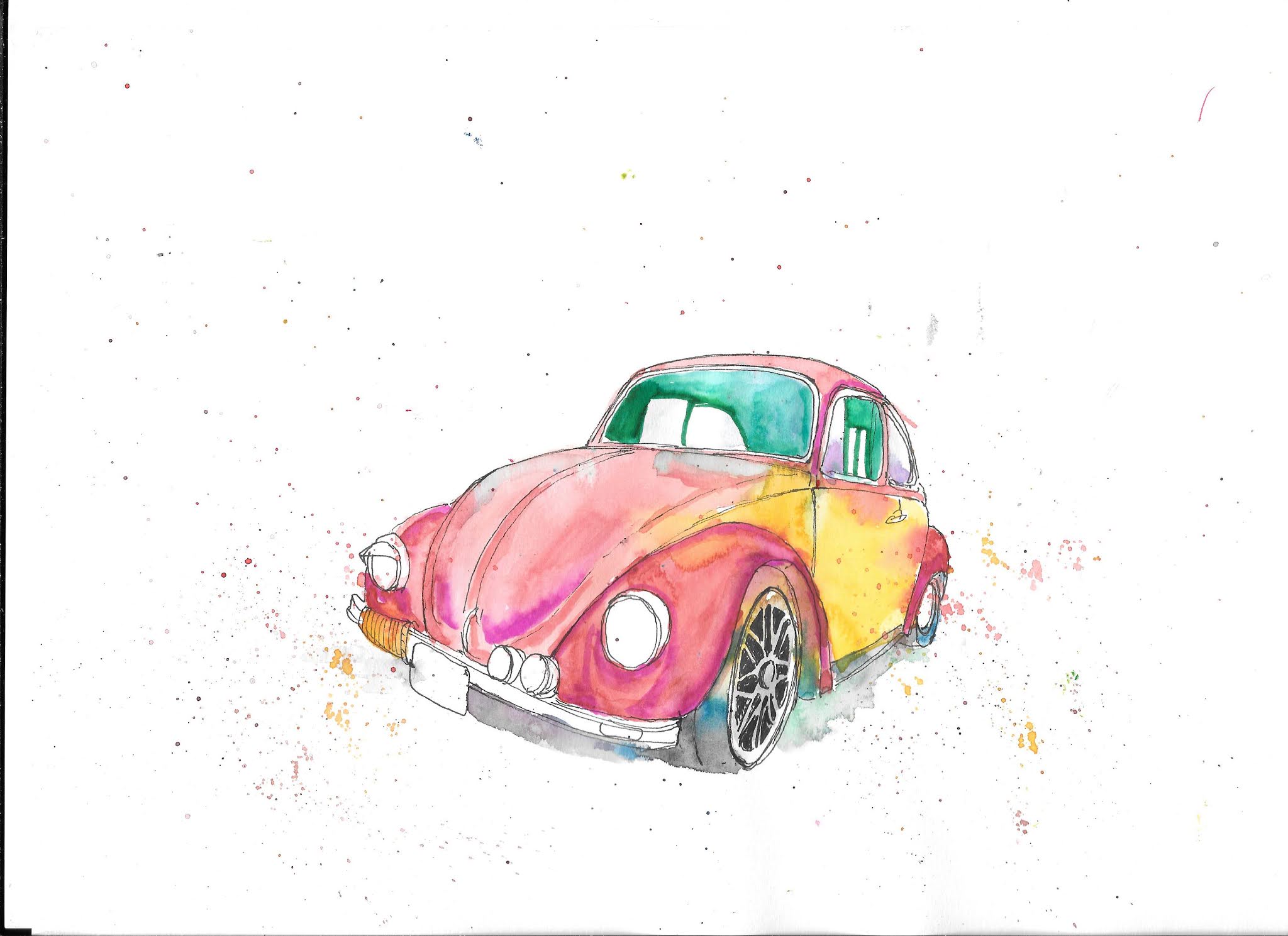
Drawing the Beetle - tutorial

 Anyone can draw a relatively straight line. Anyone can draw a curved line. Well, when you boil it down to basics, that’s all any drawing really is, lines on a page. So it really comes down to assembling the right lines in the right places.

So we’re going to draw a lovely old VW Beetle. Sometimes you’re going to make straight lines. Some times you’re going to make curved lines. You can do that. You can draw with your hand. What I want to help you do is to draw with your eye.

Your eye is just as important as your hand. Your eye has to tell you where your line is going to start, and where it’s going to end. It will tell you how steep or shallow your curve is going to be. It will tell you how high up a particular line ends. You might even find that it helps you to make a dot on the page where a particular line will end, and then ‘draw’ the line in your mind’s eye before you draw it on the page.

If you’re tentative about drawing, or just starting out, or are worried that you don’t have the ‘talent’, well, have a go at the stages I’m going to show you. Don’t think about the finished picture, just the next stage. One stage at a time.


1) We’re going to draw the car facing to the left. I started by drawing the headlight, because it’s about halfway along the length of the page, and about a 3rd of the way up. It gives me a reference point around which I can draw the rest. It’s an oval, thinner than a full circle, with a fatter semi circle joining it on the right. Try it, and don't worry about what comes next. 

2) You make one curving line for the top edge of the fender. Think of it like this - we’re going to draw the face of the car before we do the full outline. I’d usually start with pencil, and then go over it with ink, but ink shows better for demonstrations so I've gone straight in with the pen. Don’t get too worked up about proportions. If you’re working in pencil you can always make adjustments. Just make that nice very gentle curve upwards. If you like, make a small dot where the line is going to end, join it up in your minds eye, then draw it when you’re happy.


3) Now add the slightly more complicated curve underneath, joining it back up to the top curve. Look at where it starts on the left, underneath the headlight. Do it in stages, curve it upwards to just above the level of the headlight. Now curve it round, and then steeply down. If you look carefully, you’ll see we’re not quite going as far down as the start of the line. Now, from the bottom of that line, go upwards and slightly to the right, and then curve right round to join with the top of the fender that you drew last time.  Now you’ve pretty much completed that first fender. Again, don’t get hung up about whether you have the proportions right . Repeat after me – we are not trying to make a photograph!


4) So we start to work our way to the right along the front of the car. Make these two little lights – just like you made the headlight. Not circles - ovals, with small semi circles on their right sides. The nearest one should just touch the bottom of the first mudguard line you drew. The one alongside it should be slightly smaller, and slightly higher.


5) So now we start to add the bumper. You might find it easiest if you make a little dot level with the centre of the headlight, not quite halfway between the centre of the headlight, and the left hand edge of the page. This isn’t quite the edge of the bumper, but it is where the rope wrapped around part of it ends. Draw a relatively straight line down to the bottom of the two small lights you just drew. Draw another line slightly underneath the bumper from about halfway along almost to the small lights. This is the top of the number (license) plate. Draw a ring around the bumper, just to the left of the number plate, then link it up with the end of the bumper. Draw in the other lines to complete the plate. Now go back to the top line of the bumper, and curve it very gently upwards to meet the bottom line of the fender. Finally, at the bottom of the fender, where it just starts to curve upwards. Make that very small line curving down, which will be the edge of the bumper.


6) This stage is the longest yet, but when you’ve done it, your car will already be looking like a Beetle. At the end of the bumper, on the left hand side, just extend it curving upwards slightly. Draw in the bottom of the bumper, and then make the lines to make it look as if there are coils of rope around the left hand side, next to the number plate. Look at the nearest fender. Draw a straight, upwards line, from just left of where it extends downwards, to slightly about the height of the curve of the top of the fender. Then draw a slightly curving line from the top of the curve of the fender to this line. This creates the edge of the bonnet (hood).

Now make a small dot, above the one of the two small lights above the bumper, that is on the left. It should be slightly higher than the top of the edge of the fender on the right. Starting from just above the top left-hand edge of the number plate, curve a line slightly to the left, then to the right to join up with the dot you’ve made. This is the other edge of the bonnet. Now, to the left of the top edge of the bonnet, a little way above the bumper, you’re going to make the other headlight. It should be a smaller oval than the other headlight. Don’t forget the slightly wider semi-circle on the right-hand side. Then about a third of the way down the oval, draw in the ‘eyelid’, like a wide, short triangle.

From the top of the light, draw in a curve slightly upwards and to the right to meet the edge of the bonnet. They should meet at about the same height where the nearest fender starts curving downwards. Finally, draw a short, slightly curving line, from about halfway down the left hand edge of the far headlight, to meet the bumper.


7) There’s not so much to do in this stage, but it’s important. Firstly, draw a line to link the top and bottom edges of the hood. It should make a very slight convex curve. Look at the downwards angle it makes. This should be less steep than the downwards angle of the bumper you’ve drawn. If you need to lessen this angle, redraw the line going from slightly further down on the top of the hood.

Now we’re going to start to draw in the nearest of the wheels. This is a much taller and thinner oval than the headlights. It should be furthest away from the right hand edge of the fender, and curve closest to the fender on the left, where the fender starts to curve down to the bumper. I’ve deliberately ‘bent’ my oval, but you don’t have to do this. A regular one will work just as well. Finally start from the right of the oval you’ve drawn, and use a more gentle curve to join it with the top of the fender. You can also draw another short curve down from the front of the fender to make the edge of the tyre.


8) We’ve almost completed the face of the car now. Draw in those two lines in the bonnet. They should be curves, which start about a quarter of the length of the top of the bonnet in from the right hand side. They can largely reproduce the curve of the top edge, converging almost in the middle of the bonnet where it reaches the bumper. You can also draw in the two curves inside the edges of the bonnet.

Now we draw the windscreen (windshield). The lines on the sides of the screen both slant towards the right. However the one on the right should have the more pronounced slant. This helps give the car more dramatic perspective. Both should reach a similar height. Join them with a very gentle convex curved line, but the curve should be more pronounced where it joins the line on the right.

9) Now we’ve completed the face of the car, we can start on the body. I’m deliberately exaggerating the perspective of my beetle, so I’m consciously drawing the body of the car rather shorter than it is in real life. Make a dot on a level just above the centre of the wheel you’ve drawn, and about twice the distance across the wheel. Then draw a curving line from the dot to the bottom of the fender. Then make another dot, a little to the right of the end of the line you’ve just drawn, and on a level with the top of the fender. Draw one straight line from the dot to the top of the line that comes straight up from the fender, which meets the line of the hood. Now join the two dots you made. Drawing downwards, go slightly to the right , and then leftwards to join with the line on the bottom.

Also, to finish the windscreen, can you draw another line just inside the outline all the way round. This will make the rubber seal.

10) Now we’re going to make the side windows. Make a line slightly to the right of the edge of the windscreen. It should curve away from the windscreen as you get close to the top and should not quite go so far up. At this stage it might help if you draw in the little handle shape inside the body panel you drew last time. The handle should be about 2 thirds along the length. Now you can draw the bottom edge of the window you’ve started. Don’t go quite as far as the handle, then draw an upwards line, not quite to the level where you started curving it away from the windscreen. Then draw a line connecting the left and right top edges of the window. Now. Extend this line, curving quite sharply downwards to connect with the top right hand edge of the body panel. Now, just very lightly draw a line just inside the outlines of the windows, just as you did with the windscreen.


11) Basically there’s the roof and the back wheel left. I did the back wheel first. Now, I began by making a line from the bottom of the body panel. It curves around, away from the panel to about halfway up the panel, then back down and round. Then I drew a curve from where this ender curves back round, and this curve goes up to where the body panel curves back round from right to left. For the back wheel, I drew a very thin oval, from about the same level as the bottom of the body panel, up to join the fender before it’s complete. Then a wider oval outside this first one, which extends a little further away from the inner oval at the bottom. This outer oval should be peeping out below the level of the body panel. Finally, from the bottom of this outer oval, draw a line curving gently upwards until it meets the body panel.


12) Last section of the drawing stage is the roof line. So, draw a line which very gently curves upwards from the left hand side of the windscreen. This upwards curve should start curving more steeply downwards from above the right hand edge of the windscreen, joining the top line of the side windows where they start to curve steeply downwards.

And that’s it, that’s the drawing stage of your beetle done. Now, how you colour it, what media you use, what colour scheme you use is up to you. I’m going to use a two tone colour scheme. Strictly speaking it should be read with white panels. However, I’m substituting yellow, as I can get better paint effects that way.

The materials I use are watercolour paints, and water soluble brush pens.

13) I started with the font tyre and the wheel arch below the fender. This is just watercolour. I tend to throw the kitchen sink at the front tyre in terms of colour, because when they’re wet, the colours can give some nice effects when they mingle, and it doesn’t have to affect the colour scheme of the car’s body. Also, I’ve learned not to worry about staying between the lines. Taking a looser approach can add energy to your picture and stop it from laying flat and two dimensional on the page. Also you might want to allow some of your colours to mingle underneath the bumper and the body of the car between the wheels. When I did this I noticed that I hadn’t drawn in the line marking the end of the body panels, and making a very small running board between the fenders, so I drew this in. In this stage the colours I used were

Red – this will be the main colour of the body work, and I let this seep from the fender, through the wheel arch onto the tyre.

Yellow – on the tyre

Blue, on the tyre

Black, very watery, on the tyre, underneath the bumper, and between the wheels. An even more watery grey is on the front wheel as well.

Blue – on the tyre, under the bumper

Purple – just a hint beside the bottom of the number plate

Viridian green – very lightly between the wheels.

14) Before I began the bodywork, I spattered the colours I’d already used. All this meant was that in turn I charged the brush with each of the colours I’d used. I tapped it down onto another brush above the paper to create the spatter. With this kind of picture I always want to try to bring energy to it, and to make it pop off the page. This helps. I applied a quite watery red quickly to the bodywork, and then the yellow to the panels. This created the blush where the red has seeped into the yellow. Some blush is quite intentional, but it’s difficult to judge just how much you’ll get. Go with the flow, and don’t worry about it, is my advice.

While it was still wet I just introduced a little blue beneath the windscreen as well. I allowed the paint to dry quite a bit before I applied the red again to create some of the detail on the bonnet and fenders, and used the yellow for the rope on the end of the fender. Finally, although the scanner hasn’t picked it out very well, I used a light blue wash in the windows.

That was as much as I wanted to do with the watercolour paint. Don’t worry if you think it looks a bit of a mess at the end of this watercolour stage. I always think that my pictures look a mess at this stage.


15) Here’s where I’d started applying brush pens, and also using my black ink drawing pens as well. I could have used a black brush pen and a waterbrush to get a grey interior, However I went with the green, partly because a couple of my reference photos show the interiors with a dull, greeny tinge, and partly because the green really contrasts with the dominant red of the bodywork. I used the green brush pen around the windows, interior windows, then a waterbrush to spread and weaken the colour for the rest of the interior, and then did the same with the side window. I then took a pinky red brush pen to add highlights and details to fender and hood. Finally, if you look at the front wheel you can really see the difference it makes when you add details in ink on top of the paint.


16) I was on the home stretch by this stage. I used a thick black ink pen (0.8mm) to darken the rubber seals around windscreen and windows. I then used a black brush pen, and a watery brush darkening areas. It’s most obvious in the interior through the windscreen. However I also used it in the front wheel arch, and between the front tyre and the bumper. The edge of the bonnet I first applied brown bush pen before a touch of black on top.


17) And this is it. More work with the ink pen to outline details, for example on the headlights, the bonnet and the bumper. I added some darkening to areas between Also I did a little work with a red brush pen in areas on the bonnet and the fenders just to strengthen the colour in places.

That’s it. I’ve never actually driven a Beetle, but it’s always struck me as fun. So I wanted to try to get some of that across in my painting. And that’s what I think I’ve done by a mixture of playing with and slightly distorting the perspective, by using spatter, and by being looser with the colours, allowing them to mingle in the watercolour stage, and strengthening them with the brush pens. Also a touch of orange on the side lights and on the panels on the bumper. That's it.

I hope that you have as much fun with yours. If you have a go, I'd love it if you put a message in the comment section to let us know how you got on. If you could post a picture, that would be brilliant.