Sunday, 24 July 2022

Craft Fairs: Take two

It was only three years ago that I did my first Craft Fair, although this was before Covid, so it seems like a lifetime ago. The craft fair was at the school where I teach. I used my ink sketches to make some prints, some postcards and some calendars, large and small. Considering I was winging it I made a very nice bit of profit after all the costs were taken into consideration. This was just consolidated when the local church held a craft fair a week later, and since I could sell leftover stock, once I’d paid for the stall it was practically all profit, even though I didn’t sell as much.

Then covid happened.

I was offered he chance to take a stall in a craft fair in the same church in June. Bearing in mind the small number of sales I made the previous time I decided to pass. Last Tuesday, though, the school held another Craft Fair. It’s the wrong time of year to try flogging calendars, I reasoned, but I have a huge number of original watercolours to sell, and ran off some more prints and postcards.

I have to be honest, it wasn’t great. There were very few people there, I’m afraid. For most of the evening it looked as if I wasn’t going to cover my costs. Then I sold an original sketch, and a print, which covered the costs, and a colour print, an embroidered bag and a couple of postcards which made a small profit. The profit became a bit larger when a colleague asked me if I’d sold one of the acrylic paintings I had with me on the night, and bought it off me the next day.

Still, one of the things you can find when you do a craft fair is that you can pick up some useful contacts. I was approached by a lady who is running a Craft Fair in Neath next Saturday. The only thing is. . ., well most of the prints and sketches I’ve sold in craft fairs have been of local locations in Port Talbot. I haven’t made many sketches of Neath locations at all. So I held back a little and set myself the target of making four or five sketches of Neath locations in the weekend. If I could do it then happy days and I’d book a stall. If I couldn’t, then I’d save myself £20.

Well, I did book the stall, so obviously I made the sketches. Here they are – sorry that I’ve put the word sample on them. 


A fortnight ago I have a very unpleasant exchange when I posted a painting of an Ealing trolleybus on an Ealing group. One of the people who commented said that he’d bought a frame for it. Which left me a bit puzzled. Was this an offer to buy? A request for a print? I asked him for clarification, and reminded him that the image is copyright, and I had made it clear when I posted it that I do not give permission for anyone to print the image off.

Ho boy.

Can open. Worms all over the floor.

Facebook groups are quite clear. You’re not to post to advertise your work. Fair enough. I don’t even respond publicly when someone posts requesting a print, or to buy the original. I may well respond with a private message, but that’s as far as I would go. But simply reminding people that the copyright on my painting is mine brought a storm of abuse from this numpty. So there you go.

Now, I will have to print off some prints and postcards, so I am gambling that I will at least cover my costs. Nothing ventured nothing gained, though. I’ll let you know how we go.

Saturday, 16 July 2022

Trying out the new paintbox: Type B London Bus

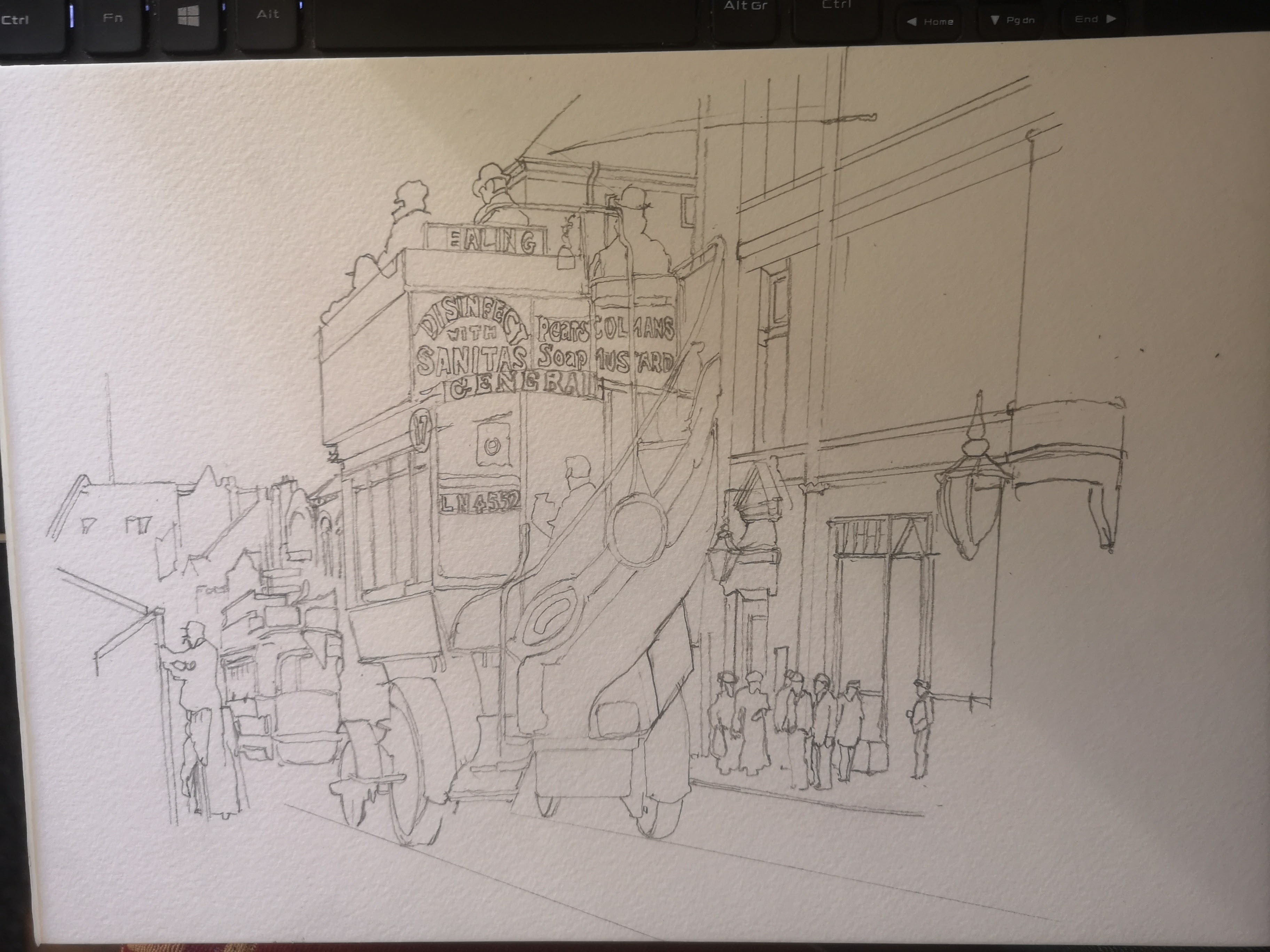
Another week, another bus. Except this wasn’t just any ordinary week. 6 years ago now I bought a Winsor and Newton watercolour set. I found it on special offer, and couldn’t believe my luck. Well, that was 6 years ago, since when I’ve completed the 30x30 watercolour challenge four times by my reckoning and that’s not counting all of the other watercolour paintings I’ve made with it. The thing is though all of my favourite colours, and all of the colours I use most in it are pretty much gone. So I did some research, and I’m giving a different make a try. This painting I’m going to show you my process photos of is the first I’ve made with it. I did make an ink sketch of it last year, like the trolleybus picture:- here's the ink sketch: - 


So, here is the first of the process photos that I took. I started yesterday on Friday evening.

So, as with the trolleybus I painted last weekend, I knew I was going to sketch the basic design first. Like that picture, this one is based on a black and white postcard. It was one of a series you could get from Ealing Libraries back in the 1970s. I started with the bus. It’s not, I’m sure, technically the ‘right’ way to do it. But I can’t help it. Primarily I paint for fun, and while I’ve tried doing things the way that books and tutorials say, I just can’t. I always revert to my own ways, wrong though they may be. As it is I got the bus proportions right pretty much first time, although I did make the passenger on the top right smaller while I was painting.

So here you see the whole piece of paper. It’s A4 again, and the bus is slightly right of centre. The next stage was to outline the buildings to the right of the bus. Like last weekend’s painting, this is the London Borough of Ealing, in the East of the borough in Acton High Street. Acton was where my dad grew up, although he was born in Battersea, and he grew up in Acton a few decades after the original photograph was taken.

So the basic outline of the buildings is begun here. I also sketched in the figures since I found them to be useful reference points for the building.

And there we are. This is as much detail as I wanted to do on the original sketch. It’s plenty to give me what I need to get the proportions right when I come to paint it. If anything it’s a little more detailed than I planned, but the back of the bus, and those adverts on it kind of necessitated it.

So it was taped to the board, and since there was plenty of daylight left on Friday evening I felt I could and should make headway before I left it for the night.

First job, as usual, was to paint in the sky. I would have given it a blue sky anyway, but even on a black and white photo I felt you could see that this was taken on a sunny day all those years ago. I also began to paint in the bus. My first thought was that the red was a little too crimson for my liking, but you know my thoughts – don’t pass judgement until the bus is complete with its interior painted in. I made a mistake not painting in the first layer of the roadway, but I rectified this by the next photo.

By the time I took this photo you can see that I had started painting the interior, seen from the rear. You can also see that I’s started painting in the adverts. The dark blue background to the letters was a bit of a no brainer. Apart from the fact that I have seen enamel signs from the time in this colour scheme, the blue makes such a contrast with the red of the bus. If you look to the left of the picture you can also see there’s a tram. In the photo I can’t be certain, but it does look like a London United Tramways tram, and dark blue and white was the colour scheme of these beauties.

The green oval sign on the back of the bus is actually an advert for Heinz, but I juet couldn’t do the lettering, It’s just too small. I had also made a good start on the underside of the bus, the wheels and tyres. I mentioned last week about my inability to focus on one aspect of a painting for very long. Well, you can see where my attention wandered in this photo in the way that I suddenly decided to paint in the passengers’ hats on top.

This is the photo I took when I finished up working on the painting on Friday evening and it gives you a good idea of how the light was going. I was about ready to finish anyway. I’d pretty much finish the bus. I’d painted in the top deck passengers, the red destinations on the boards, the brass rails and the advert on the side of the bus. I’d also made a start on the buildings. Not bad for one evening’s work.

So, a fresh start on Saturday morning. The first job was to apply the first creamy, sandy layer of colour to the main building.

It’s in this photo that I first really started to get an idea of what the finished painting was going to look like. The obvious thing is the dark brickwork on top of the first layer of paint on the building. However there’s also the green ornamental lamppost as well. I have it in my head that these posts might well have been green back in the day. However, even if they weren’t, it kind of looks okay.

Now the window and door frames have been applied and I am starting to be very pleased with the building. I think the dark green ornamental lamp which has just been added looks a treat. Putting in some of the windows helped as well

This photo shows where I used guesswork on the far right of the building, since this extends further than the cut off point for the photograph. I also painted in a little dark area on the roof just above and slightly to the right of the bus.

Can you see what I worked on between the previous photo and this one? It’s over on the far left. I added some shading to the wooden frame that the bloke with the cap is putting up, I also painted in part of a shadowy figure walking away from the camera on the extreme left. A few more details like the chimney on top of the white building on the left pretty much took care of that part of the painting. I also painted in the faces of the figures.

So this is the last process photo and by the time I took this the painting was more or less complete. I decided that the figures would have to be in brown, dark blue, greens and greys and I’m pretty happy with the way they worked out.

Type B Bus in Acton High Street
So this is the finished painting. I’m not sure that it’s as good as the trolleybus, but then it’s a rather more complicated subject for all that. As a first go with the new paint set I’m really rather pleased. I do think that with hindsight, if I was doing another London bus with it I would mix in some orange with the red to take it more towards the pillar box red which I wanted.

Saturday, 9 July 2022

London Trolleybus in Ealing process and finished painting

Good morning dearly beloved. I did do a couple of prompts on Sketching Every Day during the week, which I haven't posted here. But during the week I saw a lovely video on Facebook posted by the London Trolleybus Preservation Society of one of their restored trolleybuses. Now, I'm a tram man, yes, but that doesn't mean I don't like trolleybuses, especially London ones. 

Last year, I think, I made this ink sketch based on a black and white photograph.


I was pretty pleased with it at the time. Come to think of it, I still think it's a nice sketch. Still, the painting itch was strong in me on Saturday, and so in the morning I decided I would use the black and white photo as the basis for a watercolour painting. I originally made this post before I'd finished the painting. Since then I've added the  more process photos and the final finished painting.

Yes, I did draw the design in pencil first. There is a reason. My way of thinking was - look, my direct watercolours greatly improved in June. Will this improvement manifest itself in my watercolours where I have sketched them on the paper first? Now, as you can see when you see the next sketch, this is nothing like as detailed as the pen sketch. It still took ages though.


Okay, ready to start painting by now. As I said, the sketch was a lot less detailed than I used to do even as the basis of a painting. Even the trolleybus, which looks quite detailed compared with the buildings in the centre isn't actually as detailed as I would previously have made it. Ready now to be taped down to the board.
Right, so, Ealing, where this is set, is my home borough, and I want it looking its best. Also I felt that blue sky would contrast better with the red trolleybus. This is not the best blue sky I have ever painted, and could have been an inauspicious start. The tower just left of the centre of the picture is the town hall. You can see the road markings, and if you look really closely you can see that they were meant to be made slightly to the right of where they are. Oops. 


No standing on ceremony today. Straight on with the bus once the sky and the road surface had had their first layer applied. Remember what I've said before - this is where you have to have patience and faith. It may not look much now - it certainly doesn't - but there was plenty of time for it to come good.
At this point I took a break and went for a walk for an hour and a half, during which I saw 6 different species of butterfly, which put me in a great mood. 


Back to the painting then. The trolleybus is already looking better here now I've worked on shading and shadows. In order to have enough precision to be able to make legible writing on the destination board I did use a very thin fineliner.  Although you may notice that my wandering attention span has led me at this stage to leave the unfinished bus for now to paint in one of the cars alongside it, and also the tree in the background. 


I've said before that the time you start to get a feel for what a painted bus, tram or railway carriage will look like when it's finished is when you've painted the interior, or at least what you can see of it through the windows and the windscreen. I think you can see what I mean if you compare this photo with the previous one, and I really wasn't at all unhappy by this stage. 

So this is as far as I got on the Saturday, and I was really starting to get a feeling for what the finished painting would be like. The trolleybus is virtually finished. I haven't quite finished all of the cars in the background, but there's really just detailing left. The biggest job left is the buildings directly to the left of the bus, and the wall beneath the tree on the extreme right. There's orange brown brickwork and window details to apply to the buildings, then the very dark shopfronts below which should provide interest and a contrast to the lightness of the town hall. I stopped for the day after this one. All of the following pictures were taken on the Sunday.

I began work on the shops just to the left of the trolleybus. I'm from Ealing so I had a pretty good idea of what colour I wanted for the brickwork, but I will admit that I did google for some colour photos of the buildings just to be on the safe side. Curiously, the more detail that I paint in next to the bus, the better it looks itself.

Just a little bit of work to suggest the windows on the shops gave me just what I was looking for here. You can also see that I've started to paint in some of the details of the shop fronts. The idea was to go with a brown base, suggesting the wooden frames of doorways and windows, and paynes grey for the darkest areas. I also decided not to edit out the figures in the reference photograph, but so I sketched in very rough outlines  to paint around. If you look on the far left, I've added detail to the rear end of the trolleybus going the other way, and the trees.

Not far off done now. I've completed all the detailing on the buildings, and painted in the shop fronts and the suggestion of figures by the shops. The only large area which isn't quite finished is the wall to the extreme right which you can also see through the windscreen of the trolleybus. 

This is the last process photo that I took before taking the tape off the finished painting. The wall is done, and I've painted in the kerbs and the shadow of the trolleybus on the pavement. It looks pretty much complete at this stage. Can you see the small finishing touches I needed to add before removing the tape?

This is the finished painting. I've added the tramlines rather than leaving them in pencil - they're ink, in case you were wondering. I also used a watercolour pencil to give a very light blue tinge to some of the windscreen frames on the front of the bus, just to pull them back a little.I also added a little yellow around the London Transport roundel on the front of the bus. That's it. I know I shouldn't say it, but I'm really pleased with this painting, because it's pretty much turned out the way I wanted it to. You can't ask a huge amount more than that. 


Sunday, 3 July 2022

The Copy Cat is back in town

 Yes, I'm back making my own copy of the work of much better artists. Today's prompt on Sketching Every Day was Thomas Schaller. He's an American artist whose work I've not encountered before. I believe that he was trained as an architect, and I have to say his work is right up my street - I love it. This is the part of one of his paintings that I wanted to try to copy: - 


and this is my copy

Yes, I know, not approaching the original in terms of quality. But then the fact that  would even put it on the same page as the original, let alone so close to it does show, I think , that I'm fairly pleased. Trying to copy such an accomplished painting is a learning experience, which can only serve to help me improve.

And in case you're wondering, I would NEVER sell one of my copies of someone else's work, even as a copy - inferior copy at that. Absolutely not on, that.

Saturday, 2 July 2022

A Watercolour - Glasgow Tram and process photos

I had a hankering to paint another tram. Not a Mumbles tram this time – number 30 from the challenge hasn’t sold yet, although there is some interest in it. I’ve had a surprising amount of success with Glasgow trams. The only previous painting I’ve made of a Glasgow tram which hasn't sold is ironically one of the best paintings of the lot of them. Maybe this is because it’s a fairly large acrylic painting. Still I have sold a few prints of the picture, so I can’t complain. Here it is:-

I did try to take photos of it throughout the process. I did get caught up in the painting though, and so the stretches between photos being taken are pretty uneven.

So there you are – stage 1 – tape the blank piece of paper to the board to prevent the wet paper from getting all out of shape. This is Daler Rowney cold pressed 300 gsm watercolour paper.

If you saw my posts about the 30th direct watercolour of the 2022 batch you might remember that I painted in part of the skeleton of the tram and the line of the mountains behind so that I could paint in the sky. I did something similar here with the buildings’ rooflines replacing the mountains from the other picture. Perversely I’ve started painting in the right hand side of the paper. I say perversely because when I’m painting in acrylic I try to force myself to work from left to right to avoid smudging wet paint with my right hand accidentally touching the canvas. Watercolour does dry a lot more quickly though. 

You can see here what I mean about painting in the right hand side of the painting. I've started on the cars and the figure on the right here. It wasn’t my intention to go extremely detailed on either, bearing in mind that the focus of the picture is the tram. Like the Mumbles trams I’ve painted Glasgow trams on several occasions, but I often find the a little harder than their Mumbles counterparts. It took a long time to develop the tram in this painting, and it probably didn’t help that it’s smaller in the picture than either of the Mumbles tram pictures. 

The next stage of painting this was to work on developing the tram. As I said, I didn’t find this extremely easy to do, but as often when you paint a tram, it really does start to appear on the paper when you being to paint in the windows. I also wanted to convey the general dirtiness of the tram, because this tram was a workhorse. Don’t get me wrong, I’ve been to Glasgow a couple of times and I think it’s a fabulous place, and very beautiful now. However, like any large and industrial UK city in the forties and fifties it was smoky and it was grimy. Look at photos from the time, and you’ll see for yourself. 

Having painted most of the detail on the right and in the centre of the painting I put down a wash for the road surface and began to build up the block on the left. I also liked that this painting has a bus going in the opposite direction. It’s in the same Glasgow transport livery as the tram, but in many ways this is the enemy. Tram networks were ripped up throughout the UK at the end of the fifties and the start of the sixties to the great benefit of motor buses. Ecologically trams are much better than buses we now know, especially second generation tramways like those in 7 UK cities now. 


It doesn’t necessarily look like it here, but by this time a lot of the hardwork on the left is done. The bus and the two parked vehicles have been painted, as has the line of the kerb which makes it relatively simple to paint in the building. The bus needs a little shading and tone work, but this is minimal.


This is the last of my process photographs, taken immediately after I placed my name in the bottom left had corner. It’s still on the board, but to all intents and purposes it’s done. All in all it took a little more than four hours to paint. It’s a direct watercolour. I painted it straight onto the paper not because I am trying to extend the challenge. But after the last month it just seemed the natural thing to do. So here’s the finished, dry painting. 


It's okay. I don’t think it’s quite as good as the Mumbles trams, but then they are very different subjects from a Glasgow Tram. I do think it’s worth compering with a couple of previous watercolours of Glasgow trams, made with either ink and watercolour, or just watercolour.


I think I can fairly say that I’m becoming bolder with my use of colour.

Friday, 1 July 2022

Thoughts on the 30x30 Direct Watercolour Challenge 2022

I did say a couple of days ago when I completed the 30x30 direct watercolour challenge that I would get my thoughts down about the whole thing.

I think the experience this year has changed my opinion about painting in general and about watercolour in particular. I think I’ve always had a competitive streak. That’s not always a bad thing, but it’s not always a good thing. For example, my competitive streak in quizzing led to me developing myself as a quizzer to the point where I could be runner up in BBC’s Only Connect and Radio 4‘s Brain of Britain, and the winner of BBC’s Mastermind and also the Brain of Mensa. On the other hand it has also made me take my local pub quiz in the rugby club far too seriously, and frankly, act like a prick on occasions.

Now, Ive always said, since taking up Art several years ago, that this is going to be one area of my life where I’m not going to be competitive about it. And to an extent that’s true. Sadly the Afan Nedd Artist’s group has wound up, being essentially another victim of Covid. However when it was happening, I never looked at the other members’ work thinking – mine’s better than yours, mine’s worse than yous, etc. etc. When I look at the work of amazing artists – and yes, we did have a couple in the Afan Nedd group – I’m never jealous, and always feel grateful to know people with such skill and talent.

But I’m kidding myself if I think I’m not at all competitive with Art. Because I’m competitive all right, but competitive with myself. I want to improve. I want to beat the best that I’ve done up to now. When it comes to drawing with ink or pencil. I know I’m competent. I have a certain amount of skill – which is hardly surprising since I’ve been drawing for pretty much as long as I can remember. I know that for the most part, if I set out to draw something then the end result is going to be pretty much what I planned. Yes, sometimes it will be a little better, and sometimes a little worse, but I’ve reached a level that usually makes me happy.

It isn’t like that with painting. I don’t have any great instinctive understanding about colour. I’m not colour-blind in any medical sense, but I’m working in the dark about how to use them effectively. And it’s something I’d really like to get better at. It’s something I feel competitive about. After all, being useless with colour – alright, a bit harsh – struggling with colour is a bit of a drawback for a painter.

So when I do something  like the 30x30 challenge, I’m really looking for evidence to answer the question – am I actually getting any better at this? And with the benefit of a few days away from the paintbox to think about it. I’ve come back to this year’ paintings with a fresh pair of eyes and I think in all honesty I can say that yes, it looks like it.

Trying to understand why, I think it is partly because in most of the pictures I’ve tried to paint a whole page. Compare the horse racing scenes from 2018, and from this year and you’ll see what I mean.

Horse Racing 2018

Horse racing 2022

I also think that I’ve been a lot more confident drawing with a brush. If you compare similar subjects from 2021 and from this year I think it’s noticeable – particularly if you compare this year’s Swansea tram paintings with last year’s.

Mumbles Tram 2021

Mumbles Tram 2022
Ah yes -, I say to myself, - but is there any evidence that I’m getting any better at handling colour? – Well, I actually think there is. Four of my favourites of this year’s paintings – the two Mumbles tram paintings, the racing car at Goodwood, and the old Scottish fisherman, were all based on black and white reference photographs. Yes, I did some research on the original colours for the trams and the car, but even allowing for that I am very happy with the choices of colours and the ways that I’ve used those colours in all  of them. It’s funny considering how much easier I’ve found it to turn colour reference photos into monochrome paintings in previous years.

2022 Old Scottish fisherman - all of the colour choices were mine

I think I ought to keep going with the watercolour. It’s been great fun this year, and I don’t think I should leave it again for another 11 months.