Showing posts with label bus. Show all posts

Sunday, 18 May 2025

Weekend Sketches

Yesterday I just never found the time for another watercolour Treasure Island copy. In the last two or three months I’ve just been working in my Canson A5 mixed media sketching journal. However on Friday I wanted to make a copy of one of William Heath Robinson’s illustrations for the poems of Edgar Allan Poe. The original is such a complex illustration that I decided to use one of the empty pages in my Daler Rowney A4 sketchbook. Here’s my copy.

You know, I enjoyed it so much that I used the book for all of my sketches this weekend. Amongst others was this copy of a Treasure Island illustration by Walter Paget. Paget was a respected and very successful English illustrator in the last years of the 19th century ad the first couple of decades of the 20th. His illustrations to “Treasure Island” provide many striking images of the story and are amongst the most popular.

Finally, then, old Victoria London, a favourite subject of mine to sketch. This one took hours.


Monday, 5 May 2025

Seven Ages of Public Transport on London's Roads

 Last week I posted recent sketches of various forms of public transport on London's roads through the ages. I realised hat I hadn't made a new sketch of a trolleybus. So, here we go, in chronological order of their use rather than when I made them

1) Horse drawn bus


2) Horse drawn tram


Electric Tram


Motor Bus


Trolley Bus

Double Decker 


Now, yes, I know that's only six. Because I haven't yet done what should be the last of he series, a modern London Double Decker. Watch this space.

Sunday, 27 April 2025

Me and London Buses (and Trams

You know, if I’ve got an old, or very old black and white photograph of London to use as reference for a sketch, then I’m happy. If it has a method of public transport in it, then doubly so. What can I say? I’m a simple soul. So while I’ve been chancing my arm at copying some Treasure Island illustrations recently, during the last week or two I’ve also been making some sketches of London transport. Here they are:-

London’s first ever scheduled horse drawn buses were operated by Mr. George Shillibeer in 1829. Shillibeer – shilli name. Regulations over the next 30 years saw more efficient, lighter buses which could carry more passengers. Horse drawn services came under competition from motor buses and electric trams from the end of the Victorian era, and the last horse drawn service was withdrawn in 1911. The bus in the picture was operated by the London General Omnibus Company (LGOC). The company was formed in the eighteen fifties, and was one of the main companies to be amalgamated to form London Transport in the 1930s.

London’s first red motorbuses were operated by the LGOC – General for short. In fact London Transport would use the same colour scheme when they took over. London’s first really successful motor bus was the type B that entered service in 1911. During World War I 900 of these buses were sent out to the Western Front where they were nicknamed ‘Ole Bill’ after a popular newspaper cartoon figure of the time. The last Type B was withdrawn in 1926.

A couple of horse drawn tram lines began running in London in the 1860s, but they didn’t really get going until the 1870s.Electric powered trams weren’t used until the first years of the 20th century. By the outbreak of the First World War London had the largest tram network in Europe. However it was hard for tram companies to find investment for further expansion in the 1920s. Trams were expensive to maintain and competition from larger and more reliable motorised buses saw some companies increasingly switching. By the mid 30s it had been decided to replace London’s remaining tramways with motor buses and with trolleybuses powered by overhead wires. The outbreak of World War 2 meant that the last tram services remained until 1951.

It's probably fair to say that no form of public transport ever contributed so much to London as the Routemaster double decker bus. Its contribution to London’s visual identity alone is immense. The iconic Routemaster first ran in 1954, and even though production ended in 1968 Routemaster services were still running into the new millennium, finally ending in 2005. I haven’t lived in London for 39 years, but I was born there, I grew up there, I went to London University. It will always be my home town. And there are some things which always feel like home to me, and a Routemaster bus is one of them. Thankfully, of the almost 3000 built, over a third of them still exist.


Saturday, 25 March 2023

It grabbed me

Look, you already know that I love painting London buses, trams, trolleybuses and the Tube. I got myself very frustrated with a tech company today – no names no pack drill. But they’re bloody useless. So I decided to try to paint away my anger.

Now, I don’t know if you’re the same as me, but every now and then I will see something – could be in real life, could be a photograph – and I’ll have an idea that it would make a nice painting. Almost as if it has grabbed hold of me and said PAINT ME! Granted, very often my efforts to produce that painting end up being nothing like as good as the painting I see in my imagination, but that’s my fault because my imagination is much better at painting than the rest of me is. Well, I saw the photograph upon which this painting is based and thought – hello, this is something I want to try. So here’s the painting.

I really rather like this. As a rule, I don’t do subtle and delicate very well, but this, to me is a step in the right direction. I took more than a few liberties with the sky, but what the hell?  It’s the second time that I’ve painted a 607 trolleybus. Here’s the first. 


This one was painted last summer, and I have to say it’s one of my favourites of my watercolours. You see what I mean that it’s not subtle or delicate, though.

Tuesday, 26 July 2022

Completing my Ealing bus trilogy

Yesterday was the first day of the long summer holidays from school. I don’t have many more of these holidays left if all goes to plan. I always think that it’s a good idea to give yourself a little project to do something constructive on the first day. So I decided to complete a trilogy of watercolour paintings of Ealing buses, which I’ve just finished this morning. If you check out previous posts you'll see that the first two were a trolley bus near Ealing Broadway, and an old B Type bus on Acton High Street.

I’m always a little tense when I look at the blank page which I’m about to start working on, like this. As with the trolleybus and the Type B Bus, I decided to sketch the design first. It’s another fairly complex scene, in fact maybe the most complicated of the three, bearing in mind the amount of other traffic in the picture.

The routemaster bus is the ‘star’ of the picture and so I went with my instincts to draw the bus first. The reference photo I was using is monochrome, and very nice too, but it does have a huge photographers mark covering the face of the bus. This meant that for a long time the side of the front of the bus on the right on the bottom deck was going to remain very sketchy.

I think you can see what I mean when you look at this photo of the completed bus sketch. It took me over an hour to get this far, and I was itching to start painting. However the background at least needed to be sketched in lightly before I was going to do this.

You can see the shops and the other traffic to the far left now, and I’ve also drawn in the first car on the right, really as a bit of a marker. I judge distances by eye normally, and this car gives me a handy reference point for putting in the traffic, for the buildings behind the bus, for the buildings on the right and for the traffic island. You can see these things more clearly in the next photo.

In this one you can probably see what I mean whenever I say that when you start painting you can be forgiven for thinking that it is going to turn out terribly. I haven’t done much more here than finish sketching in the outlines, then painting in the traditional Ealing blue sky, and the purple grey road surface. Then I couldn’t resist it any longer, and began on the bus. One thing I was happy with was that even though I painted this with my new paint box I did manage to get a shade of red that was right, whereas the type B Bus I painted a fortnight or so ago was too crimson for my liking.

So you can see that the bus skeleton has been painted in now, and on the side of the bus I had started to add some deeper shades. Incidentally – to the right of the bus can you see where I inadvertently got some red on the sky by mistake? In the next photo you can see what I did to try to sort that out.

So with a small, wet brush I lifted as much of the red as I could, leaving a pinky blush. I wasn’t finished with it yet, but for now it would do and I wouldn’t need to bother about it until much later. As I did with the trolleybus a few weeks ago, I used ink for the number and for the destination board on the front of the bus. The important thing for me to remember here is that the pens I used for it are water soluble, so a little care would be required. The shadows at the top of the window frames on the side of the bus are paint, though.

Now, what do we usually say? With a bus or tram, don’t judge how well you’ve done until you’ve painted the interior through the windows. Suddenly, it’s a routemaster bus! Well, not actually suddenly. I paused for lunch between this and the previous painting, and during this I googled several photos which showed me what the missing section of the front of the bus should look like. Then I sketched it in, painted it and was happy with the results. You may also notice that I’ve started on the vehicles to the left of the bus. Working with monochrome photos the colours are a matter of guesswork, but I did fancy a very 70s/80s bronze for the car on the immediate left.

A brown roof for the car, and dark brown lettering on the van pretty much finished them off, with shadows under the car, and the kerb. I also painted the vertical blue posts of the rails. It’s not immediately obvious either, but I painted a creamy yellow on the main body of the building on the left. My experience with the Acton painting is that this makes a really good base for putting dark brickwork on top of.

With the brickwork, the window panes, and the shop details painted in the left hand side of the painting was pretty much complete. The passenger on the top left you can see through the window still needed painting in, but the blue rails on the left are there, although they’re so faint you do have to look quite closely. By now, you can see that the bus is tied into the painting, and is part of it, rather than just being this huge red object floating in space.

This is the last photo I took before calling it a day yesterday. I painted in most of the cars to the immediate right of the bus, and was pretty pleased with the way that they turned out. I used a minimum of strokes with the brush. Since the cars are this far in the background, what I was trying to do was just make suggestions, enough to trick the eye into filling the rest. You might also notice another routemaster bus just peeping out from behind the shop on the left. Speaking of that shop, I solved the problem of putting the front of it in light shadow by using a very faint blue. As for the fitted furniture sign, again I used an ink pen – this time a green one. I painted in the curving pavement on the bottom right, and the yellow line on the road. Finally I very lightly painted in the windows of the tower block above and slightly to the right of the traffic.

I will come clean that I did do a little research last night. I was fairly sure that the buildings immediately behind the bus and above the traffic were what I remember as Abernethies and Daniels. But I found some colour photos of both just to make sure that I was remembering the colours correctly – darker brown brickwork for Abernethies, more yellowy brickwork for Daniels. Once I’d completed these buildings I think it was the first time I could get a really clear idea of what the finished painting would look like.

Not a lot remained to do. Detailed work on the shopfronts, and on the figure on the traffic island, and some street furniture on the right. Nor, remember I said I would come back later to the pink splodge? Well, first I darkened some of the windows on the tower block and gave it a little more definition to make it more recognisable. Then I used a little grey quite judiciously to plump the splodge out into a cloud. All that really remained was to sign and date it.

Here it is, the finished painting. I think it’s a nice painting, on a par with the trolleybus, which is pleasing. What I really like though, is that this is how I remember West Ealing. I wasn’t around when type B buses were trundling up and down Acton High Street and I wasn’t around when trolleybuses were gliding towards Ealing Broadway. However I very much was around when scenes like this were happening, and I look at this, and it seems right. Job done.

Saturday, 16 July 2022

Trying out the new paintbox: Type B London Bus

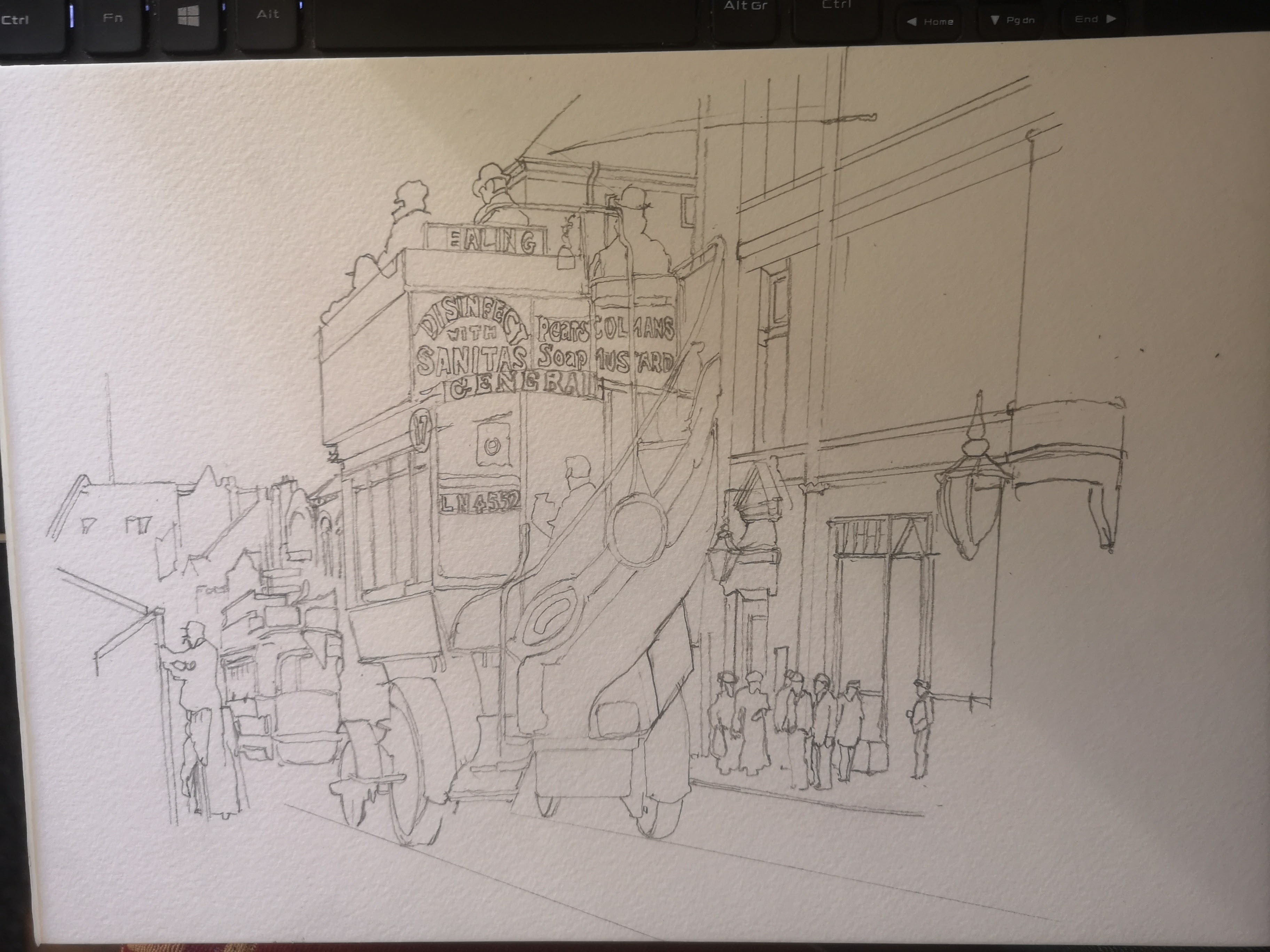
Another week, another bus. Except this wasn’t just any ordinary week. 6 years ago now I bought a Winsor and Newton watercolour set. I found it on special offer, and couldn’t believe my luck. Well, that was 6 years ago, since when I’ve completed the 30x30 watercolour challenge four times by my reckoning and that’s not counting all of the other watercolour paintings I’ve made with it. The thing is though all of my favourite colours, and all of the colours I use most in it are pretty much gone. So I did some research, and I’m giving a different make a try. This painting I’m going to show you my process photos of is the first I’ve made with it. I did make an ink sketch of it last year, like the trolleybus picture:- here's the ink sketch: - 


So, here is the first of the process photos that I took. I started yesterday on Friday evening.

So, as with the trolleybus I painted last weekend, I knew I was going to sketch the basic design first. Like that picture, this one is based on a black and white postcard. It was one of a series you could get from Ealing Libraries back in the 1970s. I started with the bus. It’s not, I’m sure, technically the ‘right’ way to do it. But I can’t help it. Primarily I paint for fun, and while I’ve tried doing things the way that books and tutorials say, I just can’t. I always revert to my own ways, wrong though they may be. As it is I got the bus proportions right pretty much first time, although I did make the passenger on the top right smaller while I was painting.

So here you see the whole piece of paper. It’s A4 again, and the bus is slightly right of centre. The next stage was to outline the buildings to the right of the bus. Like last weekend’s painting, this is the London Borough of Ealing, in the East of the borough in Acton High Street. Acton was where my dad grew up, although he was born in Battersea, and he grew up in Acton a few decades after the original photograph was taken.

So the basic outline of the buildings is begun here. I also sketched in the figures since I found them to be useful reference points for the building.

And there we are. This is as much detail as I wanted to do on the original sketch. It’s plenty to give me what I need to get the proportions right when I come to paint it. If anything it’s a little more detailed than I planned, but the back of the bus, and those adverts on it kind of necessitated it.

So it was taped to the board, and since there was plenty of daylight left on Friday evening I felt I could and should make headway before I left it for the night.

First job, as usual, was to paint in the sky. I would have given it a blue sky anyway, but even on a black and white photo I felt you could see that this was taken on a sunny day all those years ago. I also began to paint in the bus. My first thought was that the red was a little too crimson for my liking, but you know my thoughts – don’t pass judgement until the bus is complete with its interior painted in. I made a mistake not painting in the first layer of the roadway, but I rectified this by the next photo.

By the time I took this photo you can see that I had started painting the interior, seen from the rear. You can also see that I’s started painting in the adverts. The dark blue background to the letters was a bit of a no brainer. Apart from the fact that I have seen enamel signs from the time in this colour scheme, the blue makes such a contrast with the red of the bus. If you look to the left of the picture you can also see there’s a tram. In the photo I can’t be certain, but it does look like a London United Tramways tram, and dark blue and white was the colour scheme of these beauties.

The green oval sign on the back of the bus is actually an advert for Heinz, but I juet couldn’t do the lettering, It’s just too small. I had also made a good start on the underside of the bus, the wheels and tyres. I mentioned last week about my inability to focus on one aspect of a painting for very long. Well, you can see where my attention wandered in this photo in the way that I suddenly decided to paint in the passengers’ hats on top.

This is the photo I took when I finished up working on the painting on Friday evening and it gives you a good idea of how the light was going. I was about ready to finish anyway. I’d pretty much finish the bus. I’d painted in the top deck passengers, the red destinations on the boards, the brass rails and the advert on the side of the bus. I’d also made a start on the buildings. Not bad for one evening’s work.

So, a fresh start on Saturday morning. The first job was to apply the first creamy, sandy layer of colour to the main building.

It’s in this photo that I first really started to get an idea of what the finished painting was going to look like. The obvious thing is the dark brickwork on top of the first layer of paint on the building. However there’s also the green ornamental lamppost as well. I have it in my head that these posts might well have been green back in the day. However, even if they weren’t, it kind of looks okay.

Now the window and door frames have been applied and I am starting to be very pleased with the building. I think the dark green ornamental lamp which has just been added looks a treat. Putting in some of the windows helped as well

This photo shows where I used guesswork on the far right of the building, since this extends further than the cut off point for the photograph. I also painted in a little dark area on the roof just above and slightly to the right of the bus.

Can you see what I worked on between the previous photo and this one? It’s over on the far left. I added some shading to the wooden frame that the bloke with the cap is putting up, I also painted in part of a shadowy figure walking away from the camera on the extreme left. A few more details like the chimney on top of the white building on the left pretty much took care of that part of the painting. I also painted in the faces of the figures.

So this is the last process photo and by the time I took this the painting was more or less complete. I decided that the figures would have to be in brown, dark blue, greens and greys and I’m pretty happy with the way they worked out.

Type B Bus in Acton High Street
So this is the finished painting. I’m not sure that it’s as good as the trolleybus, but then it’s a rather more complicated subject for all that. As a first go with the new paint set I’m really rather pleased. I do think that with hindsight, if I was doing another London bus with it I would mix in some orange with the red to take it more towards the pillar box red which I wanted.

Sunday, 15 August 2021

More Underground Stations

 I've been pushing on with my London Underground Stations Project. In the last two days I've added another 4 pictures - which isn't bad going for the week when you consider that I spent 3 days of it in London. Here's the pictures:-

Top - Rayners Lane
Bottom - Hounslow West c. 1955

Top - Hounslow East
Bottom - Southgate c. 1940
I like each of these stations - 3 of them were designed by the great Charles Holden. No prizes for guessing that Hounslow East wasn't - that's a child of the 21st century designed by Acanthus Lawrence and Wrightson Architects. My current favourite among these three is the Hounslow West picture - I think that the two buses really make the picture. 

Rayners Lane -I am very sorry, but I still can never see the name Rayners Lane written down without feeling a little bit of residual irritation. Rayners Lane – Grrr. It sounds right. It goes back to the days of waiting footsore on Piccadilly line platforms, watching the next train boards flash up train after train to Rayners Lane of Uxbridge, with narry a one for Hounslow for ages. Despite my residual ill feeling towards it, this is a striking building. It’s a typically Holden arrangement, with the rectangular booking hall dominating the wide, low entrance. The distinctive things here are the semi-circular ends of the street level entrance. A little judicious googling shows that Holden collaborated with New Zealand born architect Reginald Uren, who could boast the John Lewis store in Oxford Street on his design CV. Uren also collaborated with Holden on an unbuilt design for Finchley Central.

Hounslow West, the end of this arm of the Piccadilly Line until 1975. To look at it you’d immediately say it was the work of Charles Holden, who is one of my architectural heroes.

 Charles Holden was a distinguished architect, who  designed cemeteries for the war dead of the First World War. He first came to know Frank Pick, general manager of the Underground Electric Railways Company of London, through the Design and Industries Association. Although he’d never been involved with railway architecture prior to this, in 1923 Pick commissioned Holden to produce a new entrance for Westminster Station, and thus began an association which would last, on and off, for more than 20 years. As well as a large number of stations for the Northern and Piccadilly Line extensions, Pick engaged Holden to design the headquarters of the UERL at 55 Broadway, above St. James’ Park Station. This building resembles nothing quite so much as a modern ziggurat, a huge stepped pyramid.

 Holden did assist in the design of Hounslow West. In its glazed panels, and liberal use of Portland stone rather than brick it clearly shows the influences of Holden’s slightly earlier designs for what became the southern end of the Northern Line. However, the main architect was Stanley Heaps. Heaps had been assistant to Leslie Green in the 1900s, and his earliest designs very much followed the corporate style developed by Green, in stations like Kilburn Park. We’ll come to Green’s stations in the fullness of time. By the 1930s, though, Frank Pick wanted a more modernist approach, and brought in Holden, relegating Heap to less important stations, and less important buildings, although he worked with Holden on a number of occasions, Hounslow West being one. It’s a striking concrete structure, clearly of the same era as the slightly earlier Empire Stadium at Wembley. The heptagonal ticket hall forms a memorable structure and is reminiscent of the similar structure at Ealing Common station, for example. Holden’s stations are as often described as ‘modernist’ or art deco, and this can be briefly defined as a rejection of ornamentation for ornamentation’s sake, and an adoption of clean, geometrical shapes, of which the heptagonal ticket hall is a pretty good example.

Hounslow East is the cheese to the previous station’s chalk. Opened in the noughties, this is a striking demonstration of what can really be done with steel, chrome and glass. It’s far removed from the design of Hounslow West. When I was growing up in the late 60s and the 70s, artists impressions of cities of the future were full of buildings which looked like this. During my research for this first section of the challenge, I tried to find photographs of what Hounslow East looked like prior to the rebuilding. I can see the back of the old building from the platform on which I alight, and it looks perfectly inoffensive. This is all the more surprising when I google the building on my phone and find a very interesting Hansard debate from 1961, in which the station was described as – and I apologise for the language used here – “an abortion of a station”. As I mentioned earlier, I am not a great fan of modern architecture. This is gorgeous, though.

When it comes to Southgate station, I would imagine that my first reaction to the station when I walked out of it was pretty similar to most people’s, that is that it looks as if a flying saucer from a 1950s B movie has landed in suburban North London. I absolutely love this station. I can only imagine what the reaction of people was when it first opened in 1933. It must have been like walking onto the set of Metropolis, or the Flash Gordon movie serials. I make the connection to movies of the time deliberately, since I’m convinced that movies in part influenced Holden in his design. The story goes that the structure on the roof was inspired by the tesla coils which help bring the monster to life in the 1931 movie “Frankenstein”. This station is about as far as you can get from Holden’s own appraisal of his stations as ‘brick boxes with concrete lids’. 


Friday, 5 March 2021

Horse Drawn Bus Sketch


 I acquired a London Horse drawn bus model for my Matchbox London Bus collection, and so in celebration I made this ink sketch. I know it's vulgar to talk money, but then I'm a vulgar person, so I don't mind saying it's been a really good week for business with my Etsy shop - starting with a bumper order of Port Talbot prints, and then selling the first prints from my new Ealing range , and receiving a sketch commission. 

This bus has the destinations Waterloo and Somerset House on it. Well, surely that can't have been the whole route - after all, you can walk from one to the other in a few minutes. My great great grandfather wasn't a horse drawn bus driver, but he was a horse drawn dustcart driver, and I sometimes think back to what it must have been like, even on the streets of Victorian Hammersmith. Apart from anything else, with everything being horse drawn in those days the amount of manure deposited on the streets every day must have been prodigious. Poor man, I think he died at the age of 29 from penumonia, leaving 4 children behind him. Don't try to tell me about the Good Old Days.