Showing posts with label transport. Show all posts

Saturday, 4 July 2026

I'm No Roy Cross

It’s quite possible that the name Roy Cross doesn’t mean a great deal to you. That’s okay, this is not a test. However if you’re a man who grew up in the UK or several other countries during the 1960s or the 1970s, I bet that you’ve seen some of his artwork. For Roy Cross produced the artwork that graced the packaging of many, many Airfix model kits. He was, in my opinion, a very fine artist, who, in the hope of securing regular work, wrote to Airfix headquarters enclosing samples of his work. Airfix, knowing a good thing when they saw it, commissioned him to produce artwork for the packaging of a model of a German Dornier bomber. Thus began a long and fruitful partnership. Sadly, Roy passed away a little while ago, having just reached the age of 100.

For me, one of the huge advantages that Airfix models had over rivals was the Roy Cross artwork on the boxes. Even now just looking at the artwork brings wee tingle of excitement to me.

Okay. Now, if you cast your mind back to June , you may recall that as one of the 30x30 challenge paintings I made this-

I worked out when I was doing it that I wanted to use this specific livery , the Hoverlloyd livery, because that was the livery in the Roy Cross painting for the Airfix kit of the SRN4. Now, even if I had permission to reproduce the Roy Cross picture here, I wouldn’t. This is not a copy, and believe me, as you would see, I’m no Roy Cross. But it did set me thinking.

Now, I was a pretty dedicated Airfix modeler from the age of about 5 or 6 right through until my O Levels. Oh, don’t get me wrong, I wouldn’t turn my nose up at Frog, Revell or Tamiya, or Matchbox when they produced model kits for a while, but Airfix were my faves. Then life intervened. My son was never interested in modelling or anything craftwise in general and so that way back in was never opened to me. Then, maybe five years ago, I discovered that Airfix – who have passed through different owners more than once since, is still out there. I bought a kit of the Aston Martin DB5 to see if I could rekindle the flame. I just didn’t really enjoy it – maybe because I have other outlets for my creativity now.

Still, thinking about the SRN4 kit. I could afford to buy it now. But I don’t want to. I’m not interested in building it. But. I can’t help wishing that I’d bought it or had it bought for me back in the day. Which led to me thinking about other models that got away. Another one was the Type B London Bus. Which purely coincidentally I also painted during the 30x30 challenge – straight after the SRN4 –

AS it happened I also painted this type of bus as my last painting of the 2018 challenge

Which set me to thinking. Why don’t I make a few more pictures of the subjects of the kits that got away? And today, I made another one.

It’s a rather unusual looking plane called the Short Skyvan. The back of the plane opened up and you could drive a vehicle into it. They also carried passengers. I’ve painted this in the Olympic Airways livery artly because this was the livery of the plane on the painting of the box lid, but also because I did actually see one of these on my first visit to Greece in 1982. I was island hopping and could only afford ferries, so I didn’t get to fly in one, more’s the pity. The 30x30 is over so I sketched it roughly in pencil first:-

I did think about going straight in with paint as I’ve become more and more confident with y draughtsmanship with direct watercolour over the last couple of years, but what the hell? Here’s the finished painting

Now I somehow doubt that this painting would shift that many model kits, but it’s pretty decent. As I said, I’m no Roy Cross.

Sunday, 27 April 2025

Me and London Buses (and Trams

You know, if I’ve got an old, or very old black and white photograph of London to use as reference for a sketch, then I’m happy. If it has a method of public transport in it, then doubly so. What can I say? I’m a simple soul. So while I’ve been chancing my arm at copying some Treasure Island illustrations recently, during the last week or two I’ve also been making some sketches of London transport. Here they are:-

London’s first ever scheduled horse drawn buses were operated by Mr. George Shillibeer in 1829. Shillibeer – shilli name. Regulations over the next 30 years saw more efficient, lighter buses which could carry more passengers. Horse drawn services came under competition from motor buses and electric trams from the end of the Victorian era, and the last horse drawn service was withdrawn in 1911. The bus in the picture was operated by the London General Omnibus Company (LGOC). The company was formed in the eighteen fifties, and was one of the main companies to be amalgamated to form London Transport in the 1930s.

London’s first red motorbuses were operated by the LGOC – General for short. In fact London Transport would use the same colour scheme when they took over. London’s first really successful motor bus was the type B that entered service in 1911. During World War I 900 of these buses were sent out to the Western Front where they were nicknamed ‘Ole Bill’ after a popular newspaper cartoon figure of the time. The last Type B was withdrawn in 1926.

A couple of horse drawn tram lines began running in London in the 1860s, but they didn’t really get going until the 1870s.Electric powered trams weren’t used until the first years of the 20th century. By the outbreak of the First World War London had the largest tram network in Europe. However it was hard for tram companies to find investment for further expansion in the 1920s. Trams were expensive to maintain and competition from larger and more reliable motorised buses saw some companies increasingly switching. By the mid 30s it had been decided to replace London’s remaining tramways with motor buses and with trolleybuses powered by overhead wires. The outbreak of World War 2 meant that the last tram services remained until 1951.

It's probably fair to say that no form of public transport ever contributed so much to London as the Routemaster double decker bus. Its contribution to London’s visual identity alone is immense. The iconic Routemaster first ran in 1954, and even though production ended in 1968 Routemaster services were still running into the new millennium, finally ending in 2005. I haven’t lived in London for 39 years, but I was born there, I grew up there, I went to London University. It will always be my home town. And there are some things which always feel like home to me, and a Routemaster bus is one of them. Thankfully, of the almost 3000 built, over a third of them still exist.


Sunday, 12 May 2024

Comparison

Well, yes, it did strike me that if I make another bus painting, this time in my Winsor and Newton book, then we can make a comparison of sorts. So, contestant number 1 - 


This rather nice A4 ink and watercolour sketch shows a scene from c 1956. It was made in a WH Smith Globetrotter notebook. This is a discontinued line, and the paper in the book is surprisingly thin. I've bee told not to even bother trying to use watercolour on anything lighter than 130gsm. I don't know the weight of the paper in this book, but if it's 130gsm it's certainly no heavier. But I do like the way that the paper has taken these colours, and the buckling is not so bad as to prevent me from framing it and putting it in a local exhibition. 

So, having got this result from using a really light paper, what could I get from a more expensive book? Let's see our second contestant then.


This is the same sketch that I posted this morning, but it's a new photograph of it a few hours later, after the paper has had a chance to dry thoroughly. It's not as easy to compare as it could be bearing in mind that the two pictures use a different rage of colours largely. Still, I really enjoyed taking up so much of the page with the coach itself. The sketchbook here is my A4 portrait Seawhite of Brighton, with 140 gsm paper. This is still very much on the light side for applying watercolour, but once the page had time to dry out properly the amount of buckling reduced significantly. My gut feeling is that the colour is just a little subdued compared with the first sketch - but then on he other hand I don't think that I used the same set of paints. 

Let's have a look at our third and last contestant for this post - 

This was painted with the same set of paints as the previous one. This is in my Winsor and Newton portrait A4 170 gsm sketchbook. The blue works as well as the same blue in the previous sketch, maybe even a little better. The sky is a little anaemic for my liking. but the bus itself is pretty good. I wish I'd done a single seater coach rather than a double decker bus for comparison. . 

But the upshot is that there's no clear winner. I enjoyed making all three pictures and I would use any of these sketchbooks for the next one, whatever that might be. 


Wednesday, 27 July 2022

So the trilogy becomes a tetralogy

I was congratulating myself yesterday on the Routemaster picture, telling myself that the trilogy of bus pictures was complete. Well, yes, that’s not wrong as such. However it did suddenly strike me that if you’re telling the story of transport on the Uxbridge Road in Ealing in pictures. .  . well, where’s the tram?

I have drawn a tram in Hanwell in charcoal before:-


I've even made an ink sketch of a tram in Ealing Broadway too:-

But it’s not a painting, is it? Well, it’s the school holidays. Time was not an issue today.

Step 1 – gather the materials. In this case, little more than the traditional watercolour paper, HB pencil, sharpener and rubber. Actually I did fetch a 12 inch ruler as well, which you’ll see the effect of in a little while. See if you can guess where I started.

Well, actually it was with the horse drawn wagon on the far right. However, as the drawing developed I would need to erase the cart and start it again. Let’s not mess about here. I’m a tram man, and so I wasn’t going to resist drawing the tram – or the front tram I should say – for very long. As it is, the tram is the star of the picture anyway, and a useful reference for the other aspects.

Can you see how I’ve redrawn the horse and cart on the far right? Repositioned it works much better where it is now. By this time I’ve started working on the background, and it’s the building behind that I needed the ruler for. Not being funny, simply drawing this building took ages. The reference photo is from the first decade of the 20th century, but the building is still there, and is now a Wenzel's Bakery, I think.

Once I completed the sketch of the building then it was relatively quick and easy to draw the rest of the background. As a drawing it’s a lot less detailed than it would have been had I decided to make it a monochrome ink sketch. Yet as it is, it still took ages to complete the sketch – maybe two hours, maybe a little bit more. I didn’t have a stopwatch on. It’s funny the way your mind can drift off when you’re drawing. It struck me that I would love to be able to tell people how to draw. . . but I just can’t. I can’t remember not being able to draw, and I’ve always been drawing things I can see. It started with cartoon and comic characters, then I moved into superheroes, then I was copying photographs of steam locomotives , and I suppose this was in a way like a course of self-study. But I never had a ‘lightbulb’ moment when it suddenly all clicked. It’s just something I do, and I’m not sure I could tell you how.


When I’m going to make a watercolour I get really excited by this stage. I’ve just taped the paper down. The paper is 300 gsm, so it’s fairly sturdy, but the tape helps prevent the cockling that can happen even with good quality watercolour paper like this. I’m going to start with the sky – blue of course – and the road surface. As it is the photo was obviously taken on a sunny day, anyway. But what will I do after that?

Well, if you said – the tram of course – it is true that I normally lack the discipline to stop myself going straight for my favourite bit, which is nearly always the vehicle. But just for variety today I went for that building. I had an inkling it was going to be quite complex. I couldn’t stop myself from jumping around a little though. At the same time I also began working on the horse’s cart, the tree and a couple of the figures as well.

I added definition to the figures and continued work on the cart. I tried to darken the front and the right hand side of the building as well. Being a right hander it’s not a good idea to do what I did with this picture and work extensively on the right hand side of the painting first – if you’re a little clumsy like I have been known to be from time to time you can inadvertently smudge paint without even realising it until it’s too late to do really effective remedial work.

In the same way that a bus or another vehicle never really looks right until you’ve started painting in the interior through the windows, it was true for the main building in this picture. With detailing on the windows it started to look a lot better, and with some shading. The lettering on the canopy was done with a green ink pen. Fosters had moved from Ealing Broadway but I remember them having a shop in West Ealing when I was growing up, and I think the lettering was green. If it wasn’t – hey, that’s what the term artistic license was invented for. The right hand side of the painting wasn’t looking bad by this stage.

In comparison with my three previous Ealing pictures the tram occupies a lot less of the page than the buses do. Also it’s a London United tramways tram, and their livery was mainly blue and white rather than red. I saw one in the flesh, if you like, two years ago when I visited the National Tramways museum at Crich in Derbyshire, although sadly I didn’t get to ride it since it wasn’t one of the ones on duty that particular day. To try to get a feeling for what the completed painting might look like I painted in the dark building to the left. This is the Ealing Hippodrome, a music hall/theatre which soon became a cinema, and last until the Fifties, I think. The building was demolished and a rather nondescript W.H.Smiths built in its place. The Smiths did have a shallow circular ramp into the basement record department, which was where the stage machinery had been housed.

Just after I took this photo the message flashed up on my PC, which had my reference photo on it, that the battery was running very low. So I stopped for a break to charge it up.

Once I came back, then, it was a matter of painting in the second tram and detailing the buildings behind it. I was actually quite surprised just how quickly I was able to finish off the majority of the right hand side of the picture. The further away from the foreground you get, the more you can do with just suggestion, I suppose.

So there we are, signed and ready for me to remove the tape. I do rather like this, even though I don’t expect it can speak to Ealing inhabitants of a certain age in the way that the trolleybus and routemaster pictures do.

My great, great grandfather and my great grandfather were the first members of my family to more to Ealing. When I was doing my family history research I found that they moved to Grosvenor Road in about 1907, and so this is what I think that Ealing Broadway would have looked like when they moved here. So here’s the finished painting.


Tuesday, 26 July 2022

Completing my Ealing bus trilogy

Yesterday was the first day of the long summer holidays from school. I don’t have many more of these holidays left if all goes to plan. I always think that it’s a good idea to give yourself a little project to do something constructive on the first day. So I decided to complete a trilogy of watercolour paintings of Ealing buses, which I’ve just finished this morning. If you check out previous posts you'll see that the first two were a trolley bus near Ealing Broadway, and an old B Type bus on Acton High Street.

I’m always a little tense when I look at the blank page which I’m about to start working on, like this. As with the trolleybus and the Type B Bus, I decided to sketch the design first. It’s another fairly complex scene, in fact maybe the most complicated of the three, bearing in mind the amount of other traffic in the picture.

The routemaster bus is the ‘star’ of the picture and so I went with my instincts to draw the bus first. The reference photo I was using is monochrome, and very nice too, but it does have a huge photographers mark covering the face of the bus. This meant that for a long time the side of the front of the bus on the right on the bottom deck was going to remain very sketchy.

I think you can see what I mean when you look at this photo of the completed bus sketch. It took me over an hour to get this far, and I was itching to start painting. However the background at least needed to be sketched in lightly before I was going to do this.

You can see the shops and the other traffic to the far left now, and I’ve also drawn in the first car on the right, really as a bit of a marker. I judge distances by eye normally, and this car gives me a handy reference point for putting in the traffic, for the buildings behind the bus, for the buildings on the right and for the traffic island. You can see these things more clearly in the next photo.

In this one you can probably see what I mean whenever I say that when you start painting you can be forgiven for thinking that it is going to turn out terribly. I haven’t done much more here than finish sketching in the outlines, then painting in the traditional Ealing blue sky, and the purple grey road surface. Then I couldn’t resist it any longer, and began on the bus. One thing I was happy with was that even though I painted this with my new paint box I did manage to get a shade of red that was right, whereas the type B Bus I painted a fortnight or so ago was too crimson for my liking.

So you can see that the bus skeleton has been painted in now, and on the side of the bus I had started to add some deeper shades. Incidentally – to the right of the bus can you see where I inadvertently got some red on the sky by mistake? In the next photo you can see what I did to try to sort that out.

So with a small, wet brush I lifted as much of the red as I could, leaving a pinky blush. I wasn’t finished with it yet, but for now it would do and I wouldn’t need to bother about it until much later. As I did with the trolleybus a few weeks ago, I used ink for the number and for the destination board on the front of the bus. The important thing for me to remember here is that the pens I used for it are water soluble, so a little care would be required. The shadows at the top of the window frames on the side of the bus are paint, though.

Now, what do we usually say? With a bus or tram, don’t judge how well you’ve done until you’ve painted the interior through the windows. Suddenly, it’s a routemaster bus! Well, not actually suddenly. I paused for lunch between this and the previous painting, and during this I googled several photos which showed me what the missing section of the front of the bus should look like. Then I sketched it in, painted it and was happy with the results. You may also notice that I’ve started on the vehicles to the left of the bus. Working with monochrome photos the colours are a matter of guesswork, but I did fancy a very 70s/80s bronze for the car on the immediate left.

A brown roof for the car, and dark brown lettering on the van pretty much finished them off, with shadows under the car, and the kerb. I also painted the vertical blue posts of the rails. It’s not immediately obvious either, but I painted a creamy yellow on the main body of the building on the left. My experience with the Acton painting is that this makes a really good base for putting dark brickwork on top of.

With the brickwork, the window panes, and the shop details painted in the left hand side of the painting was pretty much complete. The passenger on the top left you can see through the window still needed painting in, but the blue rails on the left are there, although they’re so faint you do have to look quite closely. By now, you can see that the bus is tied into the painting, and is part of it, rather than just being this huge red object floating in space.

This is the last photo I took before calling it a day yesterday. I painted in most of the cars to the immediate right of the bus, and was pretty pleased with the way that they turned out. I used a minimum of strokes with the brush. Since the cars are this far in the background, what I was trying to do was just make suggestions, enough to trick the eye into filling the rest. You might also notice another routemaster bus just peeping out from behind the shop on the left. Speaking of that shop, I solved the problem of putting the front of it in light shadow by using a very faint blue. As for the fitted furniture sign, again I used an ink pen – this time a green one. I painted in the curving pavement on the bottom right, and the yellow line on the road. Finally I very lightly painted in the windows of the tower block above and slightly to the right of the traffic.

I will come clean that I did do a little research last night. I was fairly sure that the buildings immediately behind the bus and above the traffic were what I remember as Abernethies and Daniels. But I found some colour photos of both just to make sure that I was remembering the colours correctly – darker brown brickwork for Abernethies, more yellowy brickwork for Daniels. Once I’d completed these buildings I think it was the first time I could get a really clear idea of what the finished painting would look like.

Not a lot remained to do. Detailed work on the shopfronts, and on the figure on the traffic island, and some street furniture on the right. Nor, remember I said I would come back later to the pink splodge? Well, first I darkened some of the windows on the tower block and gave it a little more definition to make it more recognisable. Then I used a little grey quite judiciously to plump the splodge out into a cloud. All that really remained was to sign and date it.

Here it is, the finished painting. I think it’s a nice painting, on a par with the trolleybus, which is pleasing. What I really like though, is that this is how I remember West Ealing. I wasn’t around when type B buses were trundling up and down Acton High Street and I wasn’t around when trolleybuses were gliding towards Ealing Broadway. However I very much was around when scenes like this were happening, and I look at this, and it seems right. Job done.

Saturday, 16 July 2022

Trying out the new paintbox: Type B London Bus

Another week, another bus. Except this wasn’t just any ordinary week. 6 years ago now I bought a Winsor and Newton watercolour set. I found it on special offer, and couldn’t believe my luck. Well, that was 6 years ago, since when I’ve completed the 30x30 watercolour challenge four times by my reckoning and that’s not counting all of the other watercolour paintings I’ve made with it. The thing is though all of my favourite colours, and all of the colours I use most in it are pretty much gone. So I did some research, and I’m giving a different make a try. This painting I’m going to show you my process photos of is the first I’ve made with it. I did make an ink sketch of it last year, like the trolleybus picture:- here's the ink sketch: - 


So, here is the first of the process photos that I took. I started yesterday on Friday evening.

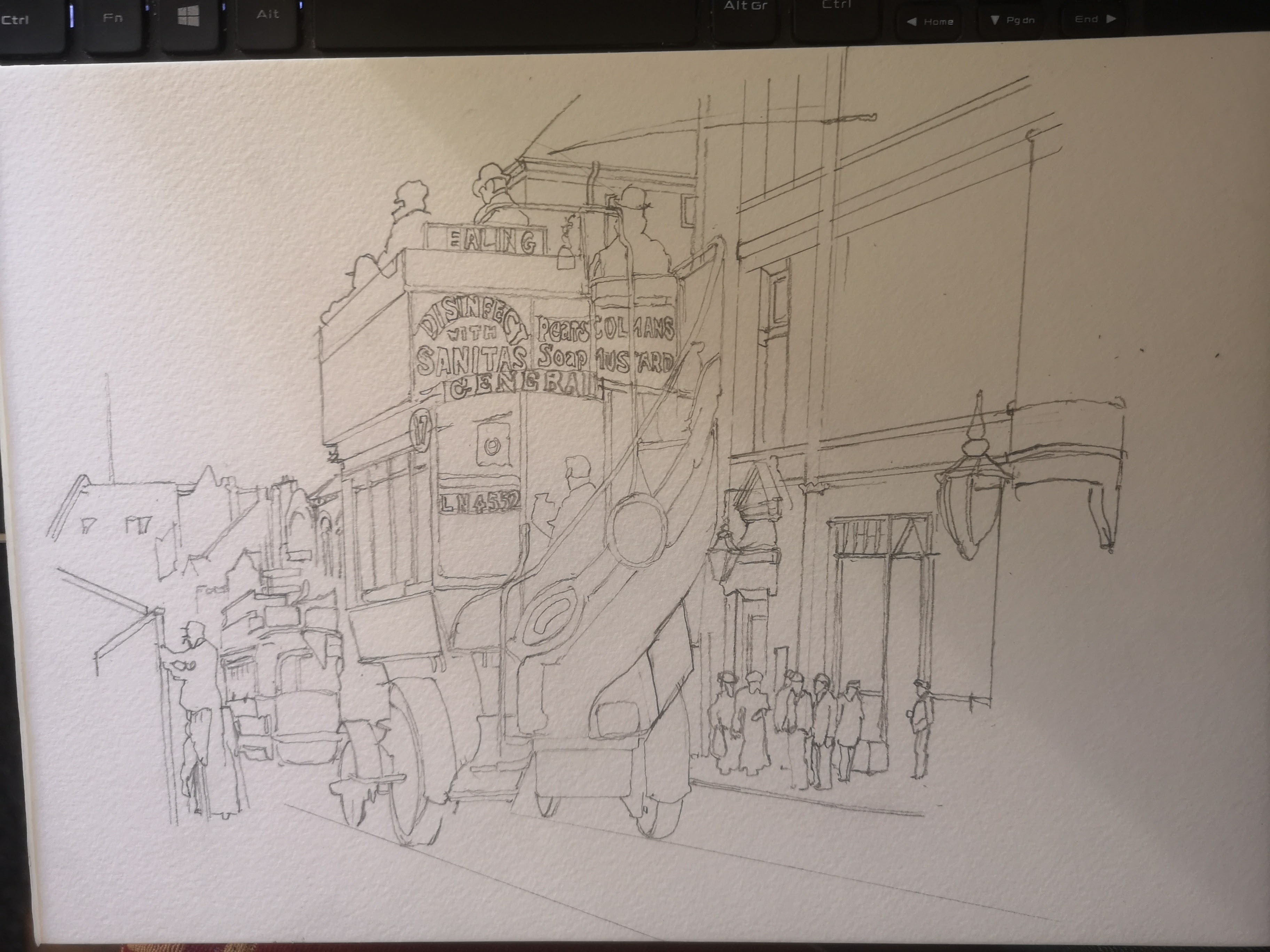
So, as with the trolleybus I painted last weekend, I knew I was going to sketch the basic design first. Like that picture, this one is based on a black and white postcard. It was one of a series you could get from Ealing Libraries back in the 1970s. I started with the bus. It’s not, I’m sure, technically the ‘right’ way to do it. But I can’t help it. Primarily I paint for fun, and while I’ve tried doing things the way that books and tutorials say, I just can’t. I always revert to my own ways, wrong though they may be. As it is I got the bus proportions right pretty much first time, although I did make the passenger on the top right smaller while I was painting.

So here you see the whole piece of paper. It’s A4 again, and the bus is slightly right of centre. The next stage was to outline the buildings to the right of the bus. Like last weekend’s painting, this is the London Borough of Ealing, in the East of the borough in Acton High Street. Acton was where my dad grew up, although he was born in Battersea, and he grew up in Acton a few decades after the original photograph was taken.

So the basic outline of the buildings is begun here. I also sketched in the figures since I found them to be useful reference points for the building.

And there we are. This is as much detail as I wanted to do on the original sketch. It’s plenty to give me what I need to get the proportions right when I come to paint it. If anything it’s a little more detailed than I planned, but the back of the bus, and those adverts on it kind of necessitated it.

So it was taped to the board, and since there was plenty of daylight left on Friday evening I felt I could and should make headway before I left it for the night.

First job, as usual, was to paint in the sky. I would have given it a blue sky anyway, but even on a black and white photo I felt you could see that this was taken on a sunny day all those years ago. I also began to paint in the bus. My first thought was that the red was a little too crimson for my liking, but you know my thoughts – don’t pass judgement until the bus is complete with its interior painted in. I made a mistake not painting in the first layer of the roadway, but I rectified this by the next photo.

By the time I took this photo you can see that I had started painting the interior, seen from the rear. You can also see that I’s started painting in the adverts. The dark blue background to the letters was a bit of a no brainer. Apart from the fact that I have seen enamel signs from the time in this colour scheme, the blue makes such a contrast with the red of the bus. If you look to the left of the picture you can also see there’s a tram. In the photo I can’t be certain, but it does look like a London United Tramways tram, and dark blue and white was the colour scheme of these beauties.

The green oval sign on the back of the bus is actually an advert for Heinz, but I juet couldn’t do the lettering, It’s just too small. I had also made a good start on the underside of the bus, the wheels and tyres. I mentioned last week about my inability to focus on one aspect of a painting for very long. Well, you can see where my attention wandered in this photo in the way that I suddenly decided to paint in the passengers’ hats on top.

This is the photo I took when I finished up working on the painting on Friday evening and it gives you a good idea of how the light was going. I was about ready to finish anyway. I’d pretty much finish the bus. I’d painted in the top deck passengers, the red destinations on the boards, the brass rails and the advert on the side of the bus. I’d also made a start on the buildings. Not bad for one evening’s work.

So, a fresh start on Saturday morning. The first job was to apply the first creamy, sandy layer of colour to the main building.

It’s in this photo that I first really started to get an idea of what the finished painting was going to look like. The obvious thing is the dark brickwork on top of the first layer of paint on the building. However there’s also the green ornamental lamppost as well. I have it in my head that these posts might well have been green back in the day. However, even if they weren’t, it kind of looks okay.

Now the window and door frames have been applied and I am starting to be very pleased with the building. I think the dark green ornamental lamp which has just been added looks a treat. Putting in some of the windows helped as well

This photo shows where I used guesswork on the far right of the building, since this extends further than the cut off point for the photograph. I also painted in a little dark area on the roof just above and slightly to the right of the bus.

Can you see what I worked on between the previous photo and this one? It’s over on the far left. I added some shading to the wooden frame that the bloke with the cap is putting up, I also painted in part of a shadowy figure walking away from the camera on the extreme left. A few more details like the chimney on top of the white building on the left pretty much took care of that part of the painting. I also painted in the faces of the figures.

So this is the last process photo and by the time I took this the painting was more or less complete. I decided that the figures would have to be in brown, dark blue, greens and greys and I’m pretty happy with the way they worked out.

Type B Bus in Acton High Street
So this is the finished painting. I’m not sure that it’s as good as the trolleybus, but then it’s a rather more complicated subject for all that. As a first go with the new paint set I’m really rather pleased. I do think that with hindsight, if I was doing another London bus with it I would mix in some orange with the red to take it more towards the pillar box red which I wanted.