Saturday, 8 March 2025

More sketches in the new Canson Sketchbook

I’ve been doing a little more work in my new Carson mixed media sketching journal today. I mentioned that I like the way that it takes fineliner when I tested it and made my first sketch in it on Monday. After making two ink sketches in it today I stand by that. It’s quite similar to sketching in the Seawhite Travel Journal, I find, even though the paper in the Seawhite is much lighter at only 130 gsm.

So this first sketch is a copy of one of the Harry Rountree (1928) illustrations of the Pig and Pepper chapter in Wonderland. Now, I’ve made most of my other Harry Rountree copies in the Royal Talens book. What I find with that is that you have to use a thinner nib whenever you’re doing something a little more detailed. I was perfectly happy with a 0.1mm nib to make this sketch. I found it gave me a lot of control and meant I could sketch pretty accurately. In fact I’m sure I could have used a nib that was a least twice as thick and achieved just as good results.

So this encouraged me to try it out with a copy of an Edgar Thurstan illustration. This is my copy of Edgar Thurstan’s illustration of Alice entering the Looking Glass. I think it has come off a wee bit better than the copies I made in the Royal Talens book using the same nib. Here it is:-

I think I should also point out that this was made on the other side of the page on which I made the watercolour and ink sketch of Disneyland Paris. The paper is so robust that you can do this without ay issues at all.

Here's the same sketch alongside my copy of the Tenniel illustration. Tenniel’s illustration is accompanied with a Mirror image illustration of Alice emerging on the other side on the reverse of the page. Edgar had to do it all in just the one illustration.

I think Edgar gets maybe just a little further away from Tenniel in this one than he does in quite a few of his other illustrations. Alice has a glass dome clock to her right in both illustrations. The interior of the fireplaces are similar. To her left Tenniel’s Alice has a vase under a dome. There’s a similar vase on Thurstan’s Alice’s left, but this doesn’t have a dome. There’s also a more prominent vase on the right too. Tenniel’s mirror is square, while Thurstan’s is a more ornate, bowed shape. I some was I’m put in the mind of the way that Edgar worked on Tenniel’s original with the train carriage illustration. In both, if I can use a photographic analogy, he's not only positioned the ‘camera’ to look down on he scene from a bit of an angle, he has also zoomed out a little which means he gets to show more of the scene than Tenniel does.

I have to say, this was another of Edgar’s illustrations that I have thoroughly enjoyed copying. I don’t think I can put poor old Edgar up on a pedestal with Tenniel, because a lot of his illustrations to seem so derivative. But then, if you’re going to be derivative, the do it well and do it interestingly and I think that Edgar certainly manages to do this.

Monday, 3 March 2025

New Sketching Journal - Canson Gradate Mixed Media A5

I’ve been reading reviews of art materials again. This is a dangerous thing for me to do as I’m sure you’re aware. But hey, sometimes you have to just live a little. Now, you may well be aware that I like travel journals for sketching in. A few years ago when I was spending time with my friends in the Cardiff Urban Sketchers one name of travel journal that kept coming up was Moleskine. So up until last year, that’s what I’ve used. And if you’re read what I’ve written in the past you’ll know that I’ve been pretty happy to use Moleskine. However, I had in the back of my mind the nagging feeling that just maybe Moleskine is a little bit on the expensive side and there may be something equally good if not better for quite a bit less money.

So in the past 12 months I’ve used Italian in Moleskine, British in Seawhite, Dutch in Royal Talens and American in Amazon Basics and now I’ve gone French, with a Canson A5(ish) mixed media Graduate sketchbook.

I’ve pictured it alongside my trusty Royal Talens sketching journal. The size is very similar, with the Canson being only slightly taller. The price is comparable too, the Canson being a few pennies cheaper. You get fewer pages for your money, but the pages are 200 gsm to the Royal Talens 140 gsm. The Seawhite is just over £1 more expensive on Amazon but you get half as many pages again – over 120.

Like Seawhite, Canson go the full Moleskine, by which I mean that you get your matte finish hard cover, your page ribbon, elastic binding strap, and document wallet at the back. Like Seawhite the paper is white, compared with the off white of the Moleskine and the ivory of the Royal Talens.

I will admit that I enjoyed drawing in ink in it. I’ve just returned from Disneyland Paris with my family and this test sketch is based on a photograph I took in the part of the park that is called Fantasyland (I think)

The paper feels as if it has a little more tooth than the Royal Talens. I love just sketching in my Royal Talens, but I do find that for anything detailed I can’t use anything much bigger than a 0.1mm nib, whereas the paper in the Canso felt a better medium for getting the kind of marks that I want to make. Still, I also wanted to see how it works with watercolour. I applied colour to the above sketch using my Windsor and Newton Cotman travel sketchers set. Here’s a photo of the result.

I took a photograph rather than making a scan, because I tend to find that a photograph will show us if there’s any buckling or waffling of the paper. This stood up pretty well to the watercolour. Mind you at 200 gsm I should hope so.

Here’s a comparison between the five brands of A5 travel sketchbook I’ve mentioned in this post.

Clockwise, from top right – Amazon Basics, Royal Talens – Canson – Moleskine – Seawhite of Brighton.

Not surprisingly the colours appear most vibrant in the 200gsm books, the Amazon Basics and the Canson, with the Seawhite coming out on top of the lighter papered books.

I’ve only made this one picture in the book so far, so it’s a little early to daw hard and fast conclusions. But it was nice enough to use, so we’ll just see how we go. If you’re looking for a budget, value for money all purpose sketchbook I still think you can do a lot worse than Seawhite, though.

Monday, 24 February 2025

A difference between the 1860s and the 1930s

When you’re making a copy of someone else’s picture, one of the benefits to be derived from it is that you learn a lot about the original while you’re doing it. This makes sense when you think about it. You can’t, well, I can’t copy a picture, or a photograph or even draw from life without looking, looking, looking. I’ve written about my ‘method’ before – which is maybe making it sound more systematic than it really is – of mentally dividing parts of the original into a series of small drawings and reproducing these which eventually combine to form the big picture. Working this way I find does help me to focus on the detail of the separate parts of the picture.


I’m getting a little away from the point I’m going to make. This morning I made a copy of Edgar’s illustration of the fish and frog footmen from Wonderland. Here it is compared with my copy of Tenniel’s illustration of the same scene. The hallmarks of Edgar’s use of the Tenniel original to inspire his work are evident. This is a bit like a mirror image – what’s on the right in Tenniel’s is on the left in Edgar’s and vice versa. The figures are very similar in both, right down to the position of the frog’s legs, and the frock coat worn by the fish. And . . . the fact that the position of the viewer is shifted, so that we are looking slightly down and slightly on he diagonal, compared with Tenniel’s figures. With Tenniel, we the viewers are largely on a level with the figures who are directly in front of us.

Maybe I have an explanation for this. Work with me. For me, it’s the difference between watching a story play out in a theatre on a stage, and watching a story play out on film. Tenniel puts the viewer in the position of the audience in a theatre. Cinema had not been invented when Tenniel made his Alice illustrations. Edgar puts the viewer in much more interesting positions, just as a film director could do using cameras in different positions. Now, I’m not saying that Edgar was consciously trying to be cinematic in his approach. But in the 1930s, when I believe Edgar made his illustrations he was living in a world where cinema had already shown us all different ways of looking at the world.

Well, it’s a theory anyway. What’s not a theory, but a fact is that my admiration for Edgar’s technical skill increases with every one of his illustrations that I copy. You know, I think that I’m pretty decent at copying Tenniel’s work. But if you said to me, well this is what you have to do – you make a mirror image copy, but then you have to also shift the viewpoint upwards, and on the diagonal – well I don’t think I would produce anything decent if I tried to.

For the record his is my tenth copy of an Edgar Thurstan Alice illustration, out of just 21 illustrations he made in total. My eleventh copy is this one below. I think that these latest two copies are probably the best ones I’ve made of Thurstan and it’s probably because I used a nib only half as thick as the 0.1mm nib I used on the others.


Saturday, 22 February 2025

Thurther Thurstan Copies

So, are you in the market for more comparisons between Sir John Teniel’s Alice illustrations and Edgar B. Thurstan’s? I hope so because that’s all I have for you.

Yesterday I made this copy of Edgar’s illustration of Alice falling down the rabbit hole.

Now, I don’t have a comparison here for the simple reason that Tenniel did not illustrate Alice falling down the hole. To me it’s always seemed like a bit of an omission. But then Lewis Carroll himself did not illustrate the scene for Alice’s Adventures Underground. Maybe he just never saw the visual potential. So this is Edgar without the temptation to draw heavily on Tenniel. Now, you have to accept that I’ve done my best with this one but it’s really not a great copy. Edgar’s, you will have to take my word for it, is a technically highly competent piece of work. I do wonder if he was inspired by anyone else’s illustration for this. I haven’t done any research on this yet, so it’s a case of watch this space.

This is a copy of Edgar’s illustration of the Wool and Water chapter of Looking Glass, followed by Tenniel's

Thurstan has once again shifted the position of the viewer, so we’re looking down rather as we did with the railway carriage illustration. If the virtually identical sheep isn’t enough to convince you that we have a deliberate borrowing from Tenniel, then just look at the way that Edgar has taken the kite, spade et al from the side of the counter in Tenniel’s and put them on the front of the counter in his.

Yes, well spotted, there is a big difference between the two. Edgar’s has an open door looking out onto a jetty with the ewe’s rowing boat. I can understand the logic behind the decision to depict the scene in this way. For Tenniel made two illustrations of the chapter, while Edgar had to get as much of it as possible into 1 illustration.

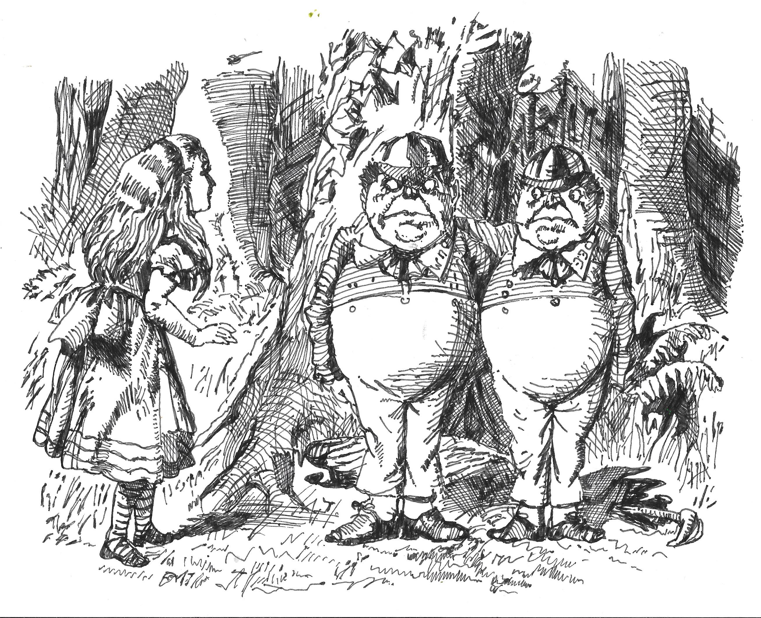
Here's my copy of the second of Edgar’s illustrations that I made today. As if you didn’t know, this is Tweedledum and Tweedledee. Tenniel's is underneath it.


I would say that Edgar is just a little further away from Tenniel than he usually is. The heads are very similar and they are wearing very similar caps. However there are differences in the clothes they wear. Tenniel’s figures wear schoolboy ‘skeleton suits’ that were old fashioned when he drew them. Edgar’s wear rather more modern waistcoats, jackets and trousers. All the time having Alice in her Victorian pinafore dress. Well, as we’ve said before, either Odham’s wanted to go for I can’t believe it’s not Tenniel, or Edgar decided to go that way for his own reasons.

Sunday, 16 February 2025

Copying Thurstan again - easing my way back into sketching

Hi, how are you doing? Me? Well, I haven’t posted anything here since completing the text and illustrations for ‘Alice’s Adventures at the Poles’, no. That’s partly because I haven’t hardly produced anything since. You know how it is – I have to give my new day job the effort and dedication it deserves, and so a lot of the time I just haven’t had the oomph to sketch in the evenings or weekends. I do make a little money out of my art, enough to provide spendsies for my overseas sketching trips, but it’s not my living so I do have the luxury of being able to leave it for a bit when I’m not feeling it.

So up until the last week, the only sketching I’ve done at all recently was during a weekend in Oslo in January. I’ll write about that in a future post – probably. But by Friday just gone I could feel my sketching mojo coming back. But what to sketch? Ideally it would have been nice to copy one of John Tenniel’s Alice sketches – stick with what you know and what you enjoy, innit? But I’ve copied every sketch he made for Alice in the past and I don’t want to do it again. So what was the next best thing? Well, yes, I could have gone for one of the other great Alice illustrators and done another of theirs. I haven’t coped all of Mervyn Peake’s, or Ralph Steadman’s, of Charles Robinson’s etc. etc. But I wasn’t feeling it. I wanted to do a Tenniel style illustration. Which is what led me back to Edgar Thurstan.

In case you haven’t read my earlier posts on this subject I will try to summarise as best as I can. I fell under the spell of the Alice books through an edition, published by Odhams in the 1930s that my grandfather had bought. In my ignorance I had always felt that it contained some of the original Tenniel illustrations. Towards the end of last year I bought a copy of this exact same edition for pennies on ebay, and found out that the 21 illustrations within it were made by one Edgar Thurstan. But they are so clearly inspired by Tenniel’s work that I think my confusion is forgivable. For what it’s worth I think that Odhams wanted the Tenniel illustrations but didn’t want to pay the commission for them to the Tenniel estate. The rights remained with the estate until the 1960s. So I guess they set our Edgar to his work with the instruction to make them as much like the Tenniel originals without breaking copyright as he could.

I copied the Thurstan illustration of Alice in the train carriage  and compared it with my copy of Tenniel's original to prove my point a couple of months ago.

I also commented that the illustrations where Thurstan shows more originality and goes further away from the Tenniel originals are less effective in my point of view. Well, maybe that’s a little unfair. Here’s the copy I made on Friday of Alice meeting the Red Queen in Looking Glass.  Below it is my copy of the Tenniel illustration of the same scene


You’ll notice the more creamy coloured paper of the Thurstan copy. This is because I used my trusty Royal Talens book for it. Not sure why I feel this way but I always enjoy sketching in it. Now, this is similar to the Tenniel in the style – the extensive hatching and cross hatching. The use of trees in the background gives the composition a little similarity. Thurstan, though, has done what he does elsewhere by transposing the positions of the figures. In this one though his Alice is in a different pose to Tenniel’s, curtseying (it saves time). The figures of the queens are quite different too – Thurstan ignores the angularity of Tenniel’s queen, and the fulness of her face seems to owe more to Tenniel’s Duchess or Queen of Hearts. Both wear crowns which look to be inspired by the top of the Queen piece in a standard Staunton chess set. Compare the next picture I copied, also of the Red Queen, with my copy of Tenniel’s:-


Compositionally there’s more similarity between these two. The position of the hands, and the Queen’s staring eyes come to mind. Ironically Tenniel’s is now fuller faced while Thurstan’s is more angular. Yet I have to say that I really like what Thurstan did with the Queen’s arms and hands. Again, he’s made a figure that is more animated than Tenniel’s original.

Okay, so we come to one of the illustrations that I did think inferior to Tenniel’s by some degree. Here’s my copy of Tenniel’s illustration of Alice meeting the caterpillar in Wonderland above Thurstan’s.


This is an interesting one. Again, Thurstan has done his mirror image trick of reversing the positions of the figures and even some of the background details like the smaller mushrooms. The Thurstan hookah is pretty much the same as Tenniel’s. But the big difference, the huge difference, is the caterpillar. Tenniel, to be fair, doesn’t give us a lot to work with in the original. The caterpillar has its back to us and he doesn’t give us much more than the clever use of what might be the forelegs of the caterpillar to suggest the profile of Mr. Punch. So here Edgar really bites the bullet and ignores Tenniel’s caterpillar completely. His caterpillar is a hairy one. And it’s actually pretty well modelled too . . . apart from that face.

You know, I must have been quite inspired by this illustration when I was tiny because the caterpillar has always been one of my favourite characters. But the face of it . . . well, it’s just wrong I’m sorry. It’s too simple, too sketchy and cartoony. It’s out of place here, and it’s a shame because I have come to really appreciate everything else in this illustration through trying to copy it. But it’s surely a case of inspiration failing Edgar when left to his own devices.

Between making the second and third sketches yesterday I tried again to find out anything I could about Edgar ‘E.B.’ Thurstan, and once again I pretty much drew a blank. The only references I could find were for a few works he illustrated for Odhams in the 1930s and the majority of those references were to Alice. And for that matter most of the references to Alice were specifically to the Humpty Dumpty illustration in Looking Glass. So I don’t know. It’s possible, I suppose, that Edgar was not under instruction from Odhams to make his illustrations like Tenniel’s. Perhaps he was under pressure, inspiration failed him and so he decided to use Tenniel’s work as a starting point. Who knows?

Whatever the case, although I know next to nothing about Edgar, I salute him. For the most part, loving your work, sir.

Sunday, 12 January 2025

ALICE'S ADVENTURES AT THE POLES - FIFTY ILLUSTRATIONS COMPLETED

Okay, it is done. Sort of. If you’ve been following the blog then you know that it’s been over a week since I finished writing the first draft of the text of “Alice’s Adventures at the Poles.”. I needed to make two illustrations to the final chapter to take me to my target of forty eight illustrations. I made one on Monday, this rather charming (to my mind) illustration of the mole who is a sweeper in the South Pole Post Office. 

On Tuesday and Wednesday I was writing up reviews of Mastermind and UC for my other blog. By Thursday I had itchy and tired eyes, so I left the other illustrations for yesterday.

Now, this meant I only needed to make one yesterday. Which I did. This mean that I had here illustrations for chapter 12. Still, when I had made the forty eighth that meant the last chapter only had 3 illustrations. As it is, chapters 2,3 and four only have 3 illustrations each, but since then every chapter has had at least four. So I did what will be the illustration at the end of chapter XII. Then I thought – forty nine. Just one away from fifty. So I drew an illustration of the octopuss, a recurring character who makes no fewer than three separate appearances in the story. Here’s the illustrations.


So, am I done with the making, then? Well, no, not quite. The text needs editing and possibly revising slightly. Then there’s the illustrations. I’ve tried to be quite hard on myself as I go along, rejecting and re-doing where necessary. I redrew the second illustration in the book because the original was on cream coloured paper, for example. But there are still a least a couple of illustrations that I think I need to redo. It seems a waste to come this far, and then accept pictures where I think I might do better.

In the coming week, I guess I’ll start to think about my feelings about the whole project, and look to get this down on paper by the end of the month (I’m away on holiday next weekend.)

Saturday, 4 January 2025

ALICE'S ADVENTURES AT THE POLES - NARRATIVE FIRST DRAFT COMPLETE!!!

Okay. Let’s recap. I started writing my own Alice adventure in September, around the 11th. It took me until the beginning of December to write and illustrate 6 chapters. The speed with which I wrote the chapters varied – I can remember taking the best part of three weeks on one of them, but generally they were taking between 10 days and a fortnight. Then we got to December.

The last time I posted, six days ago I had completed Chapter X. I promised myself that I would take it rather easier on Chapter XI and my actual words were “I have no intention of rushing through the chapter at full tilt again,”. Yeah, right. I finished writing Chapter XI on Wednesday, New Year’s Day, and immediately started to write Chapter XII. I produced two illustrations for Chapter XI by Friday evening, and made two more this morning. Then I finished writing Chapter XII. Which means, dearly beloved, that I’ve finished writing the whole of the narrative. Well, the first draft, anyway.

Okay, so I was always going to read and revise the whole story again anyway, but the speed with which I’ve completed the last couple of chapters worries me a little, so I definitely need to go through them.

For the record, then. The current length of the novel is just over 46000 words – which is quite a bit longer than Alice in Wonderland. Which is absolutely not a criticism of Carroll’s book, which is above criticism, just a comparison.

I have completed 45 illustrations, but not yet illustrated chapter XII. My target for the whole novel was 48.John Tenniel made 42 illustrations for Wonderland (and another 50 for as Looking Glass)

My first draft has 19 poems in it. I think that there are 19 poems in Wonderland and Looking Glass combined – 11 in the first book and 8 in the second.

My first draft does also include 180 footnotes which add just over 11,000 words. Self indulgent – probably but writing them gave me a great amount of pleasure.

I don’t think I want to write about what I’ve got out of writing the story and making the illustrations until I’ve illustrated the last chapter, so in the meantime, here’s he illustrations to chapter XII:-