Okay - so I made this sketch of Mariners Quay, Aberavon Beach: -
 |
| Mariners Quay |
However: -
While, in my opinion, it's a definite cut above any line and wash painting I've done before, it's maybe still not quite where I'd like to be. So I looked closely at it for a while, and what eventually struck me is that it's a little bit over-drawn.
I'll try to explain that. If you compare this to the sketches I made on Saturday, you'll see that this is nowhere near as heavily shaded. That's helped. However, there are still some unnecessary lines here. The glaring one is the line of the distant hills - this could have been better done just with the paint itself. The railings on the left and the wall in front of the buildings on the right are a little fussy too.
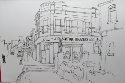
So I tried to put these points into practice for my next sketch. For this one I picked a building in town which I've always liked. Here's the ink sketch: -
 |
| Talbot Road |
It's got something - as an urban sketch it's approaching what I want to be able to do. However. . . I still think even this is a little over-drawn. The main building is fine, but the foreground and background buildings, although simplified, are still too much. So I had one more go, this time based on a couple of boats I saw moored in the river just a wee way from the sea. Here's the original sketch:-
 |
| Boats on the Afan |
For once, maybe my first time, the paint is not overpowered by the ink, and the two media work to enhance each other. This was only ever a simple sketch to start with- but the colour makes it.


No comments:
Post a Comment