Sunday, 29 September 2024

Sketching the Hatter

Let’s start with a bit of context. In the summer I officially retired from being a teacher. Last Monday I started in my new proper job, a temporary position working in admin for the Community Dental Service, part of the NHS. I’m enjoying it a lot, however it does mean that I don’t have the time to draw and paint during the day and having been staring at a screen all day my eyes are too tired when I get home. So I haven’t made a huge number of pictures this week.

However, I have been looking more closely at the way that Tenniel’s successors have chosen to portray the Mad Hatter. Before that though, it’s worth noting that from his very first appearance of the Mad Hatter in Wonderland in Chapter VII – A Mad Tea Party, Carroll tells us what the Hatter says and what he does, but not what he looks like. Oh, and he never calls him the Mad Hatter either. He is first mentioned in the book when the Cheshire Cat offers Alice the chance to go one of two ways – one way she’ll meet a hatter, and the other a march hare, and he says that they’re both mad. The tea party doesn’t even appear in Carroll’s original manuscript “Alice’s Adventures Underground, so Carroll never illustrated him. So we have to start with Tenniel, and it must be fair to assume that Carroll was happy with the choices that Tenniel made. As always all of the illustrations on this page are my own freehand copies of the originals.

Despite never appearing in the original manuscript Carroll must have liked the Hatter, for he brought him back in Looking Glass. Across the two books Tenniel included the character in no fewer than 7 illustrations. In Tenniel’s illustrations he is a small man with short limbs and an overly large head. His most distinctive facial feature is his beakish overly large hawk nose. He wears a large spotted bow tie, and a top hat which has a ticket stuck into the band saying ‘In this style 10/6”. His hair is long and just a little wild. As I said, Lewis Carroll wasn’t exactly backwards at coming forwards when Tenniel did something he didn’t like with the characters so he must have been happy with this visual representation.

Tenniel’s is the definitive depiction of the Hatter, so much so that subsequent illustrators have found it difficult to get away from it. I haven’t yet copied Arthur Ransome’s, yet I have copied illustrations by his contemporaries Harry Furniss and the Robinson brothers, Charles and Thomas. Here’s Harry Furniss:-

At first glance this doesn’t seem to look like Tenniel’s Hatter, but that probably has more to do with the great animation of this figure. Harry Furniss was a colleague of John Tenniel’s so it’s no great surprise that this does actually bear similarities to Tenniel. There’s the top hat with its ticket – although we can’t read what’s written on it. The high collar is very reminiscent of Tenniel’s. The nose is overly large, like Tenniel’s. This one does at least look a little madder – the hair is more wild and the eyes are popping.
Charles Robinson’s illustration of the Hatter looks a million miles away from Tenniel’s at least. He is dark haired and younger looking. He wears a top hat, but the hat he does wear is upside down which I guess is the concession to madness. He also has a remarkably long nose although his is much straighter than Tenniel’s.
Charles’ brother Thomas Henry (T.H.) Robinson’s illustrations of Wonderland are to my eyes less original and more traditional than Charles’ despite being made at pretty much the same time. His hatter is quite a tall figure with a head that is much more in proportion to his body – if anything it’s a little small. His hair is dark and short. However he wears the traditional top hat, albeit one without a ticket.  Again, his nose is overly large, but all in all he looks very sane.

Harry Rountree also illustrated the Mad Hatter as early as 1908, and then again in 1928. The 1908 illustrations are sumptuous watercolours, and in this edition the Hatter is clearly recognisable as a pretty close cousin of what we’ve seen before. His top hat has a rounded top, but his nose is very large. His concession to madness is having what looks like rolled up paper cones in each ear. 1928’s Rountree hatter is facially pretty similar to the 1908 version. The hat is a true top hat, and to be honest although the illustration is as technically well done as all of Harry Rountree’s work it just seems to lack a little originality.

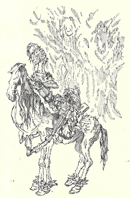
Coming forward to the immediate post war period, Mervyn Peake at least gives us something completely different from Tenniel. Or at least, almost completely different.

Mervyn Peake’s hatter has an overly large nose and his hair is rather wild but those are the only similarities he bears to Tenniel’s. I purchased a second hand combined copy of both Alice books with Mervyn Peake’s illustrations during the last week, and I’m bowled over by it. I’ve written before about how, as much as I adore Tenniel’s work, his illustrations to the books are sometimes a bit static and this is a criticism you just cannot make about Peake’s work. Peake’s hatter seems to wear a mad combination of hats of different styles and I love the way there seem to be plants sprouting out of the top of it.

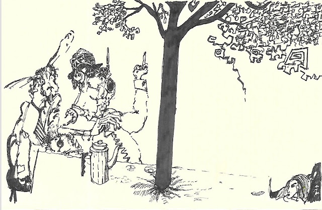
Ralph Steadman’s illustrations to both Alice books, from the end of the sixties and the beginning of the seventies are marmite to me – I either love them, hate them, or love them and hate them. I think his Hatter is in the last category. To me, the hare and the hatter look completely under the influence of some kind of narcotic – both are conspicuously smoking something and this is something that Lewis Carroll never wrote. The Hatter looks more animal than human here, although in other illustrations his face is more clearly human. Making this copy helped me appreciate the illustration more, but I can’t say that I really like it. But, it is without doubt something worlds apart from Tenniel. It’s interesting that Ralph Steadman chose to concentrate on the mad aspect of the character than the hatter. Nowadays we don’t have hatters any more. Maybe this is because of the association with Alice – we have milliners. The only concession to his profession with Steadman is what appears to be a bowler hat, and that is almost lost amongst headphones and other bits of headgear.

After the madness of Steadman’s Hatter it’s a relief to come back to the relative cosiness of Helen Oxenbury’s 1999 Hatter. As a whole set I find Helen Oxenbury’s illustrations really bring out the lightheartedness and fun in the books. Her Hatter is one of the smallest nosed depictions, and one of the fleshiest faced. He wears three of what looks like a cross between a trilby and a fedora, each perched on top of a slightly larger version. He also has the kind of moustache associated with a ‘spiv’ of the forties and fifties.

Sunday, 22 September 2024

Third time's the charm

I wrote the last post about being unable to come up with a satisfactory illustration for “Alice’s adventures at the Poles” showing Alice’s face. Well, I didn’t give up. I decided to have a third attempt, and the third time proved to be the harm. As with previous posts I’m not going to explain the story, or the part of the story that this illustrates. I’m certainly not going to be giving away a lot about the story until I’ve written the whole thing. But here’s Alice.


I explained about most of the choices I made about costume etc. in a post last week, so I won't go over all of that again now. But at least I now know what the front and back of my Alice looks like and that can only be to the good. 

Struggling -

Yeah. I’m struggling to make an illustration of Alice, showing her features, that I actually like at all. Yet I cannot sketch her from behind for every illustration she features in. I know which incident I want to draw, which involved Alice and two flatfish, but actually getting it satisfactorily onto the page is a different matter. I’ve draw two designs and I don’t like either of them. I will have to give it a lot more thought. Watch this space.

In the meantime, here’s a few more copies from the last couple of days:-

Harry Rountree

Harry Rountree

Helen Oxenbury

Charles Robinson

Charles Robinson


Friday, 20 September 2024

Alice finally makes it into an illustration

Here’s a fact you didn’t know – maybe. Alice herself is depicted in only about half of John Tenniel’s illustrations of the two Alice books. There’s two ways you can look at that. On the one hand you can say – hey, that shows you don’t have to include Alice in all of your illustrations. On the other hand it does show that you can’t avoid illustrating her in a fair proportion of them.

So, I’ve written two and a wee bit chapters of “Alice’s Adventures at the Poles” so far. Up to last night I had made 7 illustrations. Only one of them featured Alice, and that one only showed her tiny legs. I’ve been putting it off. There’s reasons for this. I put it off so that I could a least make some decent illustrations and start to build up a little confidence. But then there’s also the question you have to think about when you’re illustrating Alice – how close to the original are you going to go?

In the last day or two I’ve made copies that show how Helen Oxenbury, Mervyn Peake and Charles Robinson each illustrated Alice. Each one of them went away from Tenniel, and so did many of the other illustrators of the books over the years. But then, they’re all illustrating the original stories. It makes sense to do something different with your depiction of the story because you want to put your own stamp on it and find a little bit of originality.

But. My Alice illustrations have to fit my new, original story. The originality is inherent. It makes sense for me to use a lot of the visual vocabulary that John Tenniel uses for the way he presents Alice, as a reassurance to the reader that this is still the same Alice as in the original stories. 

Very pleased with my first illustration of Alice. If I can get her features in a way that I like when I draw them I will be delighted.

If you look at my illustration you’ll see that she is wearing a traditional pinafore dress and has long hair. Differences are that my Alice’s hair is a little darker, and braided where Tenniel’s had an Alice band. I made the decision that I was going to use my older granddaughter as a face model – and Alice’s head is based on a photo of her. I fought a little shy of depicting her features in this first one -  that’ll come now I’ve worked out the way to go with her costume, hairstyle and proportions.

For a encore I made another version of my illustration of the snake that Alice encounters. Here’s the original.


Now, for one of my original drawings it isn’t badly done at all, especially considering that I was working it out as I went along. The slight issue that I had with it was that the snake’s head was a bit too cartoony. I had a lightbulb moment this morning about it. I’ve been writing notes about the background to everything I’ve written – which I’ve enjoyed every bit as much as writing the story and making the illustrations. While writing the note about the episode with the snake, I explained that a piece of advice he gives – when flattering royalty, lay it on with a trowel – originated with Benjamin Disraeli. Apart from the fact that it’s appropriate advice for him to give at this point of the story, I also used it because some people think that Tenniel used Disraeli a couple of times in his illustrations for Looking Glass – the man in the newspaper hat sitting opposite Alice in the train compartment does bear some resemblance to him and some think hat the Unicorn represents Disraeli while the Lion represents William Ewart Gladstone.

So it became obvious to me – I should give my sake Disraeli’s head! It needed just a tiny bit of tweaking of the description of the snake in the text to make it work. Clock, mirror and picture frame are all inspired by a illustration in Looking Glass.


To me this is the first illustration in which I’ve used just a touch of the grotesque – which is one of the things I like so much about Tenniel’s work.

Wednesday, 18 September 2024

It's been two whole days and I haven't bought another sketchbook since.

The title of this post is a flippant reference to the number of sketchbooks I’ve bought in the last week or two. I have not bought another one since my last post. But I have been using them – specifically the Royal Talens and the Moleskine.

I’m still thoroughly enjoying using my RT book. Since my last post I’ve made these copies:-


The first is Mervyn Peake’s illustration of the White Knight from Looking Glass. One of the things I love about Peake, apart from the fact that his illustrations are brilliant in their own right, is that he so often subverts the expectations that we have based on our experience of Tenniel’s illustrations. Compared to Tenniel’s old buffer, this white knight has a noble, almost cavalier’s head. He has ridiculously elongated legs and neck. Then there’s the horses. Tenniel’s knight rides a fine white charger. Peake’s White Knight rides a bit of an emaciated old nag.

This latest pair of copies in my RT book show different artist’s take on the same scene, where Alice meets the Gryphon and the Mock Turtle. If we start with the ink and watercolour sketch on our left, this is a copy of Helen Oxenbury’s illustration. It (the original) is gorgeous. Helen Oxenbury made the choice to illustrate the Mock Turtle as a tortoise. (It’s a mock turtle because it isn’t a turtle, it’s a tortoise?) That’s a sensible choice – after all, who knows (or cares) about mock turtle soup? It’s a very Victorian joke at best. I love the way that Alice is dancing with the pair. Helen Oxenbury’s Alice is really unselfconscious As a father of four daughters and a grandfather of two granddaughters, her Alice acts like a real little girl.  

Compare this with the picture on our right. This is my copy of Thomas Heath Robinson’s 1908 illustration of the same scene. It’s technically an excellent illustration of the scene. But I think it demonstrates that TH Robinson was following the well beaten path originally marked by Tenniel, rather than doing his own thing like Helen Oxenbury. His concept of the Mock Turtle is essentially Tenniel’s. Yeah, he has a top hat on here but this is still recognisably the same creature that Tenniel illustrated in the same way. It is also very static when you compare it to Helen Oxenbury’s. That for me is part of debt to Tenniel – I’ve made the point before that a significant number of his illustrations look like posed tableaux, rather than moments froze in time.


The last illustration here is my latest illustration for ‘Alice’s Adventures at the Pole’. I’ve gone farther away from life with Sliver the Snake than I did in ay of the previous illustrations. I may redo it with a more naturalistic head on the snake for comparison and see which I prefer.

Monday, 16 September 2024

Forgive me father for I have sinned. I have bought another sketchbook.

So what is it, a week since I last bought a new sketchbook? Eight and a half days actually. Look, I’d just done a bit more business on Etsy and I wanted to reward myself. I think that I’ve mentioned how much I enjoy reading reviews comparing art materials – it’s a vicarious pleasure which is almost as enjoyable as visiting specialist art supplies and stationery shops in person. Several brands tend to come up a lot in dispatches, and one of these is Hahnemuhle.

Hahnemuhle is a German company that began as a paper mill in the late 16th century. Amongst quite a wide range of products they offer their own travel sketching journal. It’s in the familiar 13x21cm format, and it sits at the more expensive end of the market. Looking today on Amazon the Hahnemuhle 13x21cm travel journal is quite a bit more expensive than the Moleskine equivalent and more than twice as expensive as the Seawhite A5 Classic Sketching Journal. It has about the same number of pages as the Seawhite too. So I bottled it. I didn’t by a Hahnemuhle travel journal. I did, however, buy a rather cute little product that Hahnemuhle make. It’s their Draft and Sketch mini sketchbook, and you can see it in the photograph below. The other sketchbook in the second photo for comparison is the Royal Talens 9x14cm journal I bought a fortnight or so ago.


Mini? My friends, It’s absolutely tiny. It has 60 sides of paper, but the important thing is that the paper is the same weight – 140 gsm – as the Hahnemuhle travel journal. So at least, I thought, at least it should give me some idea of what to expect from the journal.

Okay then, first impressions. It’s lovely paper for fineliner sketching. It has just the right amount of tooth so that the ink makes very neat crisp and clear lines, so much so that I could use a 0.1mm nib for the finer lines as opposed to the 0.05 I’ve been using on other books, and even this I would abandon for a 0.2mm nib. The first sketch I made was the ink outlining for an ink and watercolour copy of a 1908 illustration Harry Rountree made for his 1908 set of Alice in Wonderland illustrations. I enjoyed this so much I decided to gamble and try to make the next illustration for my Alice story “Alice’s Adventures at the Pole”. And another. And another. Learning from my experience with my Royal Talens I decided to distance myself a little, and while I could still be objective about it, put it to the watercolour test.


Hahnemuhle make it perfectly clear in the packaging and promotional material that this mini sketchbook is suitable for dry media. Most sketchbooks of 130 gsm or more make claims that to be suitable for light watercolour. I did think that it was a bit odd for Hahnemuhle not to say something similar, and decided, what the hell, let’s give it a go. Here’s the result.


At first I thought that it was buckling a bit, but frankly it’s not noticeable at all now. It looks like the watercoloured pages in my seawhite sketchbooks do. And if anything, I’d say that the colours are maybe a little brighter and more vibrant. Blow me down. Comparing the pages where I’ve used watercolour I’d say it has performed better than either the Moleskine or the Royal Talens, and at least as well as the Seawhite. And this little feller is not twice as expensive as the Royal Talens equivalent. However that’s a little misleading since there are more pages in the Royal Talens. There’s no pocket in this and no elastic binding, but then it isn’t claiming to be a travel journal. So is it better or worse value than the small Royal Talens? Well, that all depends on what value means to you. But I have to say, using it today has been like using a little bit of quality. Would I buy a Hahnemuhle travel journal now, knowing what I know? At today’ s Amazon price I probably wouldn’t. But I’d love to be given one!

Sunday, 15 September 2024

To be original or faithful?

Yesterday was a bit of a bumper day for making copies of illustrations in my new Royal Talens sketchbook. I wrote yesterday about the watercolour test based on a 1908 Harry Rountree illustration of Advice from a Caterpillar, and also showed my copy of his White Rabbit in the page’s tabard.

Later on in the day I took on a TH Robinson illustration of The Pool of Tears. I’m sure that I’ve written about him before, but briefly, T.H. Robinson – Thomas Heath Robinson – was one of a very talented trio of brothers. His brothers were Charles Robinson and William Heath Robinson. William, the most famous of the three, never illustrated Alice to the best of my knowledge, but Charles did, and he produced one of my all-time favourite Alice illustrations, which was also of the Pool of Tears. I wanted to draw Thomas’ illustration of the same scene by way of comparison.

After that I copied two more Harry Rountree illustrations – of the March Hare and the Mad Hatter, and of the Mock Turtle. The Mad Hatter surely must be one of the biggest problems for illustrators since 1907. The Tenniel illustrations of him are so distinctive and have become so ingrained within the public consciousness that an illustrator can be forgiven for thinking long and hard before going too far away from Tenniel’s Hatter. Amongst my favourite other Alice illustrators, Mervyn Peake displays more originality than most. If you look at Rountree’s, he moves away from the oversized head and shortened limbs of Tenniel, but his Hatter still has an exaggerated nose, a tail coat and a top hat. At least he didn’t go the whole hog of having the 10/6 ticket in it.


Incidentally, even Walt Disney didn’t go very far away from the Tenniel original of the Hatter. Disney loved Carroll’s book. One of his earliest cartoons was “Alice’s Wonderland” which combined live action and animation, and led to a series of fifty seven short films. He wanted to make “Alice in Wonderland” as his first feature film, but may have been put off by the fact that MGM produced a live action version in 1933 that bombed at the box office. When he made his 1951 “Alice in Wonderland”, the script did play a little bit fast and loose with the story, including Tweedledum and Tweedledee from “Alice Through the Looking Glass” and leaving out some of the characters from the first book. One character you just couldn’t leave out is the Mad Hatter. If you looked at one of the Tenniel illustrations of the character alongside a still from the film you’d perhaps be struck by the facial differences between them. Disney’s is fleshier and has a bulbous hooter rather than the hawklike beak that Tenniel’s Hatter sports. But look closer and you can see that facial differences aside, he is otherwise pretty faithful, down to the 10/6 label in the hat.


Of course, the Mock Turtle is one of the Wonderland characters excised from the Disney animation. Many illustrators of Wonderland since Tenniel have faced the challenge of the Mock Turtle in three ways – 1) – ot to illustrate the character at all – 2) – To use a similar visual concept of the character to Tenniel’s – 3) To ignore that it’s a ‘mock’ turtle and draw it as a tortoise or turtle. It’s pretty easy to see that Harry Rountree took the second approach. I think it’s technically a fine illustration, but it doesn’t show us anything about the character that Tenniel didn’t do before.

Saturday, 14 September 2024

Royal Talens Art Creations Travel Sketchbook - My 1 week verdict

It’s a week now since my new Royal Talens sketchbook arrived. Long enough, I think, to make some observations and comparisons. Since it arrived I’ve made 11 sketches inside it. 10 of them have been ink fineliner sketches, 8 copies of Harry Rountree illustrations of Alice in Wonderland, 1 copy of a Mervyn Peake illustration of Alice through the Looking Glass and the other was an original illustration for my own unfinished Alice story, Alice’s Adventures at the Poles. However I was very conscious of the fact that I had not tried watercolour within it before his morning.

Illustrator Harry Rountree illustrated two editions of Alice in Wonderland – one in 1908 and the other 20 years later. All of his illustrations I’ve copied up to now have been from the 1928 edition. I found some of his 1908 illustrations on the net, and many of them are ink and watercolour. Now, I often fight shy of trying to copy watercolour illustration. When you get right down to it I don’t have the skills to make a decent job of it, which I can do when I’m just sketching in ink. But, here was the perfect opportunity to test how well you can use watercolour in a Royal Talens sketching journal.

Up to this point I have enjoyed using the book so much that I was inwardly saying ‘please don’t let me down.’ I don’t know what it is that I’ve quite enjoyed so much. I like handling the book, the covers feel very similar to a Moleskine but are just a tiny bit nicer to the touch. I like the ivory colour of the paper. My untrained eye can hardly distinguish any difference between the colour of the paper in the RT, and the colour I the Moleskine, although when I scan both the RT comes out far more yellow. Drawing in ink fineliner in the RT is a very similar experience to doing the same in both Moleskine and Seawhite and I haven’t found any of the three to be worse for ink sketching.

So, here’s the Harry Rountree ink and watercolour copy. I’ve posted the scans and photographs, because I don’t feel that my scanner picks out watercolour as well as a photograph does.


My first feeling is one of relief. The colours are, to my mind, at least a little bit more vibrant than they tend to come out in the Moleskine book, which gives them more of a grainy, muted quality. In fact, I think that the RT book takes the colour as well as the Seawhite does. With 140 gsm paper you have to expect some buckling, and it’s similar to the Moleskine on this score. This is one area where the Seawhite – which has slightly lighter 130 gsm paper – performs better than either.

Now, I haven’t yet gone carrying around the RT book in my backpack for days on end, so I don’t actually have any proof whether it would stand up to it as well as the Moleskine and the Seawhite do. But my gut feeling is that it would.

So, of the these three branded travel sketching journals, I would still say that the Seawhite is the best all round option. But I think that Royal Tales is a very acceptable alternative. To me it either matches or outperforms the Moleskine in every way – apart from the lack of the document pocket at the back. And even after you factor in the cost of card and glue to make your own pocket for it, the RT is still considerably cheaper than the Moleskine. I like it. I like it a lot. And before you ask, nobody has offered me a penny to say so (more’s the pity).

Friday, 13 September 2024

Alice Project 3 - Third Illustration

 Without giving the plot (so far) away I will say that I have now completed the first draft of the first chapter of my Alice story. The third illustration comes from earlier in the chapter than the other two. Here it is:-


I enjoyed writing out the part of the story which yesterday's illustration accompanied on the page opposite the sketch so I did it again here. You may have noticed that I didn't make this sketch in my new Royal Talens book I've bee working in. So, I lost the courage of my convictions here, and felt sure I was going to produce something awful. So I decided I'd rather mess up my Moleskine rather than the RT. By all means you must hold your own opinion, but I don't think it came out too badly at all. So here's just the sketch - 

What's happening? Ah, that would be telling! And I'm not sure when I'll be telling. 


Maybe Picasso was onto something

Picasso once said, "It took me four years to paint like Raphael, but a lifetime to paint like a child."  I didn't understand that the first time I read it, when I was in my teens. By that time I'd long since dropped Art as a school subject, but I was still drawing in my own time, and frankly I was doing my level best to get away from drawing like a child. But now, well, I think I understand what he was getting at.

What brought this home to me was that yesterday I was asked to pick my granddaughter Amelia up from school and look after her for a few hours until my daughter finishes work. When I pick her up she usually plays with her slightly older cousin Ollie - he and his mum, my oldest daughter, live in our house. But Ollie was picked up from school by his Dad and went back to his house yesterday so Amelia was on her own. I asked whether she wanted to play some board games, go over the park or make some pictures. She opted for picture making, much to my delight. We found a picture of a kitten in a book, and started to make our pictures of it. We used a set of coloured pencils I've had for some time now. Here's the pictures:-

Amelia's kitten picture and mine side by side

My picture - nice but at the end of the day it's just a cat

Mimi's picture - not just a cat - but sunshine and showers, a rainbow and hearts. All in all a cornucopia of happiness. 

I'll be honest, I'm a bit blown away by Amelia's picture. Yes, mine is more accurate in terms of reproducing the photo in the book. We began and I took Mimi through steps to draw the eyes and the nose. But then I could see that she was just bursting to get on with it, so I let her go her own way and stopped directing her what marks to make. What burst from the pencils was this.

What I can't do for you is reproduce the commentary she was giving me while she was making it. I wish I'd somehow recorded it. But there is a child's logic to every mark that she made in this picture. It would never have occurred to me to juxtapose sun and rain above the cat, but the way Mimi explained it made perfect sense. Everything in the picture she thought out as she went along, and while I might not be able to explain it now, I just love it. I look at my picture, and I feel a bit of satisfaction since I've used an unfamiliar medium quite well. But I look at Mimi's picture and I feel joy and freedom. 

And isn't that what Art is supposed to be about for us amateurs?

Thursday, 12 September 2024

Alice Project - Illustration 2

I’ve had a really lovely morning. Yesterday I posted my first illustration to my Alice story. Up to this morning I had only written the nonsense poem that would make up a part of the first encounter Alice has with other characters. This morning I wrote the whole of this relatively short episode. I thoroughly enjoyed this as a exercise. I knew what I wated to say, but the mental exercise was working out how to say it, how to get in puns and characterisation etc. When I completed it I made an illustration to accompany the episode. Now, I don’t know I I am ever going to share the story with anyone else so for now all I want to say is that it’s a penguin with glasses, a sack and very bushy eyebrows.


I did write out the description of the character when Alice first sees him underneath the sketch which you can see from the whole two page scan. I’m not sure I quite like it as much as the mammoth ad the elephant sketch, but it really isn’t bad at all. I want to do at least a couple more drawings to illustrate what I’ve written so far – watch this space.

Wednesday, 11 September 2024

Alice Project - New Story, new illustration

Yesterday I mentioned my latest twist on my Alice Project – to write my own Alice story and illustrate it in the hope that being my own story I wouldn’t have to compare myself with anyone else’s illustrations of it and might just produce something I like.  I’m afraid that my attempts to produce any of my own original illustrations to Wonderland or Looking Glass have always resulted in utter pigswill.

As I said yesterday I have the outline of an idea for a plot. I’ve begun writing a part of the story where Alice, in the process of a conversation with two of my characters speculates on why people who don’t like each other for what they are get married. Now, poetry permeates both Alice books, and so this leads the character to recite a nonsense poem that I have made for the occasion. (Please note, the poem is my original work. I can’t imagine why anybody would want to copy it and reproduce it elsewhere, but if you want to do so you must contact me at the email address above and ask.)

Here's the poem –

“The Mammoth and the Elephant’s Daughter


A mammoth, and his fiancée

The elephant’s fair daughter

Decided they would walk some way

Across the frozen water.


They wandered on and ambled on

Beneath the arctic skies

While talking about this and that

And things that might arise


“O Nelly, dear,

Your eyes are clear

Your ears are large and flappy.

But, darling, swear

Some fur you’ll wear

‘Twould make me rather happy.”


“O Honey bee,

I cannot see

Why you’d prefer me hairy.

My wrinkled skin

Concealed within

An orange rug? That’s scary!


They ambled on and argued on

In tones that were not quite as nice

Not noticing they walked upon

A shelf of thawing, cracking ice.


“O Mammoth, sweet

I must repeat

That during our adventures

Your tusks have grown

10 feet alone

D’you need such massive dentures?”


“O dearest Nel

How can you smell

For juicy plants and mosses?

We were not meant

To pick up scent

With such a short proboscis!


They argued on and bickered on

With neither of them heeding

The ice that they were walking on

Was now from land receding


“O Nelly, why?

You make me cry.

These hurtful words confuse me

I don’t expect

My heart’s Elect

To stand there and abuse me


O Mammoth, dear

I think it’s clear

There is some passion lacking

Between us two

But – stop ! do you

Too hear that awful cracking?


They bickered not and argued not

But huddled close together

And sank into the icy sea,

To stay that way forever.


© David Clark 2024

Good, isn’t it? No? Well, please yourselves. I gathered many reference photos of mammoths, female indian elephants and icescapes and snow scenes, and then yesterday, in a mammoth (pardon the pun) three hour session I produced this illustration.

It’s the first time I’ve been happy when I've illustrated anything even remotely connected with Alice other than copies of other people's work , and I’m really pleased. I may well make another couple of pictures to go with the poem – if I do you’ll be the first to know.

The Honeymoon continues

Yes, it does. The main event of the day art wise yesterday will be the subject of my next post, but in between I sketched a couple more copies of Harry Rountree 1928 Alice illustrations in my new Royal Talens art creations journal.

On the left is the March Hare that I showed you in yesterday’s post. Later on, in the afternoon by way of a sort of comparison piece I drew my copy of Harry Rountree’s White Rabbit.

If I’m being honest I had to double check a couple of times that this is the white rabbit, being as he isn’t all that white. He looks as if he’s bouncing with energy, but somehow I don’t quite get the same impression of anxiety and urgency that I do with some other illustrators. Somehow, even though he’s wearing a frock coat he doesn’t come across as quite as dapper as others we’ve seen.

Tuesday, 10 September 2024

That Sketchbook Honeymoon Period

Life can provide many small pleasures. Getting to work in a new sketchbook is one of them for me. There’s nothing quite like watching your new book start to fill with your drawings. In the last couple of days I’ve made some copies of Alice illustrations by New Zealander Harry Rountree. If you look on my links on the right and click on Alice in Wonderland Illustrations it will take you to all of the copies I’ve made of illustrations by many illustrators and you and read a bit more about Harry Rountree and what I like about his work.

Latest sketches in my new Royal Talens 21x13 Sketching Journal 


Of course, the thing is that while I go through a honeymoon period with my latest sketchbook, it does mean I tend to neglect the others. As a result I have a lot of unused and only partially used sketchbooks. I’m better at keeping an A4 book in reserves until I’ve finished my current one – since Christmas 2023 I’ve filled four A4 books. But my smaller sketching journals, not so much. For example, only last week I took an unfinished Moleskine 21x13 sketching journal which has been relegated from travel duties, and I made a copy of a Mervyn Peake drawing in it. Enjoyed doing it too. I also made half a dozen sketches in my newly bought Royal Talens 9x13cm journal. Well, since opening my new Royal Talens 21x13com journal they are both back in the bag now! Sorry boys, but I’ll come back to you, I promise.

---------------------------------

Coming back to Alice illustrations it occurred to me over he weekend that making my own Alice illustrations might be an idea. Only the thing is that I’ve tried this in the past and I hated my results. I know that I cannot compare with the great illustrators who have illustrated the books in the past. But I can’t help comparing myself, and of course I come up short.

So then it occurred to me – well, you’ll have to write your own Alice story, then you won’t have to compare it to anyone’s work. And the thing is that the bare bones of a story have occurred to me. Not necessarily a novel length story – almost certainly not. In terms of writing it, it’s very daunting when you consider Lewis Carroll’s style, his copious use of puns , the importance of poetry in the two Alice books and other things. But in terms of plotting, structuring it’s not necessarily that difficult. To me both books are essentially picaresque. (For the uninitiated this means that the plot concerns the main protagonist making their way through a series of adventures, encounters and situations that are largely independent of each other). Even though ‘Alice Through the Looking Glass’ which has the overall story arc of Alice progressing across the ‘board’ trying to become a Queen by reaching the end., is still a set of largely unconnected encounters. In a way it’s almost like a music hall variety bill – the Master of Ceremonies, Carroll himself, introduces a character or group of character – they take the stage – they do their party piece – they leave. The order in which they do so doesn’t matter anything like as much as you might think.

Which is why I have been able to conceive such a little set piece scene, which can slot into my story at some part of it. It involves one of the characters ‘on stage’ reciting a nonsense poem that I’ve written about a Mammoth and an Elephant. The next step is to illustrate it. I’m going to begin later today, and if anything comes of it, I’ll tell you all about it.