Monday 31 August 2020

Beautiful Britain: Coventry Cathedral


Coventry Cathedral. Many cities across Europe faced devastation and destruction during world war II, and Coventry suffered as much if not more than any other city in England. The gothic cathedral of St. Michael was left in ruins. In 1950 a competition was held to design the new cathedral. The competition was won by an architect, Basil Spence, who was knighted for his work. The modernist structure is not everyone’s cup of tea. Personally, I think that the decision not to demolish the ruins of the old cathedral was a very fine one, as I think it’s the contrast between the gothic ruins and the modern building which make this striking.

This one was made with a 0’1mm fineliner – my trusty 0.03mm pen is knackered after being used in every other sketch this month.

Sunday 30 August 2020

Drawing Buildings

 Last Sunday I posted about how I draw figures as part of a crowd scene, following my Beautiful Britain drawing of Piccadilly Circus. That was in response to a query forum a fellow member of my favourite Facebook drawing group. I made the point that any advice that I give should be taken with caution, bearing in mind that I haven’t had any Art lessons since I was 13 (and the lessons I had in school up to that point weren’t all that great if truth be told.) Well, that still holds good, obviously. So I’m not posting this saying – this is how you SHOULD do it – only this is how I do it, and if you find that helpful, then I’m delighted. 

How do I go about sketching buildings, then? Well, let’s make the distinction between urban sketching buildings on the spot, and working from photographs. Working from photographs is a lot easier. This isn’t just because you can take your time and probably work in more detail. When you make a sketch from life, your eye, brain and hand have to do some quite complex things. You’re turning a 3D image into a 2D representation, which has finite edges. When you sketch from a photograph, the camera has already done all of that hard work for you. 

I always start by having a really good look at the building (or photograph of the building) that I’m going to draw before I start to draw it. That’s something I think you should do before you draw anything. I’m sure I’m not different from a huge number of artists who draw as much with their eyes as with their hands. I try to work out what it is that makes this building stand out, and makes me want to draw it. Let’s look at a sketch I made during the last week – Manchester Town Hall. 


One of the interesting things about this building is that it’s rather like an inverted T, with the tower and spire. This is a building which exudes power, confidence and authority – hardly surprising since it was built at a time when Manchester really had become an economic powerhouse. So both of these observations helped inform the choices I made while sketching it. 

Exaggeration is a useful tool, especially if you’re trying to make a building look impressive. I slightly exaggerated the size of the left hand end of the building, making the upright lines a little taller than they are, and making the perspective lines more acute. I’m always conscious that I’m not trying to produce a perfect photographic record. If you take this thought to its logical conclusion, then you don’t even need to make your straight lines all that straight, or if straight, you don’t need them perpendicular or parallel to the page edges. I’ll try to show what I mean – here’s a couple of watercolour and ink sketches I made a while ago:-


I found that playing with the forms like this did get across the feeling of massiveness I was looking for.


This picture of the Grand pavilion in Porthcawl shows this even more. This and a couple of my other sketches of the time are heavily influenced by one of my favourite artists, Ianf Fennelly. Except that he does this really well. If you go to his website – click here – then you’ll see what I mean.

 Ian Fennelly Gallery

Another piece of advice I would like to give you is that if you’re going to make a habit of sketching buildings, it can be very useful just to learn a little bit about various architectural styles. For the sake of argument, let’s say that you were attempting to draw a medieval gothic cathedral. You don’t need to be an expert at all, but you might well find it useful to know what a gothic medieval building is actually like – and why it looks the way that it does.

 One other thing to think about before you put pen/pencil to paper is how much background, if any, you plan to include. While I’ve done full background, no background and all stations between in different sketches, I think some background at least is usually better than none. If you compare this grey sketch of the Royal Liver Building


With this sketch of Tower Bridge –


 I think you can see what I mean. The bridge is still clearly the star, but the background gives it context, and in fat does who just how much it dominates the scene, which is part of what I was trying to say about the building in the first place.

 People often comment on the level of detail I put into a building. Actually, on all of my sketches, a lot of the smaller details are actually sketchy, since that’s how they appear to me on the building I’m looking at, or the photograph. As a rough rule of thumb, if the bit of the building you’re looking at looks blurry or indistinct to your naked eye, well, that’s how it should look on the drawing.

 Like a lot of other people, I can be very critical of my own work, but I’ve learned not to give up, and not to throw finished drawings in the bin. So one last piece of advice I’d give, is that if you think a drawing you’ve made of a building doesn’t work, try to learn something from it. Put it to one side until you can look at it objectively. Then look at it again, and try to focus on exactly what it is that you’re not happy about. Or, if you think that there’s a lot of different things you’re not happy about, then try to pick out the one you’re least happy about – the most glaring problem. Then either try sketching the same building again – perhaps from a different viewpoint or angle. Or failing that, a similar building, and make your focus to try to avoid that the issue that you picked out with the first sketch. I’d also look – without trying to copy – at drawings that other artists have produced of the same buildings, and see if there’s something you can take away from looking at the materials, style and approach that they have chosen.

Beautiful Britain : York Minster


Yesterday I used my grey fineliner which I bought on Friday to make a drawing of the Royal Liver Building in Liverpool. If you read yesterday's post, then you'll remember how disappointed I was with the results. Today, I resolved to have another go, but this time to use the grey where I'd normally use hatching or cross hatching to achieve shading and shadow effects. No production photos this time, I'm afraid. 

York is just a beautiful city, and a great place to visit. I first visited to see the National Railway Museum, and I remember distinctly that it was the day that Red Rum won his third Grand National. I enjoyed the museum very much, but I was even more blown over by the Minster, and the Shambles, which was a bit like walking back in time. When I was at uni I visited the Jorvik museum twice as well. 

I haver actually sketched this very scene before. About 18 months ago I made this ink ad wash sketch: -


It's interesting to compare the two, since today's sketch was always meant to be monochrome, and so I think you can clearly see it's a lot more detailed. I like the painted version too, mind you.

------------------------------------------------------------

I had no intention of adding paint to today's sketch since it's one of my Beautiful Britain drawings. We're not doing too badly with this series, either. I've already sold two of them - Chester and Edinburgh, and had interest expressed in a few of the others as well. 

Saturday 29 August 2020

Beautiful Britain : Royal Liver Building in Grey Ink


This is an experimental drawing. I went out yesterday morning to buy a new A4 sketch pad and I was looking at the fineliners, and noticed a special offer on a set of grey pens. So I bought them and this morning I wanted to give one of them a try. So I set out this morning to make a drawing of the beautiful Royal Liver Building in Liverpool. It was designed by Walter Aubrey Thomas, and opened in 1911. So it predates Art Deco, but if you look at it, you can see that it has several features which are a foreshadowing of things to come.


I started with the top of the tower and worked my way downwards for the top of the façade. On this first photo you can see that I completed all of the detail and shading before moving on to the next step, the pilasters on the right. A pilaster is a square column supporting and adjoining a wall, which is attached to the wall and juts out of it. They look way out of true in these first two photos, but that’s more to do with the angle at which they were taken.


The next photo shows that the next thing to do was to sketch in the windows on this section of the building. Each window sketched in on a building like this helps you clarify your sight lines for the rest. You might notice as well that I’ve started stretching one of those pilasters towards the ground level. You know, every time I do a series of work in progress photos like this, it does just tend to remind me how undisciplined I am. I ask myself, why on Earth not put in the pilasters on the left at the Same time as those on the right? I honestly have no idea. All I can say is that doing it the way that I did seemed to feel right at the time.


The next photo shows that I did at least work my way doing all the windows from right to left quite methodically. I was drawing in the pilasters as I went along.


The next step was to complete the façade by drawing in the features at the ground level. Having all the windows above to work from, this was relatively quick and simple to achieve. With the façade completed, all that remained was completing the left hand side of the building, and then putting in a couple of the background buildings.


So, overall, I’m a little ambivalent about the sketch. On paper it doesn’t look too bad, but in both scan and photograph the building looks a little more wonky. As for the grey, I think the sketches look more dramatic in black ink. Oh well, it was worth a try to see how it worked out anyway.

Friday 28 August 2020

Beautiful Britain - Manchester Town Hall


Back to Britain today, and an A4 size drawing of Alfred Waterhouse’s high Victorian Gothic masterpiece, Manchester Town Hall. It was completed in 1877. The building contains offices and grand ceremonial rooms such as the Great Hall which is decorated with Ford Madox Brown's imposing Manchester Murals illustrating the history of the city, which, to be honest, are worth visiting the building for in their own right.  The clock tower rises to 280 feet. 

I’ve had a very soft spot for Manchester since my first visit to the city in January 2007. I was appearing in the first round of the BBC TV quiz show Mastermind. I’d appeared in four other quiz shows over the past couple of years, and hadn’t won any of them. This, mark you, considering that I thought of myself as a pretty good quizzer at the time too. I won that show, and since it was the first ever quiz that I won, I look back on Manchester with real fondness. 

It really is a fine city. It’s a brilliant mixture of the old and the modern. And, what’s more, it was the first city in England to bring back its trams – in the early 1990s!

Thursday 27 August 2020

Beautiful Europe: Mont St. Michel


I was wondering what I should sketch next for my beautiful Britain prints. Then I watched a TV show that I recorded a couple of weeks ago all about Mont St. Michel. That was it. Beautiful Britain could take a hike for the rest of the day – I knew that I was going to sketch Mont. St. Michel. 

I first visited Mont St. Michel in the mid 90s when I accompanied my first school trip to France as a teacher. Because the rest of the surrounding area is so flat, you can see it from miles away, and it just gets bigger and bigger as you approach it, and you see more and more detail. 

The Gothic building at the top is the monastery, and the monastery is the reason why everything else which came later is there. When you enter through the walls at ground level, the roadway gradually spirals up around the mount towards the monasteries. At the bottom it’s all tourist shops and stalls, and I remember standing behind two of our pupils who were looking at crucifixes. One girl held up one, admiring it, while the other held up one and said, “Ooh look! This one’s got a little man on it!” 

Prints are available from my Etsy shop

DaveClark Port Talbot Etsy Shop


Wednesday 26 August 2020

Glasgow Tram at the National Tramways Museum

 In terms of art, I’ve really had two big projects on during the last week or so. One has been continuing to produce my beautiful Britain ink sketches, and the other has been to try to resurrect my Etsy shop. I’m quite pleased with what I’ve achieved in the last couple of days, and I was particularly pleased when I got up yesterday morning to see that I’ve sold a print of my Berlin tram sketch. “Yum yum,” says I, “that’s an excuse for another tram drawing!” Not that I need an excuse. 

A fortnight ago on the Tuesday I took a day off to go and visit the National Tramways Museum in Crich in Derbyshire. I had a good day out – although entrance to the Museum is NOT cheap, but then it did include a ride upon a tram. I’ll come back to that. To cap off the day, when I finished in the museum I drove into Nottingham to ride the Nottingham NET trams. 

Coming back to Crich, I did take photographs with a view to making some pictures at a later date. In particular I photographed the number 22 Glasgow tram, which was the one I got to ride upon. As it happens I painted this particular tram three or four years ago, in acrylic, and sold it, which led to one of my favourite commissions as well.


Using my photograph as a reference, I sketched the tram in pen yesterday. Here’s the finished sketch. I didn’t take any production photos – sorry about that. Trams are something I enjoy sketching very much. I usually complete the tram before I add any background. I drew the outline of the front of the tram from the top of the bottom deck downwards, and filled in all of the detail and shading. Then I drew in the side of the bus from the same level down. I usually do all of the bodywork of the lower deck before tackling wheels and all the gubbins underneath. They’re usually an area of a tram or train where a little suggestion and judicious use of shading can get you a long way. 

Basically it was a case of repeat what you just did with the upper deck. The upper deck is always quicker and easier, because I’ve already done all of the working out for the bottom deck – things like window spacing for example. Then when the whole tram is completely drawn and shaded I start to think about the background. Normal principles apply – the further away an object, the less detail it needs to be sketched in. Because the tram is so large and dominates the picture, it really didn’t take long to put in the background, and there we are, the sketch was finished.


I wasn’t at all unhappy with it either. However, I got up this morning, looked at it again, and thought – you know, it might look good with a touch of watercolour. So I scanned it before applying any colour, and then got weaving. Here’s the result.


You might be wondering why I didn’t paint in the sky. Good question. Sometimes even someone who knows as little as I do about Art can give a technical explanation for what I do. More often, though, it comes down to a feeling. I felt that this was enough – that if I pained in the sky, which was a light, fine cerulean blue on the day, it wouldn’t improve the picture, and actually might make it worse. I liked it as far as I’d taken it, and that’s enough.

Monday 24 August 2020

Beautiful Britain - London Eye and Palace of Westminster


Sorry if you're hoping for some production photos taken as the sketch progressed, I just didn't get round to taking any. 

COmpared with the other sketches I've done recently, this was a much quicker and much simpler undertaking. For one thing it's a far less complex scene - the most complex part of it being the wheel itself. 

Sunday 23 August 2020

Sketching figures in a crowd scene

 This entry comes with a health warning. I am NOT an Art teacher, I’m an English teacher. If that hasn’t sent you running for the hills, then let me add – I have had very little schooling in Art. I haven’t had a lesson since I dropped the subject at school when I was 13 years old.

As I’ve mentioned in recent posts, I am a little wary of going into detail and explaining how I produce my pictures, because I don’t  want anyone picking up my bad habits. The problem is, because I’m pretty much self taught – having received a leaver’s certificate from the school of go your own sweet way until it looks something like what you were trying to sketch. So I don’t really know what good habits are.

Let’s get to the point then. I like to post from time to time on a social media group, and I was asked today by another member of the group if I had any advice for depicting crowds in sketches. This is the gist of what I wrote.

If you’re sketching from life , there’s a whole different level of complexity compared with sketching from a photograph. Apart from anything else, you have to try to work incredibly quickly, because real people don’t stand still for very long. If you’re not used to sketching crowds, my advice would be to practice with photographs for a while before you think about trying to sketch from life.

So if you’re working from a photograph, look at it carefully for a while before you put pen or pencil to paper. Try to get a feel of how the figures work on the page. Look at the closest figures, then the furthest away, look at the different levels they all are. Look where the crowd is thickest and thinnest. See if you can make out distinct groups within the crowd.

I start with some of the figures which are closest to the viewer. These will naturally be larger and more detailed than the other figures.


This was the first pair of figures I sketched in my Piccadilly Circus sketch. They demonstrate some of the things I try to think about when I’m putting figures into a scene. Firstly, the outline. If you take these figures, because the child is sitting on the man’s shoulders, the two of them only have one combined outline. At this stage it’s worth saying that I do really believe that when you’re outlining a figure, obviously you want to do all of it well, but possibly the most important feature is the legs. Seriously. If you get the outline of the legs right, it will look like a figure, and if you don’t, then it won’t.

Once the outline is in, think about the amount of shading you want to do. Shading is really important when you’re sketching figures as part of a scene. Shading adds definition to your figures, so it’s really important to get the main shadows in. They don’t have to be perfect, if you give the general idea the viewer’s eye will do a lot of the work for you.

If you’re including a crowd scene in a picture, then that first figure is probably the most important. If you look at this next stage of my Piccadilly picture, you can see that once I completed the first figure – or figures since one was having a piggy back off the other – I could sketch the two figures alongside and be confident I would get the sizing right. It also meant I could start working on the smaller figures further back . It might be interesting to compare some of these with the previous.


On the left we have some of the figures back on the fountain, blown up to match the size of the first figure. You can see the difference in detail – the figure on the left has hardly any detail at all. It doesn’t need any more – it’s very hard to include more detail on something so small, and it does mimic the way that in a crowd scene, the further back figures are the more blurry and indistinct they are.


I try to sketch groups all together at the same time. They might all be standing on the same level, or, in this case, be figures at different distances from the viewer, but all in the same small area of the scene. It’s worth looking at just how detailed the guy with the backpack is compared with the heads and shoulders above his shoulder. 

That was all that I came up with on my reply to my fellow group member, anyway. Remember - you follow any of my advce at your own risk

Saturday 22 August 2020

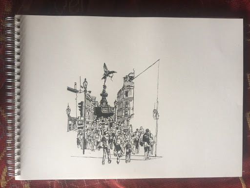
Beautiful Britain - Piccadilly Circus A4 fineliner


Today’s drawing is of Piccadilly Circus in London. If you’d like a print of it, either drop me a line at londinius@yahoo.co.uk – or, even easier – you can buy a printable copy in my Etsy shop

https://www.etsy.com/uk/shop/DaveClarkPortTalbot 

Right then, let’s start. Now this is the most complicated scene that I’ve set out to draw since my sketch of Chester’s Eastgate last week. So I’m afraid that my modus operandi was never going to allow me to be methodical about working left to right. Even though it’s deliberately some way to the left of the centre of the scene, the focal point is obviously Eros, so that was where I had to start. Incidentally, you maybe already know this – but the statue we commonly call Eros isn’t actually Eros. Nor is it the Spirit of Christian Charity as some have tried to claim. No, Alfred Hodges Baily’s original aluminium statue represents Anteros, the twin brother of Eros. Anteros was the God of Platonic Love, while Eros was the God of Romantic Love and Naughty-naughties. 

I also sketched in the two larger figures below the fountain, as these would provide useful markers to help me put in other figures. Speaking of markers, I found the street lamp to the left to be a useful upright marker as well.


In the second photo you can see that I’ve been working my way downwards from the fountain. Firstly I completed the family group of figures by drawing in the mother, and the older child holding her hand. Then I filled in the figures between them, the fountain, and the street lamp. I find it useful when I’m doing a complicated street scene with so many figures like this to complete a ‘slice’ through the scene like this, as it gave me markers for the size of figures on the fountain, then below it, and so forth.

I also drew in the lamp post to the right of the fountain. This was going to help when I started on the buildings on the right. To the left, just beyond the lamp post I’ve started to put in a double decker bus. 

By this next picture you can see that the most obvious development is that I’ve start to put the buildings in. From the fountain to the centre on the right, and from the fountain to the lamppost on the right I’ve put in quite a lot of the detail, and I’ve also extended the roofline on both sides. This just makes it so much easier to keep perspective as you’re moving from the background in the centre, to the foreground at either side of the scene. I’ve also added more figures. For some reason I just didn’t want to do all of the figures in one go. I found it better to grow the scene outwards from the centre.

If you look at the right hand side of the picture it may give you an idea of how I work. There’s a traffic light which meets up with the vertical where two building divide, and so I filled in all of the figures up to that point. Perversely, though, once I’d done that I went back to the buildings on the left. 


I knuckled down at this point to try to complete the drawing up to the left hand edge. So as well as drawing in the buildings, I’ve also drawn in figures, finished the bus, added a transit van, and the steps some people are sitting on. As it is I did do a tiny bit more work on the left hand side, extending the traffic island and adding a keep left sign, but that was hardly onerous. All of which left the right hand half of the sketch.

 Actually in terms of surface area I had about half of the sketch to do, but in terms of work it was quite a bit less, since it’s mases of figures like those clustered around the fountain which take a lot of time in a complicated sketch like this one. There were still figures to add, but none quite so time consuming as we’d already done. I often feel like I’m on home ground when I’m drawing in the details of a building and by the time I’d got as far as when this photograph was taken I already had something whereby, if I’d cut off the blank paper remaining, I’d have still had a decent sketch. It wasn’t what I was planning, though.


This penultimate photo demonstrates again how I was working. You can see that I’ve already drawn in the figures as far as that piece of street furniture ( it’s something to do with electricity – stop me if I get too technical). I’ve started drawing in the details of the building above them. By this stage I’d made the decision that I’m going to keep the buildings which are on the further right of the picture largely unshaded.


So that’s it. I didn’t have room to sketch in the Lillywhite’s sign in its entirety – in a way, though, it’s quite funny that I have that sign where the buildings are unshaded. All in all, it must have taken a good 5 or 6 hours today. I’m getting slower in my old age.

Friday 21 August 2020

Beautiful Britain - Durham Cathedral A4 fineliner


If you’re talking or thinking about Beautiful Britain, then sooner or later you’re going to need to get to Durham. I visited Durham for the first time by train, and arrived on a Sunday evening in February. The sight of the Cathedral, all lit up on the top of the hill was absolutely magical. 

Here’s a few photos I took while I was drawing this picture this morning. 

As with the St. Paul’s drawing earlier this week, this was carried out on an A4 pad with a 0.03mm fineliner pen. I didn’t actually start the sketch quite at the extreme left hand edge. You can see two towers, and the left hand one was where I started. Again, no grid, although if you don’t have confidence in your own dead-eye reckoning then I can certainly see why you’d want to use one. Once I’ve got my marker in – in this case that tower – then I can go about building outwards. One thing I did say to myself was that I was going to try to be a little more disciplined and not flit from feature to feature. So I worked on the cathedral building up to the point where the main tower starts to rise from it, then all of the foliage to the building’s left, and then all of the foliage beneath what I’d already sketched.

Carrying on this principle of completing one part before moving onto another, between the first photo and this one I sketched in the main tower. And not much else. I did put in the part immediately below the tower, at least, so you can see that I am at this point trying to stick to my resolution. I’ve also put in the outlines of the next part of the cathedral I’m going to work on.


This shows how I finished the cathedral then sketched in the buildings and foliage below it. In all honesty, it really isn’t difficult to draw a gothic cathedral. It’s almost all straight lines, for one thing. If you can draw a reasonably straight vertical line, you’re halfway there already. If you can also draw reasonably straight horizontal lines and diagonal lines, then you’re all of the way there. Like anything else, it’s a matter of looking really careful, to see how the different lines relate to each other. 

At this stage it looks like we’re slightly over halfway there, but as with the St. Paul’s sketch, appearances can be deceptive. The most fiddly part of what’s left at this stage are the buildings on the right, but these are only small when compared with the cathedral, so it’s possible to suggest what’s there rather than try to depict them in detail. 

Most of the buildings done by now, with only the foliage and the distant hills to do, neither of which is especially irksome. The difficult thing abot foliage in a sketch like this is making sure that you get the different textures and levels of shading. A mixture of more scribbly marks, and hatching lines of different directions, and also different spacing between them is what I used here to try to finish off the sketch. 

Here it is finished. The distant hill I decided would stand out better if I forewent any shading at all apart from the tree line at the top. The drawing gives an idea of the sheer size of the cathedral. If you look at the rose window, for example, there’s no other object or feature outside of the cathedral itself which even approached it in size.

Wednesday 19 August 2020

Beautiful Britain - Looking Across the Thames at St. Paul's - A4 fineliner


This is my latest Beautiful Britain Sketch. Unlike the previous sketches, this one is only A4 sized. I don't possess an A3 scanner, you see. 

If you'd like a copy of this sketch, it's available in my Etsy shop. For a ridiculously low price you'll receive a digital, printable copy of your very own, to print off and enjoy.
(We're all friends here, so I'm sure you won't mind me reminding you that all the images on this blog are copyright, nd any unauthorised reproduction or use is forbidden. )

There's a link to my Etsy Shop on the right, but in case you're that desperate to get there this instant, here's the link as well: - 

As with other recent pictures, I did take a few photographs while I was sketching it. This was A4 rather than A3. I don’t possess a large enough scanner to accommodate A3, but my scanner will accommodate A4. Scanning gives me the option of selling my art digitally on Etsy.


This sketch is all about two things – the dome of St. Paul’s gives a vertical focus, and the bridge across the Thames gives a horizontal focus. I eye-judged where I wanted the dome to be, and then sketched it in to start. The rest of the background above the bridge is all about how it relates to the dome, and so once the dome was sketched in, then I reckoned that it should be relatively simple to sketch the rest of the background in. 

I could quote you chapter and verse about the history of St. Paul’s, but you’ll probably be glad that I won’t. But as a Londoner myself, and a proud one at that, the sight of St. Paul’s is one of those things which just makes me feel good – Tower Bridge, the Palace of Westminster and the BT Tower all have the same effect as well. 


Once the Dome was in I put in some of the first lines of the bridge, extending it to over halfway across the page. Then I drew the background buildings between the left hand edge and the dome. 

If you read my previous post about the Newcastle sketch, you might recall that I mentioned that there is usually a point in a sketch where you start to think that the sketch is looking as if it will turn out to be a LOOR (load of old rubbish). This was that point. I wasn’t happy with any part of this sketch, but I’m experienced enough with my own work to know that if you just push on and keep working steadily through, the end results usually turn out alright.


 As I got more involved in making the sketch, I forgot to take any more photographs, so this is the last one. The sketch here looks better than the previous one, because the little over half that has been completed gives a good idea of what the whole will be like. Actually, although the sketch at this point only extends a little over halfway across the page, well over half of the hard work has been done. If you look at the finished sketch at the top of this post, you’ll see that most of what’s left is the bridge, so while it had taken maybe 2 and a half hours to get this far, what was left required a little less than an hour. 

Monday 17 August 2020

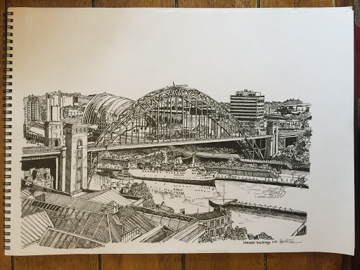
Beautiful Britain - Newcastle Upon Tyne - Tyne Bridge


People who see my drawings often make comments like – I don’t know how you can do this – or – I wish I knew how to make something like this. So I thought it might be interesting to try to take you through the process. This isn’t a tutorial – I don’t feel qualified to teach anyone how to draw. Apart from anything else, I don’t want to encourage anyone else to pick up any of my bad habits.

So, this latest sketch is of Newcastle Upon Tyne, and the Tyne Bridge, one of my favourite bridges. Since this is a detailed sketch which I wanted to spend time over, I used photographic references. When using photographic references, I know that a lot of artists would use a grid . This is especially effective if you are looking at your photograph online, as it's very easy to superimpose a grid upon it. I’m afraid that the big kid in me just wants to get started committing ink to paper, and so I try to do the work of the grid with my eye. I try to judge the proportions with my eye. 

Here’s the first photo I took during the sketch.You can see that the bridge towers on the left have been more fully sketched in than any other feature at this point. This is because I made the conscious choice to start with the closest tower. I took some time to judge just how far from either side of the photograph the tower was, and how far from the top and bottom it extended. The next step was to draw in the roadway on the bridge, and the opposite tower.

You might notice the large roofs at the bottom left hand corner. I didn’t want to sketch them in completely at this stage, until I had more details around the bridge sketched in to help me judge angles and distances.

If this had been an A5 sketch, or even an A4 sketch I probably wouldn’t have sketched in the outline of the arch of the bridge this early. However, I thought it would e a good idea to do it now, because the arch of the bridge would give me a good marker against which to place various background and foreground features. This required nerve and confidence, though, because at this stage, the arch is always going to look awful.

By the time I took this second photo, having the bridge roadway and the arch sketched in gave me the markers I needed to begin to sketch out the roof line at the bottom of the page a little further. Then I wanted to take on the next big feature, the undulating, almost hump backed silver building behind the arch of the bridge. Once I had the outline of this building it enabled me to sketch in the background to its left. Once I’d added detail to this building, then this encouraged me to draw in some of the cross beams of the arch. Now, I have to be honest, I was never happy with the arch of the bridge, and I did try minor surgery while I was filling these parts in, but at the end of the day once you’ve committed you really have to make the best job of it that you can. I also put in some of the stays, tying the roadway to the arch. It made sense to put these in, to make sure they look like they are in front of the background buildings.

Another big feature that I wanted to place onto the paper was the ship. I believe that this is the famous Tuxedo Princess nightclub. I’m not in the habit of making complete outlines of specific features of a drawing before I start to add in the detail, but I did in this case. I just thought that it was such a complex scene that I really needed to see how a big feature like this fitted into the scene, and the best way to do this was by putting in a basic outline.


By this third photo you can probably see how I’ve added detail working from left to right. What does surprise me looking at the photograph is at this point I still hadn’t put in all of the stays holding the roadway to the arch. In all honesty it would have made a lot more sense to have sketched all of them in now. I’m afraid that this highlights one of those bad habits I mentioned earlier. I’m a real butterfly. I lose a bit on interest in the bit I’m working on, so flit away to work on something else for a little while. What can I say – I don’t even realise I’m doing it while I’m doing it. I’ve added more detail and definition to Tuxedo Princess by this photograph.

I’ve also by this stage started the construction of the far end of the bridge. I haven’t started sketching in the towers yet, but the part where the arch finishes beneath the roadway is there, and this is vital for my eye measuring of the towers, which would follow. At this stage, though, I didn’t want to start filling in detail this far right in the picture until I’d added more detail working from the left towards the centre. That would all have to wait though, since this was the photo I took before putting away the sketch for the rest of the evening.


I took this photograph after maybe half an hour’s work this morning. You can see how I’d sketched in more of the details behind the bridge, and, at last, all of the supports holding the roadway. There’s a lot of serious hatching and cross hatching been put into the roofs at the bottom of the page as well.

I’d extended some of the detail of the girders and the lattice work further around the arch of the bridge. I find that whenever I am constructing a piece of art, there’s a point where you have to really hold your nerve, and tell yourself that however bad it may look now, it will come good in the end. That’s as true for my acrylic paintings as for my sketches – with the difference being that my sketches usually come good (to an extent) whereas my acrylic paintings – not so much. Well, with this sketch it was that arch, but by this stage I was feeling happier. It’s not that it’s technically any better than it was by this stage, but that the arch is blending in more with the background.

So, once I’d added more detail to the background behind the bridge, then I worked on the detail of the back ground between the bridge roadway and the ship. You might not haver noticed straightaway, but I did at this point also sketch in a suggestion of the reflection of the ship upon the waters of the Tyne.

As I said, I worked to complete the rooftop complex at the bottom of the page, and also sketched in a rather lovely curving parade of buildings. I was in two minds at this point whether to complete all of the lattice work on the bridge, but I felt that I would be better off sketching in the towers at this point. They would give me helpful markers for areas of the background which would be visible from the lattice work.


If you look at this fifth photograph it really doesn’t look as if I’ve added hardly anything to the sketch. Yet what I had done was important. I’d continued work on the background underneath the arch of the bridge, and everything has been outlined, it’s just some shading of foliage which needs doing.

In addition, I’ve sketched in the main parts of the lattice work for the whole of the arch. There’s still shading and detail to add, but the more details you add to a specific part of the picture, the easier it is to add further necessary details to it. I’ve also started some of the necessary detailed work on the underside of the arch.

Looking forward to working on the background above the bridge roadway on the right hand side of the picture, I also sketched in the outline of the largest building in this part of the scene. This would provide a valuable marker. In all honesty I wasn’t really worried about this part of the picture, to much as with what was going on by the waterline, which was far less clear in my reference photograph, and it was the time give it some serious though about how I was going to make sense of it, and convey this in the picture.


This is the last photograph I took before completing the sketch. You can see that I’ve sketched and shaded the detail into the block on the left, and also extended the bridge roadway to help me divide up the areas of background left to do here.

As for the waterline, well the solution I came up with was a combination of darkness, shaded walls the deck just above the waterline, and areas of foliage of differing amounts of shading.

I’ve also sketched in the last large feature of the scene, the jetty at the bottom to the right. You may have noticed by now that we’re not looking like we’re going to get as far as the right hand edge of the page. Quite right. Accident or design? Well, it was just the way that it was working out, if that’s what accident means. Oh, that is what it means, fair enough. Which is another good example of why I said at the start that I don’t want you picking up any of my bad habits.

What remained to do after this was to finish suggesting the buildings and features of the background to the far right. Darkness, shading and foliage largely took care of what was underneath the bridge roadway as far as the waterline. Some graduated shading  underneath the jetty and the hint of a bridge linking it to the bank, and we were done.