Showing posts with label John Tenniel. Show all posts

Monday, 24 March 2025

John Tenniel - first Alice illustrator. And greatest?

I’ve written a lot about Edgar Thurstan and the relationship between the 21 illustrations of the Alice books he made for the 1930 Odham’s combined edition, and the original illustrations by Sir John Tenniel. For me, as for many other lovers of the books, Tenniel’s illustrations are the vision that I see in  my mind’s eye when I read the books again.

Why should this be? Especially when you consider that they have a 1951 Disney animated movie to contend with. It can’t be just because they came first , could it? Well, no, While I think being the first (published) helped establish Tenniel’s rendition of Wonderland in public consciousness, if they had been just mediocre they wouldn’t have lasted. And they’ve lasted alright – boy how they’ve lasted.

I think we can find at least part of the answer by asking the question – why did Lewis Carroll want Tenniel to make the illustrations in he first place? Carroll doesn’t often get credit for this, but I think he really understood how important illustrations would be for his story. He wrote it in manuscript form as Alice’s Adventures Underground, and accompanied the handwritten text with 37 of his own hand drawn illustrations, and presented it o Alice Liddell for Christmas in 1863. When he conceived the idea of having the book published he borrowed the manuscript and asked some literary friends to try it with their children. They were very positive about the text, much less so about the illustrations. Carroll, to his credit saw the recommendation to get a professional illustrator for what it was. Good advice. He recognised what Tenniel could bring to the party – the fact that he held off publishing Alice Through the Looking Glass for several years until Tenniel could be persuaded to illustrate it shows how essential he thought Tenniel was.

Why, though? Tenniel had already illustrated several books prior to making the illustrations for Wonderland, but he was best known as a cartoonist for Punch magazine. From 1850 he shared the duties of cartoonist with John Leech – the illustrator of Dickens’ A Christmas Carol, until becoming sole cartoonist on the death of Leech in 1864. It seems that Carroll was drawn, should you pardon the pun, to Tenniel through his great facility rendering anthropomorphic animals, and his unusual habit of drawing from his prodigious visual memory without using models or drawing from life. Did he perhaps see in Tenniel a man capable of creating worlds out of his imagination?

I personally feel that Tenniel’s illustrations demonstrate tremendous strengths. Namely –

Tenniel showed a fine ability to align his illustrations with the text, both literally and metaphorically. Tenniel followed the story. His illustrations show what Carroll wrote. In fact, he showed imagination in the way that his illustrations linked physically with the text, particularly in the L shaped illustrations of Alice looking up at Humpty and the Cheshire Cat, for example. The two side of Alice passing through the looking Glass on opposite sides of the page, and the two sides of the page showing the transformation of the Red Queen into the kitten show great innovation.

Tenniel managed to take what were sometimes sparse descriptions of the characters’ appearance and create archetypes of these same characters. A great example of this being the Hatter. (The Cheshire Cat tells us that he’s mad, but Carroll always refers to him as just The Hatter). It’s not an exaggeration to say that pretty much every depiction of the character since has been influenced by Tenniel. Illustrators are faced with the stark choice of borrowing aspects of Tenniel’s Hatter, or producing something that is deliberately made to be as different from Tenniel’s as possible.

I think that at least part of what makes Tenniel’s work on the Alice books so effective is that he doesn’t do sugar or saccharine. Even in the illustrations for the earlier chapters of Wonderland, he never really gives us anything cute, for want of a better word. Using monochrome with sometimes heavy shading means that even his brightest illustrations have shadows. Add to this his willingness to use relatively grotesque caricature. What Dickens achieved with words with, for example, a character like Sarah Gamp in “Nicholas Nickleby” Tenniel achieved with his drawing of the Duchess.

More than many of the illustrators of the Alice books who would come later, many of Tenniel’s illustrations reward the viewer who takes a second, more detailed look at them. While many who came after would concentrate on characters while giving merely the hint of a background, there’s a real richness to many of Tenniel’s backgrounds, especially the outdoors scenes. On first glance you might not notice the glass houses behind the Queen of Hearts, or the eel traps behind Father William when he is balancing an eel on his nose. They’re here. They don’t strictly need to be there but they add texture. The first time that you looked at the Duchess’ first illustration, did you notice the smiling cat by her feet? It’s the Cheshire cat before he is even mentioned as such.

I mentioned that Carroll seems to have appreciated Tenniel’s facility with anthropomorphic creatures which you can see in his illustrations of the fish and frog footmen. But he goes even further than just depicting living animals as people. For Tenniel was s wonderful fantasy artist even before anyone had conceived of that term. His sleeping Gryphon is a wonderful illustration, while his jabberwock is nothing less than a tour de force. Personally I think that this one illustration justifies the price of admission by itself.

--------------------------------------------

So, when you get right down to it I think that while other illustrators may have illustrated parts of either novel more effectively than Tenniel did, I think as a whole, as a set of illustrations they are unmatched. Which is ot the same as saying that they are beyond criticism.

I’m not totally sure exactly how I feel about Tenniel’s depiction of Alice. With her pinafore dress, and her long blond hair with its eponymous Alice band, Tenniel gives us another archetype. Even an artist as distinctive as Ralph Steadman gave us an Alice with the band, the hair and the pinafore dress. My issue with Tenniel’s Alice is that there is not a lot of life about her. Alice doesn’t do much more than standing or sitting listening to and looking at other characters, or reacting to something. In some illustrations she resembles a porcelain doll, and she’s about as dynamic as one too.

This is a criticism you can extend to many of Tenniel’s illustrations. In many of these his characters’ positions are beautifully observed, but they are poses. We, the viewers are looking straight on at characters who resemble actors who have been carefully placed in a tableau on stage, and are holding perfectly still.

Of course, it’s a bit much criticising Tenniel for not being more cinematic in his compositions when it was decades before cinema was even invented. But it’s clear how static many of his illustrations seem when you compare the slow and steady rise out of the chimney his Bill the Lizard makes, compared with the explosive lizard expectoration in Harry Rountree’s depiction of the same scene.

-        - -

Well, nobody’s perfect and trust me, it is far easier to criticise than to do something that other people can criticise. To me, Tenniel’s work is the standard against which all Alice illustrators must be judged. It’s that simple.

Saturday, 8 March 2025

More sketches in the new Canson Sketchbook

I’ve been doing a little more work in my new Carson mixed media sketching journal today. I mentioned that I like the way that it takes fineliner when I tested it and made my first sketch in it on Monday. After making two ink sketches in it today I stand by that. It’s quite similar to sketching in the Seawhite Travel Journal, I find, even though the paper in the Seawhite is much lighter at only 130 gsm.

So this first sketch is a copy of one of the Harry Rountree (1928) illustrations of the Pig and Pepper chapter in Wonderland. Now, I’ve made most of my other Harry Rountree copies in the Royal Talens book. What I find with that is that you have to use a thinner nib whenever you’re doing something a little more detailed. I was perfectly happy with a 0.1mm nib to make this sketch. I found it gave me a lot of control and meant I could sketch pretty accurately. In fact I’m sure I could have used a nib that was a least twice as thick and achieved just as good results.

So this encouraged me to try it out with a copy of an Edgar Thurstan illustration. This is my copy of Edgar Thurstan’s illustration of Alice entering the Looking Glass. I think it has come off a wee bit better than the copies I made in the Royal Talens book using the same nib. Here it is:-

I think I should also point out that this was made on the other side of the page on which I made the watercolour and ink sketch of Disneyland Paris. The paper is so robust that you can do this without ay issues at all.

Here's the same sketch alongside my copy of the Tenniel illustration. Tenniel’s illustration is accompanied with a Mirror image illustration of Alice emerging on the other side on the reverse of the page. Edgar had to do it all in just the one illustration.

I think Edgar gets maybe just a little further away from Tenniel in this one than he does in quite a few of his other illustrations. Alice has a glass dome clock to her right in both illustrations. The interior of the fireplaces are similar. To her left Tenniel’s Alice has a vase under a dome. There’s a similar vase on Thurstan’s Alice’s left, but this doesn’t have a dome. There’s also a more prominent vase on the right too. Tenniel’s mirror is square, while Thurstan’s is a more ornate, bowed shape. I some was I’m put in the mind of the way that Edgar worked on Tenniel’s original with the train carriage illustration. In both, if I can use a photographic analogy, he's not only positioned the ‘camera’ to look down on he scene from a bit of an angle, he has also zoomed out a little which means he gets to show more of the scene than Tenniel does.

I have to say, this was another of Edgar’s illustrations that I have thoroughly enjoyed copying. I don’t think I can put poor old Edgar up on a pedestal with Tenniel, because a lot of his illustrations to seem so derivative. But then, if you’re going to be derivative, the do it well and do it interestingly and I think that Edgar certainly manages to do this.

Monday, 24 February 2025

A difference between the 1860s and the 1930s

When you’re making a copy of someone else’s picture, one of the benefits to be derived from it is that you learn a lot about the original while you’re doing it. This makes sense when you think about it. You can’t, well, I can’t copy a picture, or a photograph or even draw from life without looking, looking, looking. I’ve written about my ‘method’ before – which is maybe making it sound more systematic than it really is – of mentally dividing parts of the original into a series of small drawings and reproducing these which eventually combine to form the big picture. Working this way I find does help me to focus on the detail of the separate parts of the picture.


I’m getting a little away from the point I’m going to make. This morning I made a copy of Edgar’s illustration of the fish and frog footmen from Wonderland. Here it is compared with my copy of Tenniel’s illustration of the same scene. The hallmarks of Edgar’s use of the Tenniel original to inspire his work are evident. This is a bit like a mirror image – what’s on the right in Tenniel’s is on the left in Edgar’s and vice versa. The figures are very similar in both, right down to the position of the frog’s legs, and the frock coat worn by the fish. And . . . the fact that the position of the viewer is shifted, so that we are looking slightly down and slightly on he diagonal, compared with Tenniel’s figures. With Tenniel, we the viewers are largely on a level with the figures who are directly in front of us.

Maybe I have an explanation for this. Work with me. For me, it’s the difference between watching a story play out in a theatre on a stage, and watching a story play out on film. Tenniel puts the viewer in the position of the audience in a theatre. Cinema had not been invented when Tenniel made his Alice illustrations. Edgar puts the viewer in much more interesting positions, just as a film director could do using cameras in different positions. Now, I’m not saying that Edgar was consciously trying to be cinematic in his approach. But in the 1930s, when I believe Edgar made his illustrations he was living in a world where cinema had already shown us all different ways of looking at the world.

Well, it’s a theory anyway. What’s not a theory, but a fact is that my admiration for Edgar’s technical skill increases with every one of his illustrations that I copy. You know, I think that I’m pretty decent at copying Tenniel’s work. But if you said to me, well this is what you have to do – you make a mirror image copy, but then you have to also shift the viewpoint upwards, and on the diagonal – well I don’t think I would produce anything decent if I tried to.

For the record his is my tenth copy of an Edgar Thurstan Alice illustration, out of just 21 illustrations he made in total. My eleventh copy is this one below. I think that these latest two copies are probably the best ones I’ve made of Thurstan and it’s probably because I used a nib only half as thick as the 0.1mm nib I used on the others.


Sunday, 16 February 2025

Copying Thurstan again - easing my way back into sketching

Hi, how are you doing? Me? Well, I haven’t posted anything here since completing the text and illustrations for ‘Alice’s Adventures at the Poles’, no. That’s partly because I haven’t hardly produced anything since. You know how it is – I have to give my new day job the effort and dedication it deserves, and so a lot of the time I just haven’t had the oomph to sketch in the evenings or weekends. I do make a little money out of my art, enough to provide spendsies for my overseas sketching trips, but it’s not my living so I do have the luxury of being able to leave it for a bit when I’m not feeling it.

So up until the last week, the only sketching I’ve done at all recently was during a weekend in Oslo in January. I’ll write about that in a future post – probably. But by Friday just gone I could feel my sketching mojo coming back. But what to sketch? Ideally it would have been nice to copy one of John Tenniel’s Alice sketches – stick with what you know and what you enjoy, innit? But I’ve copied every sketch he made for Alice in the past and I don’t want to do it again. So what was the next best thing? Well, yes, I could have gone for one of the other great Alice illustrators and done another of theirs. I haven’t coped all of Mervyn Peake’s, or Ralph Steadman’s, of Charles Robinson’s etc. etc. But I wasn’t feeling it. I wanted to do a Tenniel style illustration. Which is what led me back to Edgar Thurstan.

In case you haven’t read my earlier posts on this subject I will try to summarise as best as I can. I fell under the spell of the Alice books through an edition, published by Odhams in the 1930s that my grandfather had bought. In my ignorance I had always felt that it contained some of the original Tenniel illustrations. Towards the end of last year I bought a copy of this exact same edition for pennies on ebay, and found out that the 21 illustrations within it were made by one Edgar Thurstan. But they are so clearly inspired by Tenniel’s work that I think my confusion is forgivable. For what it’s worth I think that Odhams wanted the Tenniel illustrations but didn’t want to pay the commission for them to the Tenniel estate. The rights remained with the estate until the 1960s. So I guess they set our Edgar to his work with the instruction to make them as much like the Tenniel originals without breaking copyright as he could.

I copied the Thurstan illustration of Alice in the train carriage  and compared it with my copy of Tenniel's original to prove my point a couple of months ago.

I also commented that the illustrations where Thurstan shows more originality and goes further away from the Tenniel originals are less effective in my point of view. Well, maybe that’s a little unfair. Here’s the copy I made on Friday of Alice meeting the Red Queen in Looking Glass.  Below it is my copy of the Tenniel illustration of the same scene


You’ll notice the more creamy coloured paper of the Thurstan copy. This is because I used my trusty Royal Talens book for it. Not sure why I feel this way but I always enjoy sketching in it. Now, this is similar to the Tenniel in the style – the extensive hatching and cross hatching. The use of trees in the background gives the composition a little similarity. Thurstan, though, has done what he does elsewhere by transposing the positions of the figures. In this one though his Alice is in a different pose to Tenniel’s, curtseying (it saves time). The figures of the queens are quite different too – Thurstan ignores the angularity of Tenniel’s queen, and the fulness of her face seems to owe more to Tenniel’s Duchess or Queen of Hearts. Both wear crowns which look to be inspired by the top of the Queen piece in a standard Staunton chess set. Compare the next picture I copied, also of the Red Queen, with my copy of Tenniel’s:-


Compositionally there’s more similarity between these two. The position of the hands, and the Queen’s staring eyes come to mind. Ironically Tenniel’s is now fuller faced while Thurstan’s is more angular. Yet I have to say that I really like what Thurstan did with the Queen’s arms and hands. Again, he’s made a figure that is more animated than Tenniel’s original.

Okay, so we come to one of the illustrations that I did think inferior to Tenniel’s by some degree. Here’s my copy of Tenniel’s illustration of Alice meeting the caterpillar in Wonderland above Thurstan’s.


This is an interesting one. Again, Thurstan has done his mirror image trick of reversing the positions of the figures and even some of the background details like the smaller mushrooms. The Thurstan hookah is pretty much the same as Tenniel’s. But the big difference, the huge difference, is the caterpillar. Tenniel, to be fair, doesn’t give us a lot to work with in the original. The caterpillar has its back to us and he doesn’t give us much more than the clever use of what might be the forelegs of the caterpillar to suggest the profile of Mr. Punch. So here Edgar really bites the bullet and ignores Tenniel’s caterpillar completely. His caterpillar is a hairy one. And it’s actually pretty well modelled too . . . apart from that face.

You know, I must have been quite inspired by this illustration when I was tiny because the caterpillar has always been one of my favourite characters. But the face of it . . . well, it’s just wrong I’m sorry. It’s too simple, too sketchy and cartoony. It’s out of place here, and it’s a shame because I have come to really appreciate everything else in this illustration through trying to copy it. But it’s surely a case of inspiration failing Edgar when left to his own devices.

Between making the second and third sketches yesterday I tried again to find out anything I could about Edgar ‘E.B.’ Thurstan, and once again I pretty much drew a blank. The only references I could find were for a few works he illustrated for Odhams in the 1930s and the majority of those references were to Alice. And for that matter most of the references to Alice were specifically to the Humpty Dumpty illustration in Looking Glass. So I don’t know. It’s possible, I suppose, that Edgar was not under instruction from Odhams to make his illustrations like Tenniel’s. Perhaps he was under pressure, inspiration failed him and so he decided to use Tenniel’s work as a starting point. Who knows?

Whatever the case, although I know next to nothing about Edgar, I salute him. For the most part, loving your work, sir.

Sunday, 6 October 2024

There Goes Bill

You already know that it’s hard for me to find time for drawing in the evenings since starting my new job so I won’t go through all that again. Still, this weekend I’ve managed to work through the block I’ve had on writing the next chapter of “Alice’s Adventures at the Pole”. I haven’t finished it yet, but I think about 1000 more words will do it and I know exactly what to write and how to get to the end of the chapter. I’m just not forcing it. I will possibly finish writing the chapter this evening.

In celebration I spent quite a bit of time yesterday working on an illustration. In my first illustration showing Alice’s features I spent a long time before getting it right and the final version was actually my third attempt. Well, yesterday I spent quite a long time on the first attempt at the next illustration, before realising that it wasn’t going to work. 

Yes, that is a Walrus, and yes, I am conscious that one of the most famous and beloved poems in the Alice books is “The Walrus and the Carpenter” recited by Tweedledum and Tweedledee in Looking Glass. Well, this is the same character. If it was good enough for Lewis Carroll to resurrect characters from the first book in the second, then it’s certainly good enough for me. I shan’t at the moment explain just how he features in the story though.

The connections with Tenniel’s Walrus are fairly obvious. Although my head is more detailed than Tenniel’s, the clothes he wears are very similar, with the spotted bow tie being the most obvious difference. Tenniel’s wears a plain bow tie. However I did do something different with the flippers. Tenniel’s walrus has front flippers that are rather more like a seal's. They are a little more elongated than a walrus’ flippers and they have little definition. With my walrus I exaggerated the qualities that make a walrus’ flippers different from a seal’s, shortening them a little and highlighting some of the detail.

------------------------------

Well, that’s my Alice story and illustrations. On Friday I made some more copies. Last week I looked at the way some different illustrators chose to illustrate the Hatter. This week I wanted to look at another character who I think is difficult to be original with, namely, Bill the Lizard.

This is what Lewis Carroll wrote,

“she made out the words: “Where’s the other ladder?—Why, I hadn’t to bring but one; Bill’s got the other—Bill! fetch it here, lad!—Here, put ’em up at this corner—No, tie ’em together first—they don’t reach half high enough yet—Oh! they’ll do well enough; don’t be particular—Here, Bill! catch hold of this rope—Will the roof bear?—Mind that loose slate—Oh, it’s coming down! Heads below!” (a loud crash)—“Now, who did that?—It was Bill, I fancy—Who’s to go down the chimney?—Nay, I shan’t! You do it!—That I won’t, then!—Bill’s to go down—Here, Bill! the master says you’re to go down the chimney!”

“Oh! So Bill’s got to come down the chimney, has he?” said Alice to herself. “Shy, they seem to put everything upon Bill! I wouldn’t be in Bill’s place for a good deal: this fireplace is narrow, to be sure; but I think I can kick a little!”

She drew her foot as far down the chimney as she could, and waited till she heard a little animal (she couldn’t guess of what sort it was) scratching and scrambling about in the chimney close above her: then, saying to herself “This is Bill,” she gave one sharp kick, and waited to see what would happen next.

The first thing she heard was a general chorus of “There goes Bill!” 

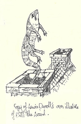
This little episode where giant Alice boots Bill the Lizard back up out of the chimney has proved a very attractive one to illustrators through the years. Now, I do think that a lot of illustrators have drawn on Tenniel’s illustration of Bill. However, I also believe that Tenniel himself drew on Lewis Carroll’s original.

If you’ve followed my blog posts on the illustrations of the Alice books, then you’ll probably know that Lewis Carroll first wrote some of his stories down at the urging of Alice Liddell, and presented the handwritten manuscript to her as a gift for Christmas 1864. The manuscript contained over 30 of Carroll’s own illustrations to the story. It is now in the British Library.

Carroll took advice about publishing the story with his own illustrations after which he engaged John Tenniel to provide the illustrations. So before we look at any of Carroll’s illustrations let’s accept a couple of facts.

Lewis Carroll never claimed to be an artist or an illustrator.

The first facsimile of Carroll’s original manuscript was never published until a relatively short while ago, so during his lifetime only a handful of people would ever have seen his illustrations.

So, bearing that in mind, here’s my copy of Carroll’s own Bill illustration.

I’ve never copied one of his illustrations before, partly because he was an amateur, and I’ve been afraid that my amateurish deficiencies might magnify his. I think that the Bill illustration is one of his better ones. For one thing the mathematician clearly knew a bit about perspective, from the way he drew the roof and chimneys. It looks to me as if, like many young men of his class and background, he probably had lessons in drawing when he was growing up, as he does use some shading and I’ve already mentioned the perspective.

Okay, now let’s have a look at Tenniel’s –

So one glance comparing the two shows that this is the work of a very accomplished masterful illustrator, while Carroll’s is the work of an amateur. Tenniel’s Bill is more lizard like as you’d expect. He was a master of shading and uses it far more effectively and extensively than Carroll could. He knows that Bill and the chimney are what’s important to the scene so doesn’t include any more than this.

Now look again and see just how Tenniel has drawn (pardon the pun) from Carroll. Both Bills are in pretty similar positions. The shape of the tail makes me think of a snake rising from a snake charmer’s basket. Carroll’s Bill seems to hover in mid-air, while the only thing about Tenniel’s illustration to suggest any movement at all is the smoke rising from the pot underneath him.


Compare this with the copy I’ve recently made of Harry Rountree’s Bill.

The composition to me draws on Tenniel’s which as we’ve seen draws on Carroll’s. Like Tenniel, we see the chimney pot and Bill coming out of it, just as with Tenniel. As fine an illustrator as Harry Rountree, though, wouldn’t just largely copy Tenniel. So he has Bill upside down, which to my mind works really well. Harry Rountree was renowned through his life as a great illustrator of animals and birds, and his Bill is even more convincingly Saurian than Tenniel’s. Unlike Tenniel, Rountree uses motion lines and has soot rather than smoke being expelled with Bill. This gives it a really explosive quality. It’s my favourite illustration of the scene.

We’ve seen before that one of the illustrators who often got further away from Tenniel than most others was Mervyn Peake. Here’s his Bill.

Like Rountree he chooses to use motion lines, but doesn’t depict the chimney. Bill’s whole body is curved sinuously and he’s fully clothed. It’s an interesting choice, but for me it’s a rare occasion when one of Mervyn Peake’s illustrations doesn’t somehow give the scene the movement that you’d expect based on what he achieved with other scenes from the story.

So I’ll finish this post with a look at my copy of what Ralph Steadman did with this scene.

It’s very easy to look at Ralph Steadman’s illustrations of both Alice books and say, well, they’re nothing like Tenniel’s. And of course when you put them side by side it’s far easier to see the differences than the similarities. But it’s still Bill rising head first out of the chimney – and that’s what Tenniel drew. This has far more of an explosive quality than Tenniel’s – like Harry Rountree he uses motion lines underneath Bill, and there’s soot being expelled along with the lizard. The originality of this sketch, apart from the comical expression on Bill’s face, is the way his cap is rising faster than he is, suggested by the motion lines. I’m intrigued that Ralph Steadman gave him a cap – was he possibly influenced in this by the depiction of Bill in the Disney film of the fifties?

Sunday, 29 September 2024

Sketching the Hatter

Let’s start with a bit of context. In the summer I officially retired from being a teacher. Last Monday I started in my new proper job, a temporary position working in admin for the Community Dental Service, part of the NHS. I’m enjoying it a lot, however it does mean that I don’t have the time to draw and paint during the day and having been staring at a screen all day my eyes are too tired when I get home. So I haven’t made a huge number of pictures this week.

However, I have been looking more closely at the way that Tenniel’s successors have chosen to portray the Mad Hatter. Before that though, it’s worth noting that from his very first appearance of the Mad Hatter in Wonderland in Chapter VII – A Mad Tea Party, Carroll tells us what the Hatter says and what he does, but not what he looks like. Oh, and he never calls him the Mad Hatter either. He is first mentioned in the book when the Cheshire Cat offers Alice the chance to go one of two ways – one way she’ll meet a hatter, and the other a march hare, and he says that they’re both mad. The tea party doesn’t even appear in Carroll’s original manuscript “Alice’s Adventures Underground, so Carroll never illustrated him. So we have to start with Tenniel, and it must be fair to assume that Carroll was happy with the choices that Tenniel made. As always all of the illustrations on this page are my own freehand copies of the originals.

Despite never appearing in the original manuscript Carroll must have liked the Hatter, for he brought him back in Looking Glass. Across the two books Tenniel included the character in no fewer than 7 illustrations. In Tenniel’s illustrations he is a small man with short limbs and an overly large head. His most distinctive facial feature is his beakish overly large hawk nose. He wears a large spotted bow tie, and a top hat which has a ticket stuck into the band saying ‘In this style 10/6”. His hair is long and just a little wild. As I said, Lewis Carroll wasn’t exactly backwards at coming forwards when Tenniel did something he didn’t like with the characters so he must have been happy with this visual representation.

Tenniel’s is the definitive depiction of the Hatter, so much so that subsequent illustrators have found it difficult to get away from it. I haven’t yet copied Arthur Ransome’s, yet I have copied illustrations by his contemporaries Harry Furniss and the Robinson brothers, Charles and Thomas. Here’s Harry Furniss:-

At first glance this doesn’t seem to look like Tenniel’s Hatter, but that probably has more to do with the great animation of this figure. Harry Furniss was a colleague of John Tenniel’s so it’s no great surprise that this does actually bear similarities to Tenniel. There’s the top hat with its ticket – although we can’t read what’s written on it. The high collar is very reminiscent of Tenniel’s. The nose is overly large, like Tenniel’s. This one does at least look a little madder – the hair is more wild and the eyes are popping.
Charles Robinson’s illustration of the Hatter looks a million miles away from Tenniel’s at least. He is dark haired and younger looking. He wears a top hat, but the hat he does wear is upside down which I guess is the concession to madness. He also has a remarkably long nose although his is much straighter than Tenniel’s.
Charles’ brother Thomas Henry (T.H.) Robinson’s illustrations of Wonderland are to my eyes less original and more traditional than Charles’ despite being made at pretty much the same time. His hatter is quite a tall figure with a head that is much more in proportion to his body – if anything it’s a little small. His hair is dark and short. However he wears the traditional top hat, albeit one without a ticket.  Again, his nose is overly large, but all in all he looks very sane.

Harry Rountree also illustrated the Mad Hatter as early as 1908, and then again in 1928. The 1908 illustrations are sumptuous watercolours, and in this edition the Hatter is clearly recognisable as a pretty close cousin of what we’ve seen before. His top hat has a rounded top, but his nose is very large. His concession to madness is having what looks like rolled up paper cones in each ear. 1928’s Rountree hatter is facially pretty similar to the 1908 version. The hat is a true top hat, and to be honest although the illustration is as technically well done as all of Harry Rountree’s work it just seems to lack a little originality.

Coming forward to the immediate post war period, Mervyn Peake at least gives us something completely different from Tenniel. Or at least, almost completely different.

Mervyn Peake’s hatter has an overly large nose and his hair is rather wild but those are the only similarities he bears to Tenniel’s. I purchased a second hand combined copy of both Alice books with Mervyn Peake’s illustrations during the last week, and I’m bowled over by it. I’ve written before about how, as much as I adore Tenniel’s work, his illustrations to the books are sometimes a bit static and this is a criticism you just cannot make about Peake’s work. Peake’s hatter seems to wear a mad combination of hats of different styles and I love the way there seem to be plants sprouting out of the top of it.

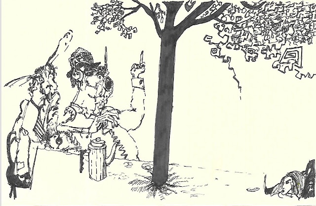
Ralph Steadman’s illustrations to both Alice books, from the end of the sixties and the beginning of the seventies are marmite to me – I either love them, hate them, or love them and hate them. I think his Hatter is in the last category. To me, the hare and the hatter look completely under the influence of some kind of narcotic – both are conspicuously smoking something and this is something that Lewis Carroll never wrote. The Hatter looks more animal than human here, although in other illustrations his face is more clearly human. Making this copy helped me appreciate the illustration more, but I can’t say that I really like it. But, it is without doubt something worlds apart from Tenniel. It’s interesting that Ralph Steadman chose to concentrate on the mad aspect of the character than the hatter. Nowadays we don’t have hatters any more. Maybe this is because of the association with Alice – we have milliners. The only concession to his profession with Steadman is what appears to be a bowler hat, and that is almost lost amongst headphones and other bits of headgear.

After the madness of Steadman’s Hatter it’s a relief to come back to the relative cosiness of Helen Oxenbury’s 1999 Hatter. As a whole set I find Helen Oxenbury’s illustrations really bring out the lightheartedness and fun in the books. Her Hatter is one of the smallest nosed depictions, and one of the fleshiest faced. He wears three of what looks like a cross between a trilby and a fedora, each perched on top of a slightly larger version. He also has the kind of moustache associated with a ‘spiv’ of the forties and fifties.

Sunday, 21 May 2023

Alice Project - COMPLETED!

Yes, good people, today I have completed my challenge to copy all 92 of Sir John Tenniel’s illustrations for Alice in Wonderland and Alice Through the Looking Glass. In my last post I reported that I had five left to draw. Here they are:-


What do I say now? Well, in one way the whole challenge was harder than I ever thought, in as much as none of my copies is perfect and some of them just aren’t any good at all. On the other hand, though, I have finished it. To be honest, I wasn’t sure that I would, yet going about it systematically I’ve completed the challenge quite a bit quicker than I thought I would.

It might be a good idea to leave it a few days for my thoughts to crystallise before posting my thoughts on the whole challenge. But just to kick off, I’m sure that I’ve already made the point in a previous post that the illustrations in Looking Glass are as a rule darker than those in Wonderland, both literally and figuratively.I stand by that observation. It shouldn’t maybe come as a surprise that there are notable differences between the two sets – it was several years between Tenniel made both sets. Another thing that has struck me is that to my eyes, Alice in Looking Glass looks a tiny bit older – a tiny bit more mature – than she does in Wonderland. Her face is a little thinner, and no quite as large when compared with her limbs and body. I couldn’t say whether this was intentional on Tenniel’s part – it’s certainly possible, bearing in mind his prodigious visual memory.

Some of the illustrations to Looking Glass seem to me to be more complex than anything else in Wonderland. While there are some quite complicated compositions in the earlier book, they are so skillfully composed that there’s none where you can’t take in the main detail and the main narrative in a single glance. There are some in Looking Glass where I don’t think that this is the case. For example, the battle scene that I posted last time, and the fireworks scene above.

I think that I’m going to just sit on my laurels for a bit, take in what I’ve managed, and think about what’s next.

Friday, 19 May 2023

Alice Project update

 Apologies. It has been 9 days since my previous post. That's the bad news. he good news is that in those 9 days I have made no fewer than 20 copies. Without further ado :- 


There are only 3 illustrations accompanying the Walrus and the Carpenter, as opposed to four accompanying Father William in Alice in Wonderland.


The Walrus and the Carpenter poem forms part of the Tweedledum and Tweedledee episode. I sketched the first illustration of them last year - and I also had a go at Mervyn Peake's interpretation.


I was not looking forward to making the sketch above, considering what a pigs ear I made of the sheep in the boat when I copied it. I'm very pleased with how this one did turn out. 


20 in 9days - that's really not bad going at all, and a few of them are even quite good. That puts the totals at - Looking Glass - 45/50 - Overall 87/92. I can see the finish line now - hopefully I'll get there some time next week.